See which elements the best landing pages all have in common, so you can set your next native ad campaign up for success. Plus see an example in action.
Native ads are a great way to get your content in front of new audiences, maximizing brand awareness and promoting key messages. However, that’s only half the battle. The landing pages your readers arrive at have the harder job of converting visitors, and this is where the battle for hearts and minds is won and lost.
Landing pages need to do a lot of work, fast. The best landing pages optimize every element to ensure readers get the key points — and make it more likely they’ll act.
One of the best ways to come up with a great landing page is to analyze examples. This gives you a template to start with, so you can make changes, test elements, and perfect your landing pages as you go.
Let’s analyze an example
Below, we walk through a real-life example of a landing page by Privacy, a virtual card service for shopping online. We’ll see how each laser-focused element reinforces the action the company wants the reader to take.
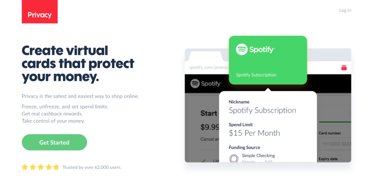
Source: Privacy landing page
This landing page example packs a mighty punch in just 16 lines of copy.
The use of short sentences and even shorter paragraphs makes it an easy read for time-poor audiences. You can let other pages on your website do the heavy lifting in terms of content, with internal links leading to the answers people might want.
In terms of design, research shows that a surprising amount of what we see and process is picked up by our peripheral vision. Privacy’s well-spaced two-column landing page layout lets a reader easily process all the major points on the page. Block color headlines break up the page further, delivering key takeaways in three words or less.
The 6 elements of the best landing pages
From attention-grabbing headlines to compelling calls-to-action (CTAs), the best landing pages for native ads contain the following six elements.
1. The headline
In seven words, Privacy sums up its purpose as a business, and the reason why you should consider its product. A reader would understand how they could benefit even if they didn’t read past the headline, a trait you’ll see on all the best landing pages.
You’ll want to make sure that your landing page headline carries over the theme from your ad. See more guidance on how to write perfect headlines for native ads.
2. The intro
Your intro must contain a hook, as with all copy written for online readers.
Any offer to make online shopping safer and easier will find an appreciative audience, which is likely why this attribute takes star billing above three other bullet-point features. A ‘Get Started’ button follows the intro, allowing people to jump straight in without requiring they read on.
Privacy also ensured their five-star customer rating is visible above the fold. The top screen of any landing page has to contain the most compelling elements, following the journalistic principle of putting the most important facts front and center. You can’t assume people will stay with you until the end, so lead with your best shot.
3. The USP
Your unique selling proposition, or USP, is the main reason why someone should sign up for your service or buy your product rather than a competitors’. The best landing pages will hit on the reader’s pain points and show how your product solves them uniquely.
In this example, a purple header highlights a nine-figure savings, above a one-sentence summary of the techniques used to achieve this attention-grabbing target. Clever use of phrases like ‘unwanted charges’ and ‘forgotten subscriptions’ address common pain points, building empathy with the audience.
4. The hero shot
This can be the hardest aspect of any landing page to judge. Stock photography has its drawbacks, but your own snaps may not look professional or dynamic enough.
Privacy chose a different route by using a screenshot of their virtual card service in action. As well as being proprietary (and therefore unique), it instantly demonstrates the product’s simplicity and flexibility. It’s no coincidence they namecheck the world’s leading ecommerce retailer, since more customers are likely to have an Amazon account than any other brand (and therefore recognize the merits of capping spend limits).
5. The social proof
In keeping with the page’s studied minimalism, Privacy chose to use social testimonials that appear to be taken directly from Twitter. They are short — between 15 and 25 words — allowing them to make use of the optimal length for strong engagement. Best of all, they appear to be unsolicited, which supports their authenticity. Comments from users are further supported by quotes from recognizable media outlets such as TechCrunch.
6. The CTA
The landing page includes two green buttons, clearly showing where the reader needs to go to start using the product.
While the lozenge-style button at the top simply says “get started”, the button at the bottom of the page offers a more specific action. By including details, “Install Privacy for Mozilla Firefox”, the button reduces the uncertainty of what will happen next, eliminating the mental obstacle for the reader.
Below the final CTA, there’s a ‘free to use’ pledge, capturing attention with the only use of full caps on the entire page. The CTA ends by explaining the firm’s business model and ruling out hidden fees, all in one carefully crafted sentence.
Drive traffic to your best landing page
Like all the best landing pages, Privacy’s model is simple, offer-specific, and geared around encouraging an action. With the six elements listed above, audiences can see a desirable solution to their pain points within seconds, naturally following the content down to a compelling CTA.
Ready to start building your landing page? You can also take advantage of a landing page builder to set up design fast. See our analysis of the best landing page builders.
The best landing pages also need strong native ads to drive traffic to them. Our 15-day free trial lets you develop and test your next native ad campaign, through one easy-to-use interface.

