There are a multitude of ways to drive traffic into your offer. You can use banner ads, email campaigns, native advertising, search ads, social media marketing, SEO, and many more. But how exactly do you turn this traffic into potential customers? That is the question.
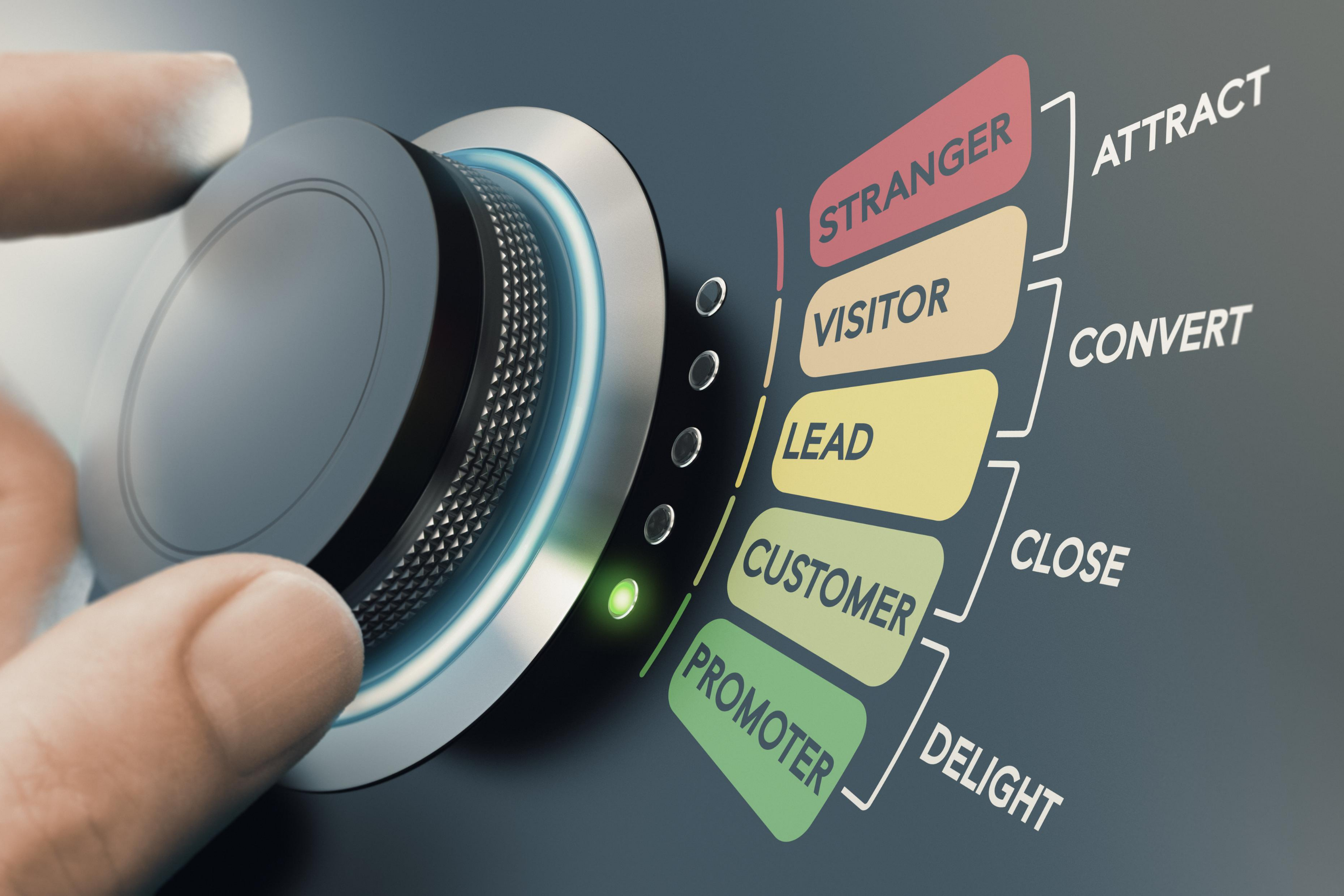
The answer is actually pretty simple: you need to establish a relationship between your business and your potential customers. The first thing to do would be to convert these visitors into leads, and you can do that with the help of a landing page.
Using a landing page will help you get the best out of your resources, including money and time. Having a landing page for your business can dramatically improve your conversion rate. This can in turn increase your marketing ROI by establishing a way to interact with your visitors in the future, eventually turning them into paying customers.
Table of Contents
I. What is a Landing Page?
II. What Makes A Good Landing Page
III. Components Of A Landing Page
IV. How To Build A Landing Page That Converts Well
What is a Landing Page?
First off, let us define what a landing page really is.
In literal terms, a landing page, or lander, is simply the initial page a visitor 'lands on' after clicking on a link. This would mean that a landing page could be any page on a website such as your home page, a lead capture page, or even a blog post; as long as visitors are directed there after clicking a link.
However, this is where a lot of people get it wrong. They send traffic to just about any page, most of the time, the homepage! But not every page on a website actually qualifies as a landing page.
In online marketing and advertising, a landing page is a term used to describe a standalone web page that is mainly created to receive traffic from an online marketing campaign. The objective is to convert visitors by encouraging them to buy, subscribe, or even something as simple as opt-in.
In a conversion funnel, it falls in the middle, right after the traffic source.
A landing page could receive traffic from any online advertising source, no matter how you choose to fill the top of your funnel. A home page or any other page on a website would not qualify as a landing page because it is not specifically designed to convert traffic from marketing campaigns.
When a landing page is used in native advertising, it often stands as a followup to any promise you have made in your content. Also, it precedes the conversion of a visitor to a customer.
It could lead to another page that may be e-commerce or lead generation based. Typically, a lead generation based landing page makes an offer to visitors, which could be in the form of a free trial, webinar registration, eBook, or contest entry, in return for their contact information.
A good landing page effectively persuades a potential customer to accept whatever offer you have in exchange for their details. A business could have several landing pages for different purposes and customer segments.
What Makes A Good Landing Page
The aim of creating a landing page is to provide a means for prospective clients to take advantage of whatever special offer you promised them in your advert. It is also a great space to provide information to your customers while leaving some sort of mystery to encourage them to sign up to learn more.
Since landing pages are made precisely according to the offer, they have a higher chance of capturing the attention of the visitor and helping them convert easily and quickly.
A good landing page, irrespective of the kind of offer it is about, must:
-
Focus entirely on the offer and not the company.
Prospective clients click on your link to learn more about the offer, not the company.
Directing them to a page containing information mostly about your company can make them feel tricked, thereby giving you a wrong first impression.
Although your landing page must represent your company, you should still make sure it appears the other way round. Your page should mostly talk about the offer, with ties to your company. In other words, a landing page should serve a distinct purpose and still be relevant to your brand.
-
Be free of diversions.
A good landing page must contain content that only directs users to the end goal of getting what they want. There should be no diversions of any sort from the offer.
-
Contain simple forms.
Long forms can be pretty discouraging to visitors. You should ensure the form on your landing page is short. This is the reason why opt-in forms that require only a name and email address has the highest average conversion rate as compared to others.
If a lot of information is required from the visitors and the form cannot be shortened, it is better to break it into parts or different pages and let the user see their progress as they fill.
For instance, the part of the form that requires visitors to input their name and contact information could be step one of four. The address should be step two of four, and so on.
-
Speak to a particular audience.
To target specific kinds of consumers, dividing your customer base into segments through customized campaigns always helps. A landing page could be created for each segment so that each page is tailor-matches the angle that you are aiming for depending on the audience.
-
Include specific information about your potential customers.
A good landing page collects useful information about potential customers. Without obtaining the right information, visitors cannot be converted. Helpful information goes beyond the visitors' name and contact address. It should give insight into why visitors clicked on your link to ascertain what could ensure a lasting connection with your brand.
-
Provide a message after completion.
A simple 'Thank You' after registration helps users understand when they have completed the registration process. It is also polite and shows appreciation.
Some landing pages provide visitors a way to interact with the business through different channels, such as social media profiles. This is not a requirement, though, as landers are usually made so as not to divert users to a different page.
Landing page designers want the user to focus on just the task at hand, and that is to subscribe, purchase, or any other action that would turn the visitor to a customer.
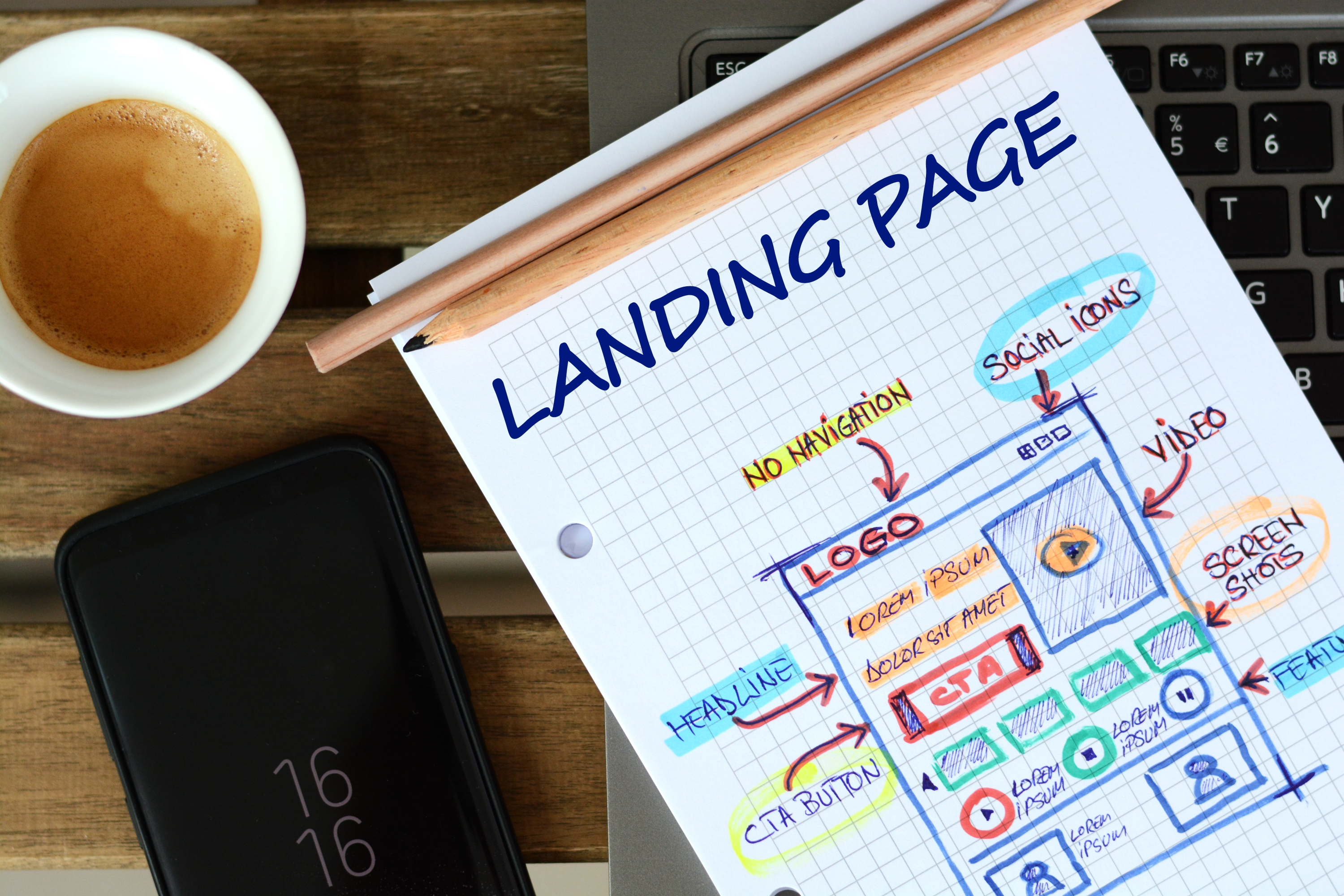
Components Of A Landing Page
Landing pages have many differentiating factors, and so there is no standard way of creating a good landing page.
However, there are some core characteristics that you must incorporate to create a converting landing page that performs well, and they are as follows:
-
The main headline and supporting headline
The very first thing users see when they open your landing page is the headline. Because of this, your landing page headline must be exciting and compelling, while clearly describing what a user will get from your product or service.
The message in your landing page headline should be powerful enough to capture the interest of visitors and enhance their understanding of what you have to offer. Generally, a landing page headline should grab the visitors' attention, give information about your product or service, and be concise, preferably never above twenty words.
It is also possible to use a subheading or a supporting headline. A supporting headline, as its name implies, simply supports the information given in the caption.
Since a headline can only be kept very brief, a supporting headline acts as a direct extension to it. It could be in the form of a continuation of the headline or an additional compelling message that supports the primary one. Your supporting headline must be very persuasive because while your headline captures the interest of visitors, your supporting headline is what convinces them to stay.
-
A unique selling proposition (USP)
A unique selling proposition communicates to visitors what sets your offer apart from others. It is essential to define a point of differentiation.

Out of all the shoes in the world, what makes you stand out?
Your landing page should explain in a straightforward way to visitors what makes your product or service unique. It would be best if you broke down your offer to the most understandable level to help customers understand why they should go on with your brand and what they can expect from your brand.
A unique selling proposition can be told in the headline, sub-headline, reinforcing statement, and in the closing statement.
-
Image or video showing the context of the use
A visual representation of how your product or service works is important on your landing page because it helps visitors to understand better what your offer is and how they can utilize it to meet their needs.
Visual representations such as photos or videos of your product or service often have more effect than text. Pictures relevant to your offer should be large and of high-quality to grab the attention of users. If you could, please avoid using stock images as they could give a false ring to your product.
-
The benefits of your offer
The benefits of your offer provide a more detailed description of what the product can do for users. A landing page has to contain information on more details about the offer and give answers to any questions users may have.
It is important to give descriptions of the features of your products along with their benefits. Providing information on both features and benefits drives more conversions. Although, you should always try to lead with the benefits because answering the question of how the product can provide value to the user’s life is far more important than any technical specification.
-
Social proof
Social proof serves as evidence that people have made use of your product or service, and this has a significant role to play on the decision users make concerning your offer.
Social proof may be in the form of logos of customer companies, case studies, review scores, testimonials or feedback, direct quotes from customers, and the number of signups.
A social proof must never be faked, or else customers may feel suspicious, and that would greatly diminish their trust for your brand. If possible, let your social proof be from someone users can identify.
If used right, social evidence can be very persuasive and make visitors convert faster.
-
Positive reinforcement statements
The purpose of a reinforcement statement is to remind visitors of your unique selling proposition. If your landing page content is a bit lengthy, it is important to create another title midway to reinforce the main headline.
When writing a reinforcement statement, you must consider the experience the user would have gained halfway through your page, and use that to drive your unique selling proposition further.
-
The closing statement
A closing statement is your final opportunity to communicate with the visitors what they have to gain from your offer. It comes towards the end of your landing page and often creates a little urgency or reminds users why they are on your landing page. This is the best place to add a counter and a discount feature.
A call-to-action often follows a closing statement.
-
Call-to-action
A call to action is the most critical component of a landing page, as it wouldn't be a landing page without it. Your CTA could be in the style of a button or a form, urging users to go on with your offer.
This has to be placed strategically. If your landing page has very little content, it should be placed above the fold (the space that immediately appears on the screen without the need for the visitor to scroll down).
If your landing page is a long-form type, it should be placed two to three times:
- above the fold,
- in the middle right after the reinforcing statement, and
- at the end right after the closing statement.
Where you place the CTA, along with how you design it, has a huge role to play on how effective it would be.
You can use conventional terms like 'submit' or 'click here' which users can identify immediately. But you can also try using words that can drive the user to act now, such as 'start my free trial now' or 'get 20% off your purchase.'
If using a form, it must be as short as possible.
How To Build A Landing Page That Converts Well
Building a landing page with the help of an LP builder is quite easy. However, creating a high converting one is another thing, and it takes some effort.
Your landing page should be straightforward and show visitors exactly what to do. Your visitors should not have to think about the next steps to take in achieving what they came to your page for.
The major components on a landing page either fall under the design or content of the page.
This means that you have to pay very close attention to the content and design when creating a landing page as they both have considerable roles to play in the effectiveness of your landing page.
Below are the steps you have to take when building an effective landing page:
1. Create a persona.
To know what users want, you must know who they are. Knowing the essential characteristics of your users such as their age, personality, budget, and habits will help you present your product to them in the most appealing way.
For this reason, you must create a buyer persona before beginning your landing page creation. A buyer persona is a reflection of your target audience. More importantly, this mirrors your ideal buyer.
Who is your buyer? What is his age group, gender, or financial status? What are his likes or dislikes? What problem is he trying to solve?
You must define your buyer persona to effectively tailor a landing page that will meet the buyer’s needs, and in effect, give you high conversion rates.
2. Define your goal.
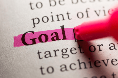 While creating your buyer persona, you should also determine what you aim to achieve from them.
Your goal could be anything including getting users to fill out a form, fill out a survey, sign up for a free trial, order a product, download an e-book, register for a webinar or provide contact information.
Your goal automatically determines what your call-to-action would be. It is important to define your goal as it will serve as a guiding light when building your lander. It helps you stay on track.
Giving your landing page one purpose means you are also giving your visitors only one option to act on. Providing multiple options for your visitors can kill your conversion rate.
3. Create a catchy headline.
The headline of your landing page has to be catchy enough to entice visitors to spend more time on your page and read through your content to know more about what you have to offer.
The end goal is to get users to perform a specific action, and your headline is the starting point. You can't afford to have a dull headline because it is the first thing users see when they enter your page. Dull headlines can become deal breakers and can cause your visitors to exit immediately.
Your headline should use words that inspire action and, at the same time, communicate the value of your offer. It is one of the significant elements the effectiveness of your landing page depends on because it is where interest, attention, and understanding begins.
Your landing page headline should be short, should capture the attention of the reader, and give them a bit of information about the product or service.
Irrespective of the kind of offer behind the landing page, your headline should possess the following characteristics:
-
Clarity
Your headline should be as straightforward as possible. Your product or service should be explained in such a way that there is no question or confusion about your offer. -
Relevance
Your visitors were directed to your landing page through an ad, and the heading of your landing page must be relevant to the ad. If visitors land on your page and notice a change in context, they would feel deceived and most likely leave immediately.
To avoid that, you have to fulfill your advert's promise. For instance, you can use the title of your ad that caused the visit as the headline of your LP so that there is some level of continuity. -
Empathy
An excellent way to draw the attention of visitors is to address their problems in an emphatic way. There are four different approaches you could take to create a powerful and persuasive headline:
-
Provide your unique selling proposition (USP)
Your unique selling proposition provides visitors with a compelling reason to choose what you have to offer over other similar brands. It describes what makes you unique and sets you apart from the competition. Giving your unique selling proposition in your headline draws visitors' attention and gives them a reason to stay on your page.
-
Ask a question
Another way to create a compelling headline is to present a pressing question. Your subject must relate to the visitor's needs or problems and force them to seek the answer in your landing page content.
-
-
-
'How To'
You can also begin your headline with 'How To' and complete it with a solution to your visitors' problems. The problem should relate to issues visitors face with your kind of product or service.
-
-
-
Show Emotion
This depends on the message you want to convey. For instance, anti-virus scanner offers usually employ scare tactics. If your audience is scared that a virus might infect their computers or phones, they'd definitely want to download your app.
Whatever emotion you want to invoke, make sure it is something that will drive your customers to like what you offer. It's all about the angle you are aiming for.
-
For more details on creating a headline, read this article on how to create the perfect headline.
4. Write a brief and informative sub-headline .
The next step to take in creating an effective landing page is writing a concise sub-headline—your sub-headline stands as an extension of your headline.
Ideally, if your headline causes visitors to take a look, your sub-headline (or subheading) should cause them to stay.
It should be an attractive statement on what people have to gain from subscribing to your offer. While your headline should be flashy, your sub-headline should clearly state the benefits of the offer and how it solves the visitor's problems.
Your subheading should be no longer than two sentences. If you feel more needs to be said, then add a bulleted list. While creating a sub-headline, here are a few things to keep in mind:
- The sub-headline should be positioned directly underneath the headline.
- It should be somewhat compelling.
- The sub-headline should go into a bit more detail than the main headline.
5. Write an effective landing page content.
After creating your headline and sub-headline, the next step would be to create the actual content of your landing page. Your headline and sub-headline should be informative enough to help customers make a decision; however, your content is vital for visitors who would prefer to read more about the offer before taking action.
An excellent and persuasive copy is essential as it is one of the best ways to communicate your points across to prospective customers. Your landing page's copy should be easy to scan and scroll through, yet detailed and compelling.
To allow readers to quickly scan through your landing page's copy on any device wherever they may be, you could make use of bullet points, text formatting (bold or italics), and other heading sizes. You should also ensure that your paragraphs are short.
The following should be considered when writing a landing page copy:
-
Length
The length of the content would determine whether visitors would read it or not. If it's too lengthy, your visitors may be discouraged and leave the page without going through any of it. And, if the content is too little, it may create doubts as most visitors like to know enough about what they are getting into.
The length of your landing page content ideally depends on two things:
- The buyer persona
Remember the target market you defined for your product? Use that information here. There are audience segments that like reading content and are actually inclined to learning more information about a product or service before making buyer decisions. There are also those despise reading and would skip your landing page altogether if it sees a lengthy copy. For such audiences, you would likely have to use videos and images. - The type of offer
If your offer is an e-book or guide, you probably only need to inform them of the basics like what the book is about and what they have to gain from downloading it. In this case, your copy could be short and still drive a lot of conversions.
Offers that require payment, on the other hand, require more extensive information. You would have to provide enough necessary information about the product as nobody would like to spend money on what they are not entirely sure about.
- The buyer persona
-
Writing style
It is imperative to write your landing page content in a way that speaks directly to prospective customers. Avoid using pronouns like 'we,' 'our' and 'us,' and instead use words like 'your' and 'you,' as it shows readers that your interested in and focused on meeting their needs. In short, write in the second person.
Your write-up must also give reasons why your product stands out from other brands in the same niche. Also, we can’t repeat this enough, so remember to explain the advantages of using your product or service and how it would be of specific help to them, rather than just focusing on the features. -
Formatting
Your landing page content should be formatted in such a way that every bit of relevant information is easily noticeable. You can achieve this by making use of different formatting techniques like adding numerals, different font sizes for headings you want to highlight, lists, bullet points, italics, bold, and so on.
6. Include an engaging media.
An engaging media on your landing page could help get information across to visitors faster. A compelling media should be directly related to your offer and inform visitors of what lies behind the landing page. Most web page visitors don't like to read, so engaging media always helps to get the information across.
For example, if your offer is an e-book on affiliate marketing, why not choose an image of someone working and taking a vacation at the same time? Isn't that something your audience wants to achieve? However, be careful when choosing images. Avoid stock images, as these look really fake and will give your customers a false impression of your brand.
There are three types of media you could use on your landing page:
-
Images
Images used on landing pages should be attractive and of high quality. In addition to that, the images must be relevant, engaging, and attention-grabbing, to help drive more conversions. Adding images on your landing page could help showcase products or their features, share a story about your brand, highlight customers, evoke human emotion, or direct the attention of visitors towards a vital element on your page like a call-to-action button. -
Videos
Most times, using videos on a landing page turns out to be more effective due to how descriptive they can be. Research has proved that a large number of consumers find videos very helpful when making buying decisions online and that such consumers consider companies that create videos more dependable than those without.
Also, the average time spent by visitors on pages with videos is a whopping six times higher than the time visitors spend on web pages without videos.
Have a look at are the results of Animoto's research on the power of videos for small businesses below:
-
GIFs
7. Optimizeyour landing page for search.
To make the best out of your landing page and get long-term traffic, you should optimize for search engines. Use the right keywords in your page title, meta description, and URL to get people to click on your listing after a search.
You should also optimize your image's Alternative text (Alt Text) because in cases where your images won't show up for whatever reason, be it your visitor's browser or your website; the text would display instead. Plus, it would give search engines another reason to feature your page in search results.
8. Create a lead capture form
Landing page forms help to collect the information of visitors. A lead capture form can only be effective if it is appropriately designed. Forms on a landing page must:
-
- only ask for the necessary information from prospects,
- be placed strategically on the page, and
- be appropriately organized to make it easy for users to complete.
To create an effective lead capture form, you should keep the following in mind:
-
- Ensure the form is of proper length.
The marketing funnel stage your offer falls into determines the amount of information required on your landing page form. You should always be mindful of the stage of the Buyer's journey. Ideally, if your offer is at the top of the funnel stage, then you would require less information from visitors. Name and address would be enough most times.
However, if your visitor falls further down the funnel, then you would require more information, and your lead capture form would be lengthier. The further your offer is down the marketing funnel stage, the more fields you'd require in your landing page forms, as the bottom of the funnel stage tends towards offers that require buying.
Your landing page form doesn't need to be lengthy or short to be effective; it only needs to go in line with the goal you're trying to achieve on the page. To avoid intimidating your visitors with lengthy forms, try dividing it into brief stages.
- Ensure the form is of proper length.
-
- Be creative with the submit button.
Avoid using the general term, 'Submit' on your submit button. Instead, let your button be action-oriented. For example, on a landing page for a software, you could make the submit to read 'Get your free trial now.'
- Be creative with the submit button.
-
- Enable progressive filling on your website.
A progressive filling helps to make filling forms on your website easy for returning visitors. Some visitors on your landing page have already filled other forms on your website, and so you should already have their information if you have contact database setup.
When you enable progressive filling on your website, returning visitors would only be required to fill information they haven't previously filled on your website. This would help you gather more useful information on your leads and, at the same time, make it easier for visitors to complete your site forms each time they visit.
- Enable progressive filling on your website.
9. Include trust indicators
Visitors often look for reviews of products and services before subscribing or making a purchase. Trust indicators should be directly tied to the offer you're promoting; else it won't be effective. Prospective customers should trust your brand before going for your offer, and that is the sole reason for adding trust indicators to your landing page.
There are different ways to add trust indicators to your landing page, and the most common ones are:
-
Trust badges
Adding badges and logos of awards and companies you’ve worked with drive a message of reliability to prospective customers. If your brand has been of service to various companies, visitors will easily believe you could be of service to them too.
However, it’s important to display badges of well-known companies, at least to the industry you are in, else it’s going to be a moot point.
Get Free Trust Badges from Convertful
-
Statistical evidence
Statistical evidence shows the number of visitors that have bought your product or subscribed to your service. Such information often proves to visitors that your offer is popular and a lot of people trust it.
The statistical evidence should be displayed where visitors will quickly notice it, preferably close to the headline, sub-headline, or web page copy. Never forget to mention the source that generated the statistical proof, or else your numbers would appear vague and dishonest. -
Third-party security seals
When customers see the seal of companies they trust, they are assured that it is safe to do business with you and that the information they provide will not be compromised. The most common and recognized security seals are McAfee, Verizon, and PayPal.
Customers know that these brands are reliable, so if you use them for your website and for your payment options, you could be trusted as well. If you already have a landing page, you would notice that the simple act of including a notable third-party seal will greatly boost your conversion rate. -
Customer testimonials
Another effective way to indicate to prospective customers that you are trustworthy is by showing them a recommendation from a satisfied customer. Avoid faking testimonials as visitors could notice, and that would be detrimental to your brand.
To prove your testimonials are genuine, try to add as much information as possible about the satisfied customer. This could be their full name, business, title, and even an image. -
Privacy policy
You can build trust by including a privacy policy on your landing page that clearly states how the information of visitors will be shared. The privacy policy is often added either below the landing page form of in the footer of the web page. Privacy policy usually goes along with terms of service.
Aside from adding trust, companies that ask for their customers’ information are now required to display Privacy Policy, else your paid marketing campaigns will not be approved by your traffic providers.
10. Add a powerful call-to-action
A call-to-action should be the highlight of your whole landing page, as it is what pushes visitors to take that final step. This landing page component should stand out above all the others and should be very clear to visitors so that there is no confusion on where to click to redeem the offer.
When creating your call-to-action button, put the below factors into consideration:
-
Position
If you have long content, avoid placing your call-to-action button at the beginning of the page. You are more likely to attract more conversions if it is placed in the middle, or after your landing page's copy. This is because users would have had the opportunity to go through your offer in detail and be more convinced of the next step to take. -
Size
Your call-to-action button should be big enough to grab the attention of viewers. If it's too small, visitors may find it hard to locate. A legible and noticeable call-to-action button encourages visitors to take action quickly. -
Color
The call-to-action button on your landing page has to have the right color contrast with the background to make it stand out from the rest of the page and draw maximum attention. This doesn't necessarily mean the call-to-action button must be in a very bright color.
White space also comes in handy to help emphasize your call-to-action button. It is essentially the empty area (not necessarily white) on a web page. White space draws attention to specific elements on a page and is very helpful in highlighting the call-to-action button on a landing page.
To find the right tone, hue, shade, and tint for your color button, check your brand kit. If you already have a color palette for your business, it would make sense to start with these. -
Text
What your call-to-action button says greatly determines whether your visitor would convert or not. The words “sign up” and “subscribe” are the most common ones. But you can try to be creative by using relatable and compelling words to drive conversions such as “get your discount now”.
11. Ensure there are no links to exit the page.
The aim of creating a landing page is to ensure visitors focus entirely on your offer. Giving them an option to exit the page defeats that purpose. Bearing this in mind, you should make sure there are no other links that will take them away from the lander. Forget about adding a navigational menu or a sidebar of all your blog posts.
When you give visitors access to other external links, you are allowing them to leave your site without converting. If possible, the only clickable link should be your call-to-action button.
Landing pages do not require a navigation menu because it should already have everything the visitor needs to know to convert. Your landing page should include everything earlier discussed in this article, and there should be no need to navigate through links to get relevant information.
If your landing page really must have a navigational menu, then it must be in the hamburger style (collapsible) to avoid distraction. Removing a navigation bar from a landing page or ensuring it is as invisible as possible has proven to increase the conversion rates significantly.
Your landing page footer should also be minimal and must not be like the footer on your regular website. It should only contain links to the privacy policy and terms of service.
Conclusion
A landing page is a vital part of marketing and knowing what it is and how to build a perfect one helps you get the best from it. Although there are several landing page building tools to make the process of creation semi-automated, it is still imperative to understand the theory behind creating a landing page that effectively converts visitors.
The next step now is actually building one! We’ve got you covered with our big list of landing page builders that will make lander creation almost effortless.
Whatever marketing approach you use, there is always one sure thing to do; and that is to test variations. In order to find the landing page that drives you more conversions, you need to test multiple variants. Here at Brax, you can monitor the performance of the campaigns you are split-testing based on their conversion rates. You can even automatically pause, activate, increase the budget, and more based on rules you set.
To find out more about how Brax can help you, drop us a line at love@brax.io and we will help guide your Native Advertising journey.

