It's one thing to get prospective clients to visit your web page, and it's another thing to get them to actually perform the action that you need them to. You may have thousands of users visiting your site, but if they’re not converting into customers, then it’s useless.
If you’ve ever been faced with this dilemma, then you’d be happy to know that there is a simple solution to this problem. And that is by incorporating a Call To Action.
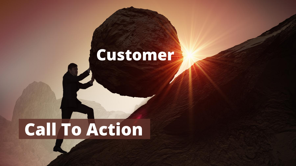
A lot of times, visitors abandon online shopping carts or end up not signing up. Some of them don't even bother reading through your web page's copy till the end. It's not because they don't want to, but because they think they’ve already fulfilled their purpose for visiting the site! It could also be because they are not being encouraged enough to do a different action.
When users fail to take action on your site, it affects the conversion rate and, ultimately, the amount of money you generate from your product or marketing campaign. An effective Call to Action can easily turn this around.
This is of course in addition to other vital factors to consider, such as advertising method and landing page content and design.
What is a call-to-action?
Call-to-action, often abbreviated as CTA, is an integral part of a webpage, piece of content, or advertisement that compels users to take necessary actions.
While marketing campaigns aim at directing audiences to make a purchase, subscribe or sign up to a service, a call to action is what gives them that final push.
Call-to-action is a crucial aspect of marketing because it is what helps to convert visitors into leads or sales, by encouraging them to take action on a marketing campaign. Without it, your visitors can become confused about what they need to do and might end up leaving.
Since there are different applicable tactics to guide an audience through their conversion journey, marketing campaigns often have different actions for the audience to carry out. These actions vary depending on the goal of the brand, content, or website.
Although applying a call-to-action is a great way to get visitors to complete specific tasks, it may end up being ineffective if not properly designed. There are a lot of factors to consider when creating the perfect call-to-action button or link on your website, which is why this single button is often one of the significant points to focus on when carrying out an optimization process.
What makes a good call-to-action?
Every digital marketer knows that without a solid call-to-action, all marketing efforts may go to waste.
On a landing page, the call-to-action is one of the most important determiners of conversion success. To be sure that your call-to-action will be compelling, check that it has the following necessary features:
-
Urgency
When visitors land on your page, they should be excited about your offer. However, sometimes even the most excited prospective customers may fail to take immediate action if they don't feel a sense of urgency.
Every marketer wants visitors to take action right there and then rather than later, knowing that they could come across the same offer elsewhere.
It is widely known that human beings tend to place a higher value on things that will soon be unavailable over things that are available in abundance. This is called the Psychology of Urgency.

For this reason, an effective call-to-action could give the visitors the sense that they may not meet the same offer the next time they return. If they don’t act now, the offer may disappear forever!
Another way to create a sense of urgency is by speaking in an active voice. For example, a call-to-action button that reads 'Learn more about marketing today' would have a greater effect on visitors than one that reads 'You can learn about marketing here.'
When you implement urgency in your call-to-action, you're sure to get great results.
-
Action-oriented
Calls to action should contain a word or a phrase that gives visitors a reason to take the action you want them to take. A good call to action button should begin with an action word like 'Get' or 'Download.'
It is always preferable to make use of a call to action that is industry-accepted and purpose-specific rather than one that reads general terms like 'submit' or 'sign up.'
A good way to choose the right call to action copy for your web page would be to put yourself in the shoes of a user and determine what people who visit your page would hope to accomplish. If it is to get exclusive access to your service, then your call to action copy should read 'Get exclusive access.'
Avoid using vague words, instead use phrases that trigger action and, at the same time, states what the button or link is for.
-
Includes a good content backup
Before users act, they need to understand the reason for doing so in the first place – this is why a call to action should always be backed up by a compelling copy.
On a landing page, a call to action should always be preceded by compelling content about your offer to generate visitors' interests. Whether you are using long-form copy or short-form content depends on your offer.
-
Conciseness
Brevity is another critical feature of an excellent call to action.
Preferably, a call to action button should not contain more than five words and should be straight to the point. While your landing page should contain information about what users can find inside the offer, the call to action should also convey the benefits of the offer, but using brief and straightforward language.
If you need to provide your visitors with further information about where they will be taken when they click on the button, then you can place this info in the content form right before the CTA.
-
Visibility
It is essential that a call to action button stands out from the rest of the content on a landing page. It must be easy to notice.
Even a perfectly crafted call to action copy could be rendered ineffective if it is difficult to see. While it doesn't have to be extremely large or dominate the whole page, it should be visible and typically more prominent than the less critical information.
There is no universal color for a call to action button; however, it should be in contrast from the rest of the web page while still fitting in with the overall color palette.
If your landing page background is plain white, a color like red or green will make the call to action button very obvious. If you have difficulties deciding on the perfect call to action button color to suit your page, you could make use of a color wheel.
Split-testing different colors can help you determine which color delivers a higher Click-Thru Rate.
-
Placement
A call to action should be placed in the most obvious place where visitors can see it without searching, preferably where they are most likely to look next.
The CTA on a landing page should follow the natural flow of the user. For example, if your landing page visitor is reading your page's copy or filling out a form, the call to action button should be right beneath the content.
A visitor must never have to backtrack to locate your call your action button.
Many internet users are familiar with the traditional landing page layout that includes a headline, marketing form, and then call to action. Therefore, a call to action should support a natural reading sequence that automatically points them to it.
This arrangement comes particularly handy in landing pages with a lengthy copy.
When visitors already know where the call to action button would be, there is a higher chance they would remain on your page longer. If a visitor sees your call to action before getting to understand what the offer is about, there is a good chance they will ignore it.
A call to action placed on any other part of the page other than after the content should be made visible enough. A good way would be to use an arrow to direct users' attention.
-
No competition with other elements
Since a landing page aims to get visitors to the bottom of the conversion funnel, the call to action should not compete with other diverting elements on the page.
Often, the call to action button stands as the only clickable link on a landing page.
But in cases where users need to be redirected, such as where a portfolio is required to convince visitors, additional links should not attract as much attention as the call to action.
For example, on a landing page with two buttons that read “Get started today” and “View our work”, the link that drives the conversion is the former. For this reason, it should be more prominent than the latter to avoid confusion. Better yet, don’t make “View our work” into a button; just an ordinary link will do.
If you can’t help it, make sure to provide a way to get the visitors back to the original page. You can also urge them to proceed with the expected action by adding another CTA button on the new page.
How Important is a CTA Button on Your Landing Page?
The importance of a call to action on a landing page cannot be overemphasized. It is easy to say that the call to action is the most critical element on an advertising page because it is what determines the conversion of a lead.
Your call to action is the final opportunity to encourage your audience to take the next step towards conversion. Ignoring the call to action on your landing page may be detrimental to your company’s advertising efforts.
Here are the reasons why this single element carries so much importance on a landing page:
-
It eliminates decision fatigue
The call to action acts as a simple directive to tell your prospective clients what and where to go next, thereby making it easier for them to make a decision.
Sometimes, people need to be told what to do. No matter how intuitive your content and page design may seem, the question still remains: “what do I do next”? Don’t make them think too much, guide them!
With an appropriate and effective call to action, users will be pointed towards making the right decision by signing up, downloading, buying a product, or whatever the landing page’s goal may be.

-
It creates a better user experience
A clear call to action reduces the chances of visitors leaving your landing page due to confusion as there would be no doubt about the page’s intention.
While your landing page copy sparks up excitement and interest, your call to action allows the reader to become a customer.
-
It is the starting point of your sales funnel
Calls to action go hand in hand with sales funnels and serve as transitions between the stages of the customer's journey.
The right words on your call to action button can create a better user experience for visitors, thereby prompting them to take action immediately by instructing them on what to do next, depending on the nature of the offer.
Call to action buttons make it easy for users to carry out the task you want them to, making it a smooth experience for them. This can also lead to a healthy opinion about your business.
-
It meets your visitors’ expectations and makes it easier for them to take action
Calls to action aren't only critical for your business – page visitors want and expect them. Most web page visitors depend on the call to action at the end of the page to proceed.
After they've read your landing page copy and have decided to go on with your offer, they will most likely look for a call to action button to learn the next step.
If users don't find a call to action button, they can get bewildered and might leave your page disgruntled. Not only would your conversion rate suffer, but so would your business’s reputation.
When using a call to action on a landing page, predictability is a good thing because it makes your brand trustworthy and effortless to engage with.
-
It helps boost conversion
Landing pages are created to give consumers more information about your product or service. It helps grab their attention and encourage them to seal the deal.
The call to action is that little piece that highlights the effect of the landing page copy.
Without a CTA, your creatively and perfectly constructed landing page copy will fall flat and won't give users that last push to go further.
Often, with a landing page, you have just one chance to give your target audience a good impression of your brand. The smallest missed opportunity can cause prospective customers to look away in favor of your competition.
For this reason, a strong and compelling call to action is critical in boosting conversion.
-
It serves as the finisher and reignites interest
CTA buttons have the power to make or break your advertising efforts. You could present an incredibly brilliant marketing pitch and be faultless in its delivery, and yet still fail to compel users to complete the transaction.
Giving a summary of the significant benefits of moving forward, coupled with an offer at the end of a pitch, is integral to concluding things.
This important conclusion is finished off with a call to action. Ideally, a call to action should come at the end of a landing page's copy after the content has (hopefully) convinced the reader.
Often, a question like 'What are you waiting for?' leads to the CTA, and reminds users of what they have to gain. Asking the readers a question at the end of the content and then following it up with an appropriate call to action can serve as a reliable way of capturing the attention of readers and increasing revenue.
When the CTA is placed prematurely before the page's copy, users may forget to take action after reading. A call to action placed after a landing page's content serves as an effective finisher that leaves a resounding impact on consumers.
However, some offers benefit from placing the CTA at the start or in the middle of the copy. Again, it cannot be emphasized how important split-testing is.
If you’re planning on testing multiple CTA styles on your landing page for your native advertising campaigns, you can manage your campaigns here at Brax. You can set-up the campaigns, monitor their performance, and make campaign adjustments all in one dashboard. Test it out for 15 days.
Examples of compelling calls to action
Creating the most compelling call-to-action for your web page can be challenging. Often, website owners carry out A/B testing to determine the best call-to-action approach for their page.
However, the process of A/B testing can be both time and money consuming. A quick way to choose the right call-to-action for your web page would be to learn from others.
Here are examples of persuasive call to actions used by different companies on their landing pages and why they work so well:
-
TRY 30 DAYS FREE – Netflix

Netflix relies mostly on their free trial to attract new customers.
The call-to-action on their home page immediately addresses the fear most users have before signing up for free trials, which is whether or not unsubscribing would be an issue for them.
Just above the highlighted call-action-action button in red that clearly states the benefit, there is a brief copy indicating that users can watch anywhere and that they are free to cancel anytime.
This little information not only boosts the confidence of prospective customers but also persuades visitors to take action.
-
GET FREE CARD READER – Square
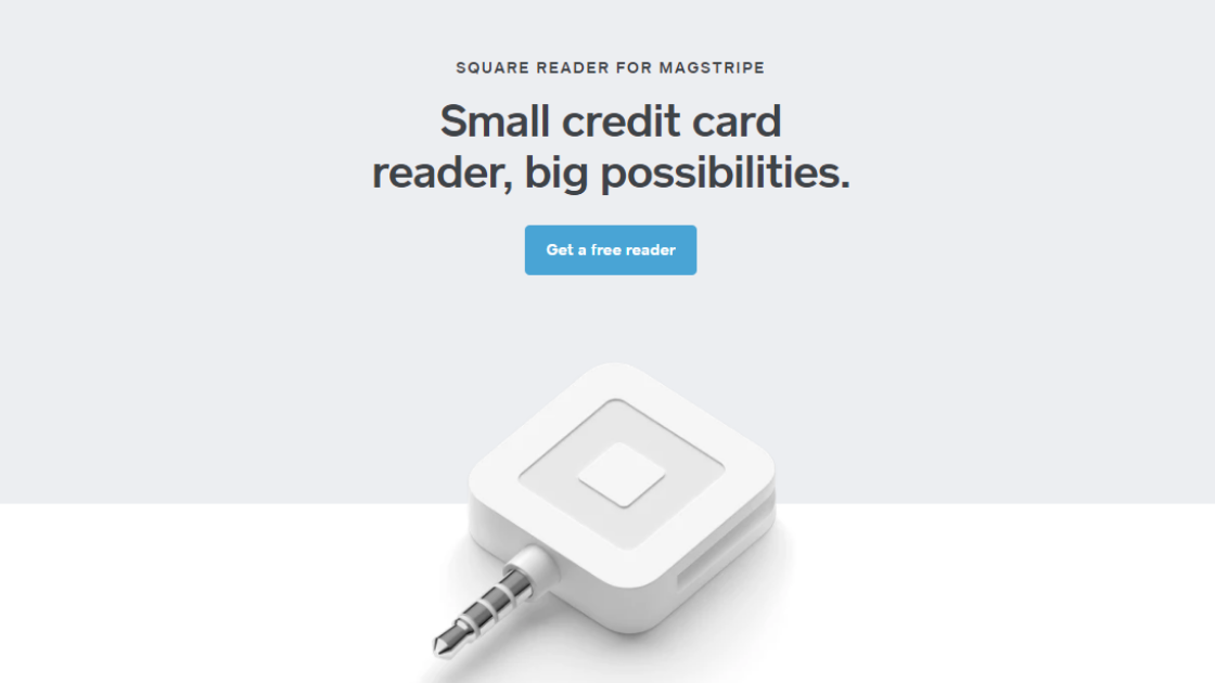
When your offer is something your target audience really want, your landing page's call to action doesn't have to be exceptionally innovative. A good example is the call-to-action used on this landing page by Square.
Square's offer is particularly attractive to small-business owners. Their product allows all businesses to accept credit cards for transactions, which was previously out of reach to most small merchants.
Square's call to action clearly states the most appealing benefit of the product, which is the fact that it is free. It also includes a persuasive word “get” that compels users to take action, along with a brief lead form.
Prospective clients are likely to find the fact that there is no charge for the product astonishing, and this strengthens the value proposition of the offer, thereby making it more attractive.
-
ANALYZE WEBSITE - Neil Patel
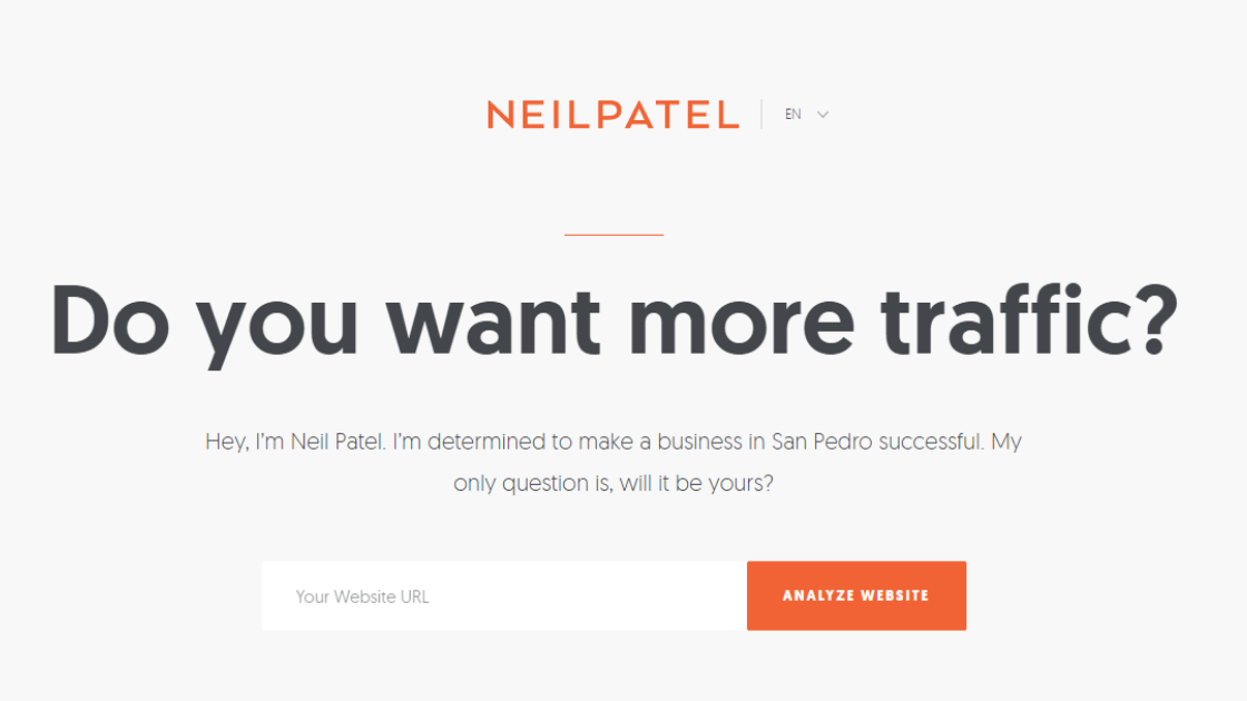
Getting people to sign up for newsletters can be pretty tricky. Although all you need them to do is sign up, using a call to action that just says 'Sign Up' most times doesn't get them to.
The call to action on Neil Patel’s website is exciting, giving users the push to sign up immediately. Even users who don't fancy newsletters may end up subscribing because Neil is offering a service that is too hard to refuse.
NeilPatel.com's call to action is made more effective because of the two supporting content for this CTA, and these are
- “Do you want more traffic?” - written in big bold letters, you are poised with a question that you will never answer with a no.
- “I’m determined to make a business in <your city> successful. My only question is, will it be yours?” - Of course, you’d want one of the top SEO professionals to support your business, right? There’s a chance someone else in your area might be interested in his service as well, so better grab the opportunity yourself while he still hasn’t chosen anyone else. The webpage uses the scarcity and urgency principle in this line.
*Note: The city is dynamically populated based on your IP address to personalize the user experience.
Another reason this call to action stands out is because of its perfect color contrast. The orange button against the light grey background makes it easily noticeable and more important than other elements on the page.
-
BUILD A MANPACK – Manpacks
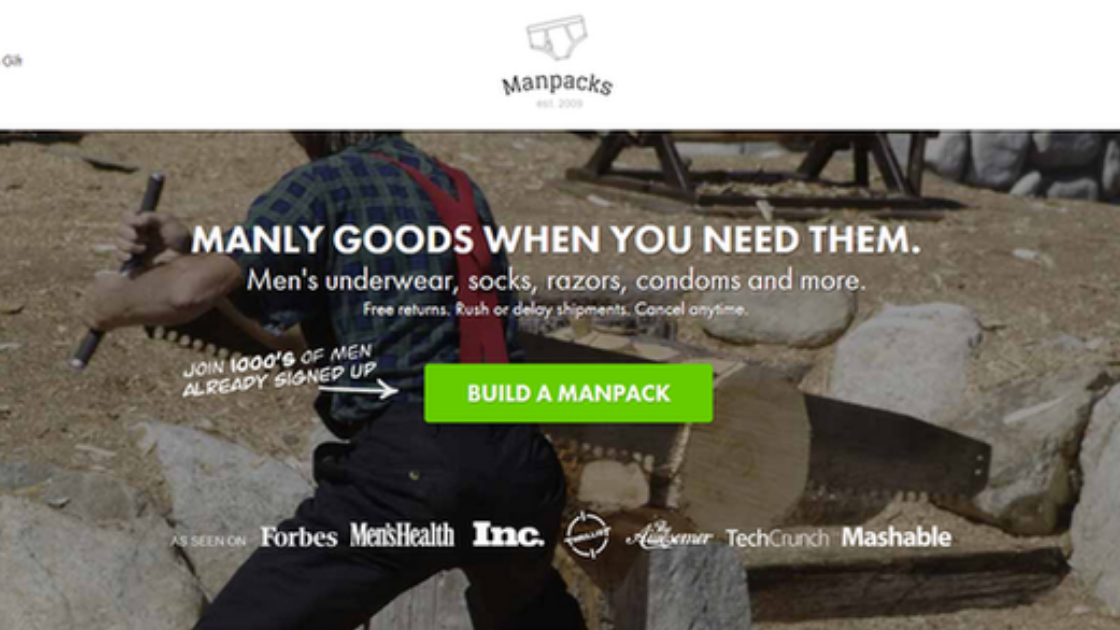
Manpacks, during its eight years of existence, used the power of language in their call to action button to appeal to their target audience.
Ordinarily, there isn't much excitement about purchasing male grooming products. However, Manpack tapped into the desire of men to build things by using a call to action that read “Build a manpack” rather than the regular “Buy now”.
Backed up with interesting imagery of a man sawing timber, the strong call to action phrase combined with a list of male grooming products sounded as exciting as an actual building project.
-
GO TO GOOGLE DRIVE – Google Drive
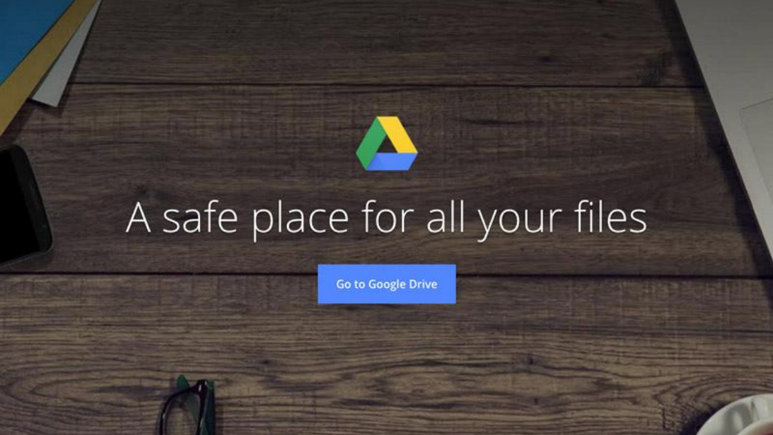
Google Drive makes use of a very simple landing page to welcome users to their platform.
A headline clearly stating the benefit of the service as “A safe place for all your files” is followed by a simple call to action that says “Go to Google Drive”.
This landing page by Google Drive shows how a headline can be used to give insight into the key benefits of a product and drive massive conversion when combined with a simple yet effective CTA.
-
LET'S DO IT! – Less Accounting
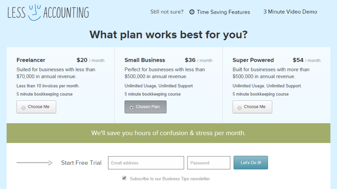
It is often difficult to persuade clients to take action that might be risky, especially in the case of SaaS companies and those offering financial software. This is why the call to action on this landing page of Less Accounting really stands out.
There are two things to take note of about this landing page.
First is the color – unlike most other calls to actions we see on other landing pages, Less Accounting made use of a muted color palette to induce the feeling of calmness in page visitors.
Second, and most importantly, is the wording on the call to action – to encourage prospects to sign for their free trial, they made use of “Let's Do It!” instead of the traditional “Sign Up”.
This call to action implies partnership and conveys excitement. It tells prospects that the company isn't just interested in getting their personal data, but also in guiding them through achieving the best from the offer.
-
GET STARTED – Salesforce
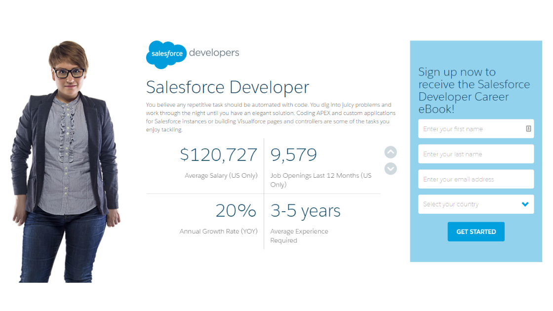
Salesforce's Developer Career eBook landing page provides information on the kind of content users would find in the book. Landing pages are meant to appeal to a specific audience persona. In this case, their target audience is people who are thinking of moving to a different company.
What better way to entice developers to switch to Salesforce than by presenting how much they can earn potentially, how many opening positions are available, and other relevant information. The only information missing is how to be part of Salesforce.
The lead form is followed by a simple and commonly used call to action. Nevertheless, this particular call to action, “Get Started” has proven to be among the highest converting calls to action across different niches. The effectiveness of this call to action, however, lies in how it is used with other elements of the landing page.
-
CREATE MY RESUME – My Perfect Resume
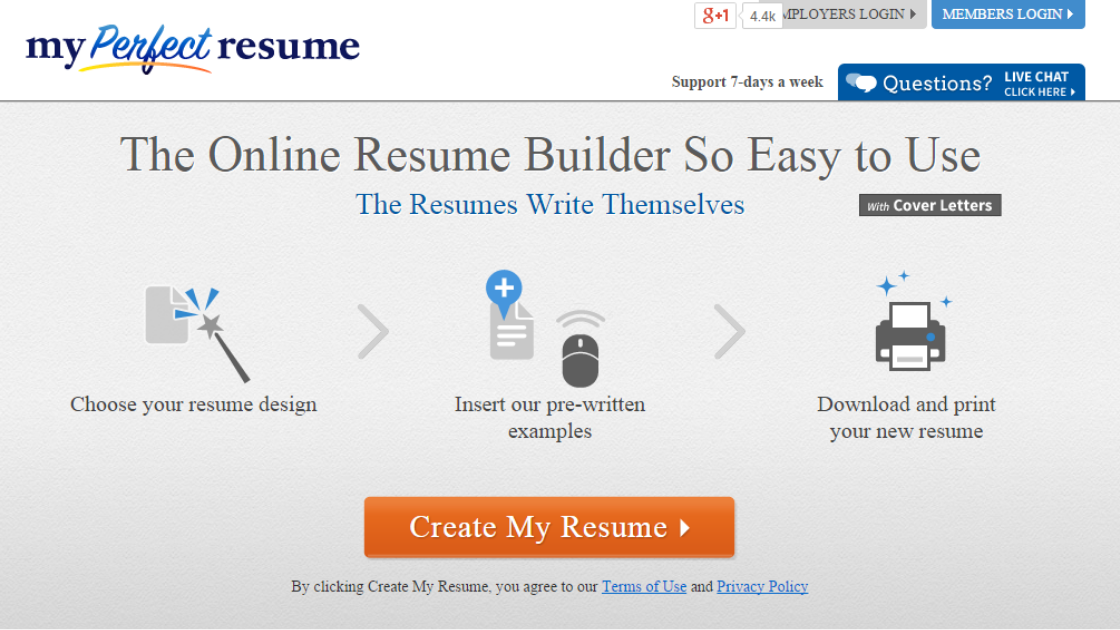
This particular landing page by My Perfect Resume gives a perfect example (pardon the pun) of how a simple call to action can be made very powerful with the combination of graphical elements.
A lot of people find writing a resume from scratch incredibly challenging, and My Perfect Resume capitalizes on this. Any user who comes across this landing page would immediately notice the brief step-by-step graphics showing how easy and straightforward the process of creating a resume with the platform is.
The well-presented graphics are immediately followed by a call to action that directly tells the user what to do. The fact that it is written in the first person makes it appeal faster to the minds of users as it appears more personalized. The simple graphical presentation, along with the clear call to action, makes the offer very tempting to users.
-
SHOW ME MY HEATMAP – Crazy Egg
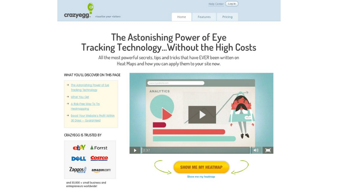
This call to action is a good one for several reasons.
One, the landing page copy preceding the call to action establishes the benefit of Crazy Egg through straightforward language. Two, it assures users of the reliability of their service by displaying the number of satisfied customers they've had. Three, below the call to action is information about a free trial and the ability to cancel anytime.
The call to action button itself says “Show Me My Heatmap” both directly reminding the users of the benefit of the offer and tapping into the power of using the voice of the customer.
Of course, let us not forget their video explainer -- this can easily take the customer from point A to B in the decision-making process.
-
SEE HOW – Lifestraw
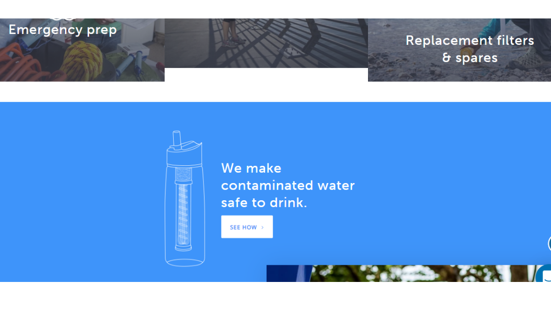
On the home page of Lifestraw, this call to action follows a very bold statement, “We make contaminated water safe to drink” and is accompanied by a doodle image of the product.
This simple and fun design, along with the powerful statement, instantly catches the attention of readers and makes them wonder how it works. The call to action that says “See how” perfectly leads them on to the next thing to do. This call to action is effective because it answers a question that users are likely to ask after reading the copy before it.
Although this call to action doesn't lead directly to a purchase, it does lead the users into other parts of the website that could capture their interest and compel them to make a purchase.
-
GIVE BASECAMP A TRY – Basecamp
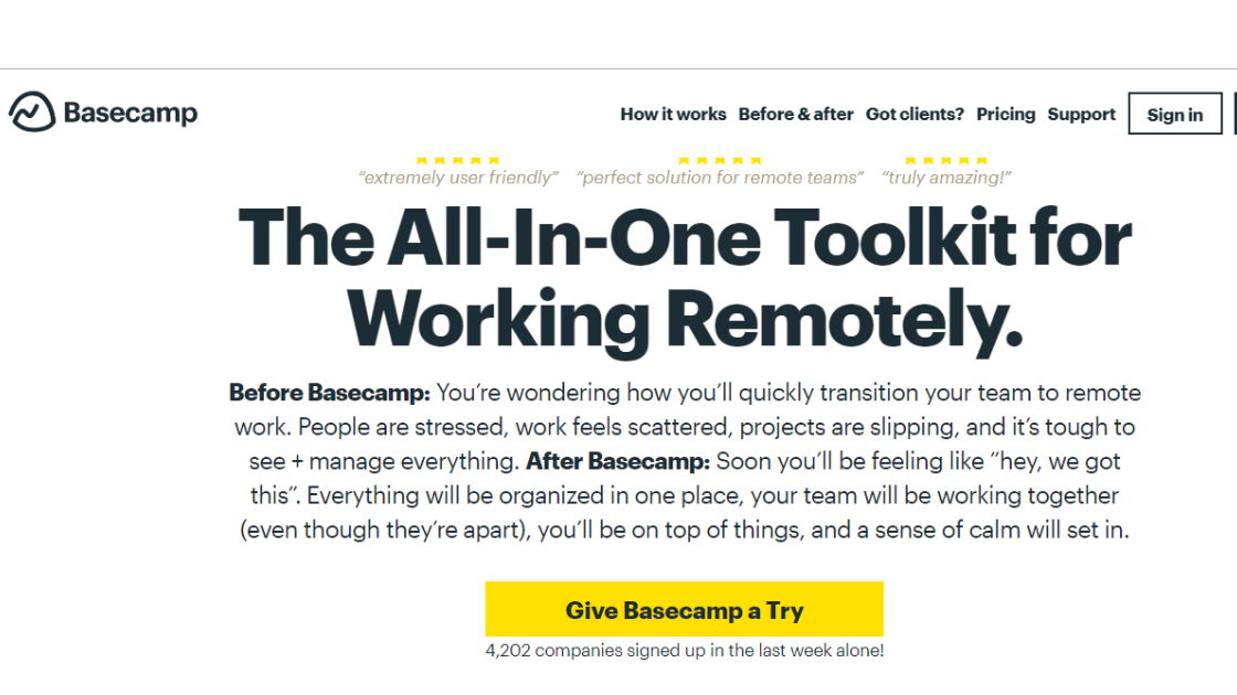
Basecamp aims to simplify life for project managers all over the world; you could tell from the tone of the copy on its website and its approachable design.
This company, like many others, uses its free trial to attract customers. However, what makes its call to action unique is its use of a rather subtle tone and language.
Most free trial related calls to action read “Start Free Trial Now”, which is compelling, but at the same time a bit forceful. The words on Basecamp's call to action says “Give Basecamp a Try” appears less intimidating, making it easier for prospects actually to give the product a try.
-
DOWNLOAD TEMPLATE NOW – When I Work
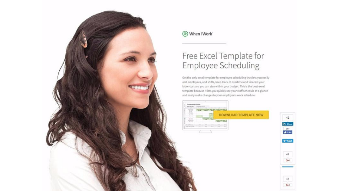
This landing page gives another example of how a simple call to action can be used effectively.
When I Work offers free excel templates as a content upgrade. Its landing page features a hero shot of a female looking right at the landing page headline.
This image automatically draws the attention of users towards the yellow call to action that says “Download Template Now”. The call to action is very specific to the content of the page, and it creates a sense of urgency with the use of the word “now”.
-
SIGN ME UP - Birchbox
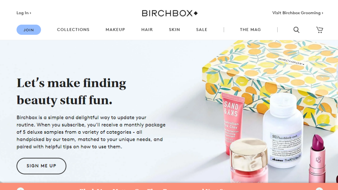
Birchbox's landing page makes use of a simple call to action, but with a little tweaking that greatly enhances its tone and effectiveness.
Most CTAs use just “Sign Up”, “Subscribe” or “Join” to direct users to subscribe to their services. However, Birchbox personalized its call to action button by the addition of a simple word – “me”.
This personalized phrase gives users the feeling of being in control, as it implies that by clicking the button, users are instructing Birchbox to do the signing up for them.
-
SECURE MY SPOT – Bamboo Underwear
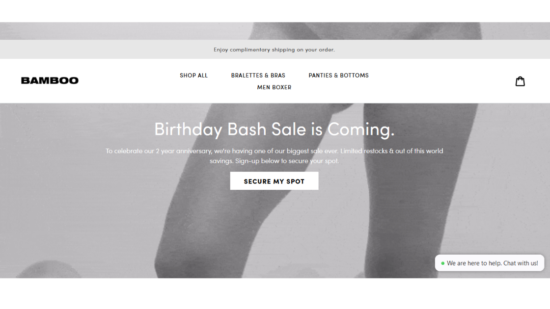
When people come across a limited opportunity, they feel the urge to take action immediately and be among the lucky ones.
On the homepage of Bamboo Underwear, to advertise their special sales program, a headline stating the offer is used, followed by a compelling copy that describes the benefit of the offer.
The call to action then reads “Secure my spot” giving users the feeling that they may not meet the offer the next time they return, thereby compelling them to take immediate action.
-
SIGN UP – IT'S FREE! – Trello
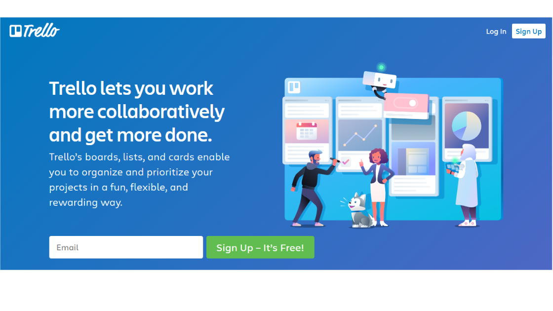
Trello uses a moderate design on its homepage, and the effectiveness of the call to action lies in its surrounding elements. Trello is a tool that can be used to plan different tasks and assignments, and a simple graphic representation on the side of the page shows the tool being used for various purposes. Its importance is further strengthened by the copy just above the call to action.
Trello makes use of perfect color contrast to ensure the call to action button stands out from the rest of the page. With the green call to action against a plain blue background, it is impossible to miss.
The call to action button uses a common phrase, “Sign Up” but then adds more value by including “It's Free!” This additional phrase shows visitors that they have nothing to lose by clicking on the offer, making it more likely for visitors to convert.
-
LET'S GO! – Hostel World
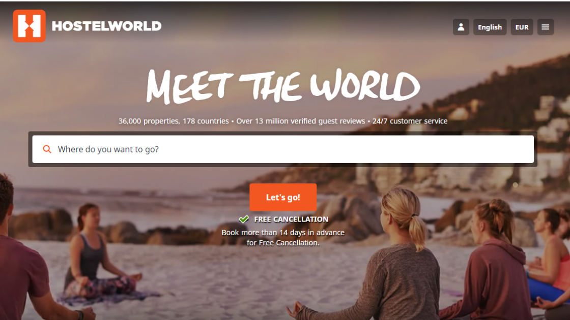
Rather than the commonly used “Search” button, Hostel World makes use of a more creative short phrase accompanied by an exclamation mark to urge users to use the search form for where they want to go.
The exclamation mark creates urgency by making users feel that there is no need to wait.
The single form also contains a brief description as a question to let users know the function of the call to action.
Another thing to note is the color of the button, along with its position on the page. The central positioning and bright orange color capture the attention of page visitors while removing distractions, directing users straight to the call to action button.
-
TRIPLE YOUR GIFT ♡ – International Rescue Committee
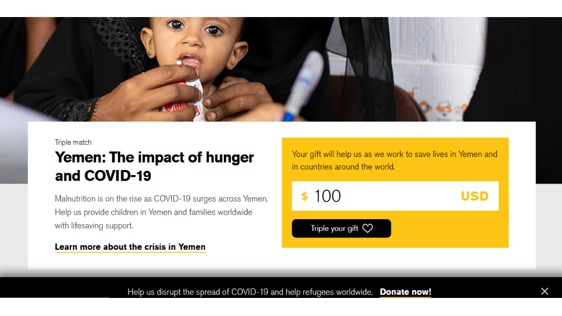
The International Rescue Committee taps into the emotions of users by a compelling call to action preceded by a copy that clearly and briefly describes the action they will be taking by clicking on the button.
This organization already knows that anyone visiting their page is interested in helping others. So they make it easy for visitors to make donations by providing them with information on what they'd be donating for along with a call to action that encourages them to give more than they normally would.
This call to action is effective because it is direct and provides a straightforward statement of what the visitors are expected to do after clicking the button. The heart sign (♡) also makes the call to action more appealing to the emotions of visitors.
-
START MY 15 DAY FREE TRIAL - Brax.io
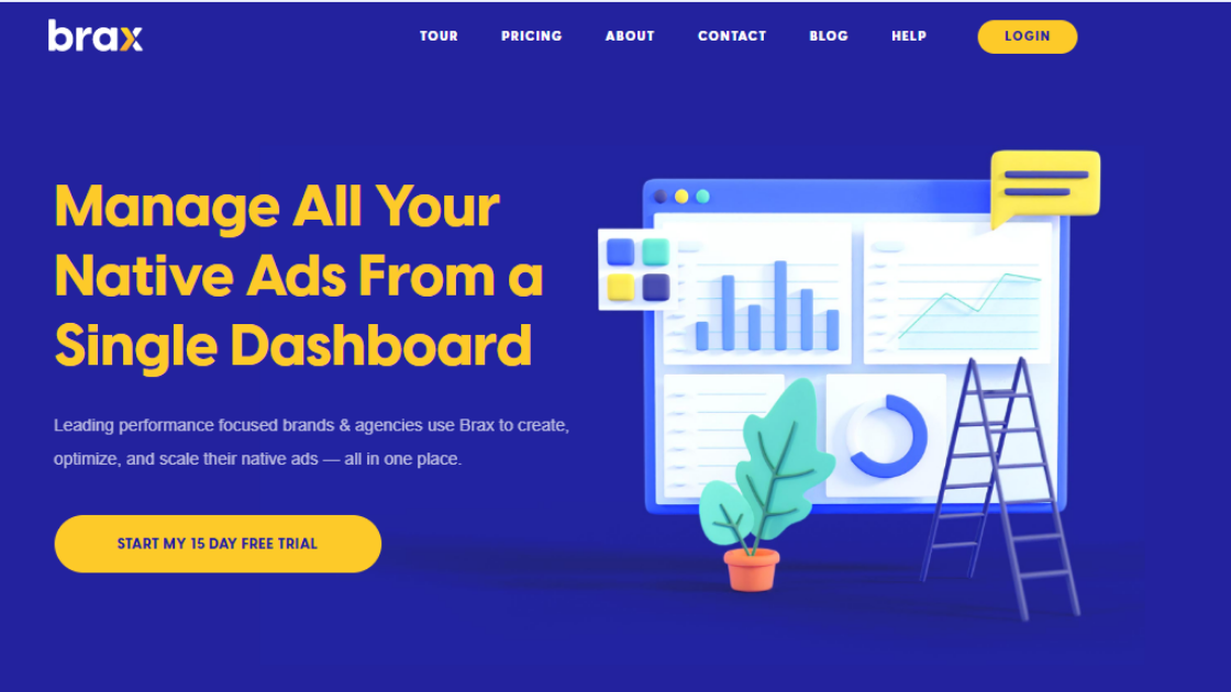
As they always say, you should practice what you preach. Which is why here at Brax, we also use compelling Call to Action on our homepage and other landing pages.
First off, we use complementary colors of the background (blue)and the text (yellow) in order to highlight the content, while still making it easy on the eyes. We then indicate in a short statement the main benefit of using our service.
Not only do we entice our users with a free trial, we also help ease them in by personalizing the CTA with the word “my”. This gives them a sense of ownership over what they are about to receive.
Final Thoughts on Creating Call To Action Buttons
Although marketing has taken new forms over the past years, the end goal remains unchanged, which is to lead consumers to take action. A call to action is one of the essential elements that must be utilized to make this happen.
Therefore, every marketer must incorporate it into their advertising schemes. On a landing page (or any web page at that), a call to action acts as the finishing touch to any kind of website content.
After users have read or scanned through your content, they may either be ready to take action or be inconclusive about moving further. This element, when strategically placed, can push that prospect in the right direction, thereby sealing the conversion.
Calls to action come in different forms, and there is no specific way to guarantee success.
If you would notice from our examples above, the CTA button only becomes highly effective if it works with other elements of the landing page: the copy, the media, even the color of the background! This means your CTA need not be over the top; instead, it should be simple, straightforward, and complements other parts of the page.
A good call to action should be created with the nature of the target audience in mind to enable you to create something that grabs their attention, gains their trust, and finally encourages them to go on with your offer. It may be a subtle or plain-spoken way of telling visitors to take action immediately for the best benefit.
Whichever it may be, your CTA must create a sense of urgency in users to drive them to take action. It can be common and non-specific, but when appropriately combined with other page elements could sell the value of your offer to consumers.
Finally, despite the shift in marketing trends, the rules for creating an effective call to action remains constant. An effective call to action should highlight low restrictions to entry, include a clear directive, and encourage users to take immediate action.
Are you ready to test your Call to Action variations now?
To find out more about how Brax can help you, drop us a line at love@brax.io and we will help guide your Native Advertising journey.

