** Disclaimer: Brax takes ZERO compensation for this, we have no relationships with any of the companies below. **
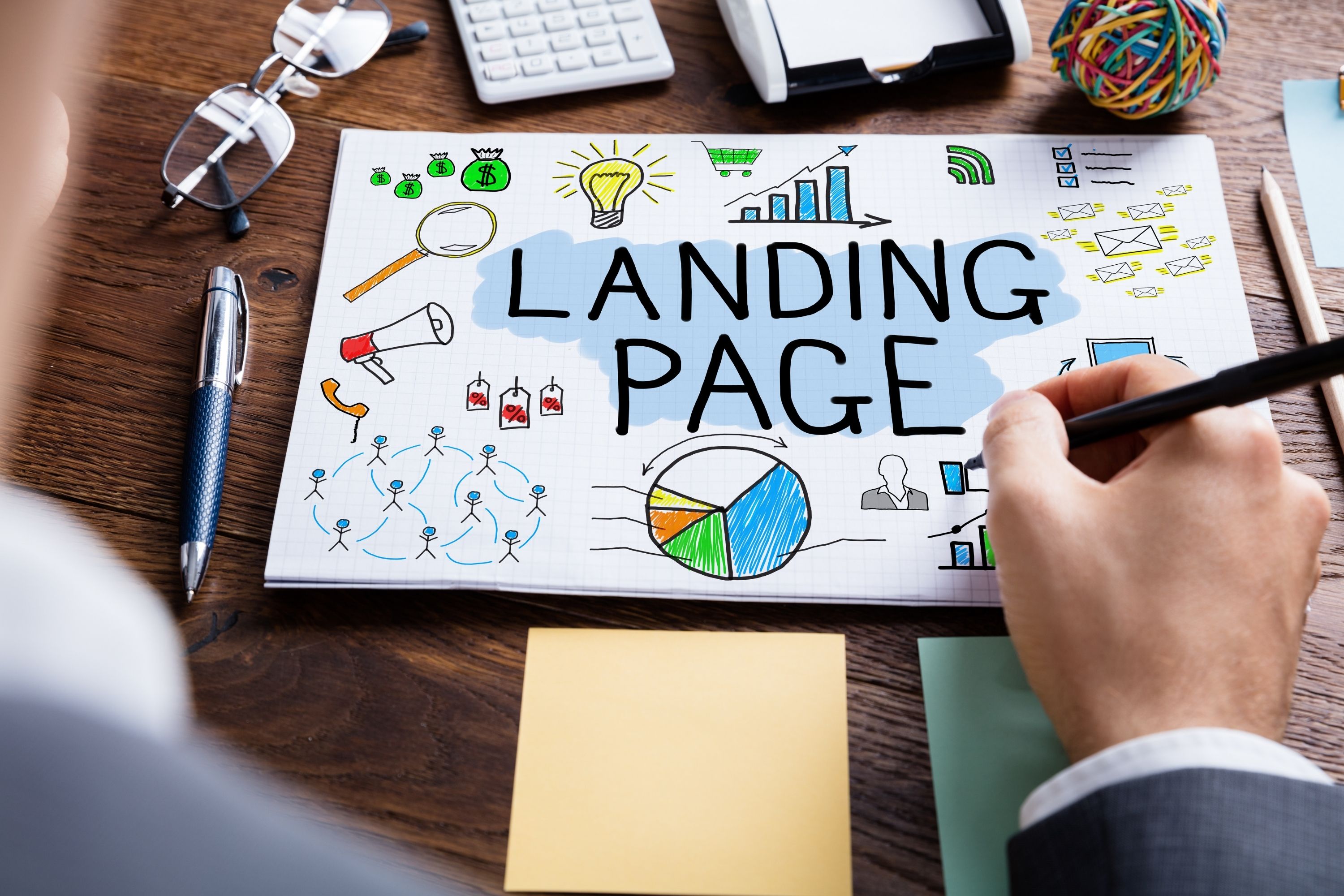
Landing pages are essential if you want to increase the chances of converting your traffic into customers. They can increase your conversion rate tenfold as these turn your audience's curiosity into interest, eventually warming them up enough to either subscribe or purchase.
But not all landers are created equally. While some can turn cold traffic to customers, others barely scratch the surface of its intended purpose.
The question is, which does your landing page fall under?
Contents
Top Converting Landing Pages for Bitcoin Offers
Top Converting Landing Pages for Nutra, Health and Beauty Offers
If you'd like to increase your conversion rate and improve your ROI, then the best technique would be to look into what your competitors and peers are doing. This way, you can incorporate elements that help them succeed and maybe even duplicate their success.
But before you do that, you must master how to create a landing page as well. You can even use landing page builders to make the job easier.
Now, let's dig deeper into the most successful landing pages as determined and collected by Anstrex, a Native Advertising Spy Tool. If you’d like to have cleaned copies of these landing pages for reference, visit Anstrex.
To make it easier for you to find what you need, we'll discuss the top landing pages based on category. This article focuses on Cryptocurrency (Bitcoin) and Nutra offers.
Top Converting Landing Pages for Cryptocurrency Offers
1. Bitcoin Revival: Jackie Chan's New Platform Launch with Alibaba CEO Jack Ma Has Reached $1B

This landing page for Bitcoin Revival works for several reasons. Let’s analyze it per part.
-
Angle and Headline
First, we'll begin with the headline structure and the angle at which the article took. You would notice that the headline, 'Jackie Chan's New Platform Launch with Alibaba CEO Jack Ma Has Reached $1B' is not only informative but also piques the interest of anyone who reads it. A lot of people would be interested in knowing how a new platform managed to make up to a billion dollars.
The mention of famous people in the headline also gives it a certain kind of validity, which utilizes the concept of Celebrity Marketing or the Piggybacking technique. This technique works great for unknown or relatively new brands as the perceived value of the celebrity mentioned is transferred to it. Even readers who are not ordinarily interested in this article's business aspect may become interested once they see the mention of a famous person like Jackie Chan.
If you would notice, the landing page tries to imitate the look of news sites to gain the viewer’s trust.
-
Written Content
Another thing that makes this landing page great is the form and structure of content used.
The long-form content on this page gave the advertisers the chance to include enough background story and detail to convince potential investors to give the platform a try. The background story is also centered around a famous person, and this is another way to keep the readers interested.
Readers will come to learn how Jackie Chan went from being a renowned actor to the owner of an incredibly successful company. In addition to the background story, the content contains information about Bitcoin Revival, including how it works and how it can change the life of anyone who decides to invest.
An interview with Bitcoin Revival's Chief Technology Officer (CTO) was included as a way to provide answers to basic and important questions the readers may have.
-
Images
Another thing worthy of note is the use of the CTO's picture to boost the credibility of the information given in the interview. When readers see a name they could lookup along with a picture, it adds a touch of reality to it.
To top it off, the content included the description of a demonstration with a real person, along with the outcome of the trial. Again, the name and picture of the person who carried out the demonstration were included to aid the story's credibility.
There are also pictures of the person's account balance to prove that Bitcoin Revival really works. The use of real stories, demonstrations, and pictures in this page's content helps to convince readers that the platform is authentic and worth giving a shot.
-
Location
Another important thing to note about this landing page is the use of locations. The article mentioned locations where Bitcoin Revival's services are available. This will quickly gain the attention and trust of readers in those locations, especially if their own city appears.
There are two ways by which an advertiser can display the correct city, region, or country on the landing page, and these are by:
- Creating a landing page specific for an area and targeting that area only during campaign set up; or
- Creating a landing page with dynamic tokens that automatically populates the viewer's city, region, or country based on his ISP.
If you are targeting more than just a couple of cities and you want the landing page to appear customized for the viewer, then doing the second option would be ideal.
-
Call to Action
In addition to the well-structured content, there is a bold subheading with contrasting colors that reads 'UPDATE' to easily draw the attention of readers, including those who may just be skimming through the page.
Under the bold subheading is a concise paragraph that lets the readers know that the platform is now live and that the first 1000 members get access to the platform for free for life. There is a countdown on how many slots are remaining.
This is indeed a very enticing offer, and coupled with the mention of the number of available slots left; it easily taps into readers' fear of losing out, which is what the principles of scarcity and urgency are based on.
Finally, the call to action link at the bottom reads 'Click here to access Bitcoin Revival,' which is basic but very specific and direct.
-
Social Proof
As a form of social proof, you would also see 'live' comments and testimonies from Facebook embedded at the bottom of the page. Social proofing is important if you want to convince your viewers that other people find this offer interesting as well, or that others have tried it.
- Exit Pop
If the user attempts to close the window, an exit pop that reinforces the urgency of the offer shows up. It indicates that the platform makes people rich and that creating an account is completely free.
2. Bitcoin Freedom: Un’ Millionario rivela il suo ultimo investimento - Sistema che può farti guadagnare €40.000 ogni mese lavorando da casa
-
Angle and Headline
This news-type landing page for Bitcoin Freedom begins with an interesting headline. You can quickly tell that this headline taps into the curiosity of its readers. It says that a millionaire reveals a secret that could guarantee financial freedom without stress, while effectively leaving out the details. “How can one do that?” -- that is the question that the advertisers want viewers to have.
For this reason, the reader is persuaded to keep on reading. Underneath the very bold headline is a direct and convincing quote from the millionaire who reveals the secret, followed by a picture that shows a man holding a huge check to validate the statement. This image also gives the impression that the man featured is a real person, and that the page can be from a news website. The tactic employed here is the Curiosity Principle, specifically utilizing the “knowledge gap”.
-
Written Content
When translated to English, the headline reads “A Millionaire Reveals His Latest Investment - A System That Can Make You Earn €40,000 Each Month Working From Home.” This high-converting landing page is in Italian, which indicates that this lander is targeted towards Italians.
The article begins with a short description of the platform, Bitcoin Freedom, including how it works and how much a user could possibly gain. What follows is a brief description of a live experience with the platform and the positive outcome. Again, this story is validated with real pictures to build credibility.
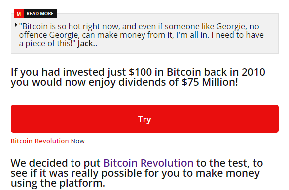
Another element worth mentioning about this landing page's success is the use of the scarcity principle by letting the readers know that there are limited slots for the €250 initial investment, after which the investment amount will soar. This immediately urges users to take the next step before they lose out on an opportunity. It also states that users can easily withdraw their money anytime to eliminate the fear that comes with investing in such platforms.
To build trust, the landing page includes actual screenshots of the platform right at the bottom of the content. Steps on how to sign up, add funds, as well as start investing, are indicated.
-
Call to Action Buttons
You would also notice a bold and contrasting call-to-action button that reads 'Try Bitcoin Freedom Now.' The call-to-action button is easy to notice since it is in hot red, and it appears in two places on the page. The first one can be found in the middle of the convincing story, and the next at the bottom of the article after detailed instructions on how to go about the registration process.
Both CTA buttons’ positions have their roles to play in the success of this landing page. Readers who are already convinced from the headline up to the testimonial story are given a chance to begin the signup process right away without having to search for the call to action button. The second one comes right after enough has been said about the platform for readers who need more convincing.
-
Social Proof
Finally, there is a display of social proof in the form of Facebook testimonies and comments from users, which again enhances the credibility of the product.
3. Bitcoin Revolution: This 15 Year Old Kid Bought his Mum a New House after making Millions of $ From His Bedroom....
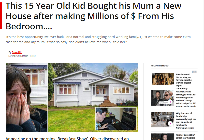
What good is a landing page if it has a poor structure? Bitcoin Revolution used certain elements when creating their landing page to ensure it achieves the best result possible, including curiosity, urgency, advertising angle, and a good call to action.
-
Angle and Headline
The structure of the advertorial for the Bitcoin Revolution is pretty similar to that of Bitcoin Freedom. It starts off with an interesting headline that introduces a surprising story. The surprise element in the title naturally piques the readers' interest to learn more about how this was made possible.
In the form of a direct quote from the main character of the story, the sub-headline supplements the main headline perfectly and encourages visitors to keep reading to learn more. This line adds impact to the headline while still not revealing the mystery.
-
Images and Written Content
Underneath the headline and sub-headline, a very appropriate picture collage was used to capture the whole story and appeal to readers' emotions. The first line of the first paragraph mentions that the person in the story appeared in the “Breakfast Show”. This is an attempt to add authenticity to the story (whether or not the Breakfast Show is real is another matter).
Afterward, you would see a detailed description of how the platform works, followed by a real story of how the Bitcoin Revolution has been used successfully. Descriptive pictures are also implemented in the right places throughout the story to add to its authenticity.
This advertorial also taps into the fear of missing out by letting the readers know that the initial investment amount will go up soon.
Additional information about how the platform works, including the fees involved, indicates transparency. At this stage, if you are a reader, you will appreciate the “review” style towards the end of the article because you will feel that the writer is not working for the company being promoted.
-
Call to Action
The call to action here is very simple: TRY. In just three letters, the intent is delivered quickly and with clarity. Try the offer, which gives the impression that you can easily back out if you change your mind.
To make the CTA button evident, it was made to occupy the whole width of the article page. Plus it uses a color you cannot ignore: red.
The button is strategically placed in two different positions on the page – one in the middle of the article and one at the end of the article. The copy on the call to action button is simple yet very persuasive and appropriate for the topic.
-
Social Proof
As a way to finalize things, there are comments and testimonials at the bottom of the page to encourage readers to take the next step towards conversion.
4. Bitcoin Revival: Singapore Mum Earns SGD 569,287 With Bitcoin

Who says only men can succeed with Bitcoins? Not Bitcoin Revival, as they try to prove that women can also make it big with Bitcoins. Bitcoin Revival certainly knows their target audience, and their landing page is an excellent example of a successful landing page for different reasons.
-
Angle and Headline
First, Bitcoin Revival's landing page's headline targets the female audience and makes fair use of curiosity to grab their audience's attention. The demographic is further narrowed down by focusing on women who have children. We can say that the target persona has been crafted effectively for this ad, which is why this lander is receiving much success.
If you would compare this advertorial to the first three, you would notice that the first three are male-centric. The first one mentions Jackie Chan (an action star), the second one says a millionaire reveals HIS secrets, while the third one states that a young man was able to buy a house for his mom.
"Who says all the Bitcoin Success Has To Go To Men?" is a question type sub-headline that is powerful enough to make women want to read the rest of the content.
-
Images
Another noticeable feature of this advertorial is that it is not just targeted towards women, but Asian women. All images, from the feature image down to reinforcing images within the article, all feature Asian women.
-
Written Content
In order to prove its headline was devoid of Clickbait, Bitcoin revival made sure to soothe the curiosity of its readers with the information they desire. It doesn't stray away from the headline's topic and makes sure to release the promised information bit by bit so the readers won't lose interest.
This landing page also makes use of the poignant question ad angle technique to manipulate the audience's interest to attract them. They kept the focus on their clients (women), and it worked well for them.
To reinforce urgency, the landing page dictates at the bottom of the article that the offer is available for a limited time, with the current date displayed.
-
Quiz as Call to Action
At the end of the story, instead of the usual CTA button, there is a questionnaire that users need to answer to find out if they qualify for the program. This is a short three-question quiz. Not only does this support the legitimacy of the platform, but it also helps the advertiser filter out the traffic.
The questions in the quiz are:
- Are you a male or a female? This information can help the advertiser reroute the audience to specific offers based on the accepted demographic.
- Are you over 18 years old? This helps prequalify audiences that are of legal age.
- Are you a Singaporean resident? This confirms the geolocation of the user.
The answers are then processed and the user is instructed to watch the video on the next page to get started. No additional CTA button appears.
-
Social Proof
There are over forty-two comments on the landing page to prove the credibility of the offers. The comments also prove that they were able to attract customers outside their target audience.
Unlike the previous landing pages, this one does not use Facebook, but a typical comment section.
5. Bitcoin Era: Patrice Motsepe Told How To Give Wealth Back To Struggling South Africans
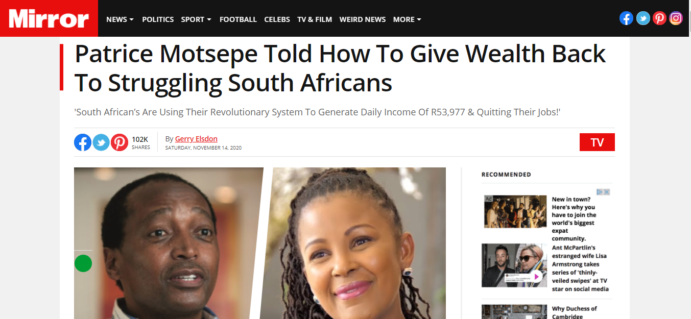
Here is another news-type landing page, mentioning a certain Patrice Matsepe, which is a well-known figure in the country. His mystery wealth system allows people to generate income without leaving their homes, and effectively reduce the rate of poverty in the country, which is a pretty big goal.
Here is the in-depth analysis of this bitcoin-based wealth systems advertorial and why it has high conversions.
-
Angle and Headline
The headline of this advertorial targets South Africans as its audience. The whole aim is to introduce audiences to a specific wealth system, whether they be male or female. There is no reference to the age, gender, career, or other demographic, which means this ad is used for all South African demographic which are of legal age.
-
Written Content and Images
Stating that this system can help struggling South Africans is a means to say that there is enough wealth for all who participate. The clincher is that the platform can only accommodate a limited number of South Africans. Although the long term goal is to provide a means of income for all South Africans, the system is yet to reach that level.
The landing page has a long-form content structure as it gives a detailed story of how the system came to be and the benefits involved. There is an offer for an R2,500 welcome bonus for anyone who joins. The text is in red so that sentence will jump off from the page and the reader will see it immediately.
Right in the middle of the advertorial is a personal experience review-type of a 37-year old woman who is a mother of two kids. This gives the impression that anyone can do this. The images reinforce this story.
There is also a step by step guide on how to register, what to expect on the platform, and how to withdraw earnings.
-
Call to Action
After the information on the benefits and steps have been delivered, interested readers click on the CTA button at the end of the page. The CTA button is likewise in red and fills up the width of the content.
This is not the only link to the offer, though. The article is peppered with links to the offer, from Bitcoin Era proper name to keyword phrases such as “fund your account”, as well as the images.
-
Social Proof
The testimonies of people regarding the wealth-based system for South Africans can be found at the bottom of the advertorial, which looks exactly like the Facebook Comments Plugin. Good comments are shown, which naturally increase the credibility of the system and would lead to more conversions.
Top Converting Landing Pages for Health Offers
For this list, let’s talk about the top five converting pages for weight loss, beauty, and health verticals.
1. Jeune Bisou: Meghan Markle's Wedding Bombshell... Royal Family Furious!
If you don’t know who Megan Markle is, then you must have been hiding under a rock for a few years now!
-
Angle and Headline
This advertorial on the Jeune Bisou product begins in a very subtle and unsuspicious way. The headline that reads 'Meghan Markle's Wedding Bombshell... Royal Family Furious!' centered around a very famous group of people, immediately gives the readers the feeling they are about to learn something exciting about the lives of these people.
It seems that something exciting took place. This now leaves readers wondering what Meghan Markle could have possibly done to get the whole Royal Family furious, which is more than enough push to read the rest of the article.
Adding a popular figure to a headline and story creates excitement around it and easily gets readers' attention and interest. This touches the Fear Of Missing Out concept in advertising.
Also, did you notice the image of People Magazine at the top of the right sidebar? If you search People magazine for the issue that features Meghan Markle, you will find out that it is a legitimate issue. This adds to the trustworthiness of the article, which translates to trust in the product.
-
Written Content
The article goes ahead to first satisfy the curiosity of its readers by narrating what happened in a captivating story; however, the story blends in smoothly and unnoticeably with the product advert. The story behind the product has already gained the brand a certain level of credibility.
A few mentions of popular figures who have tried the product out and some testimonials from them help build the trust needed. The readers will believe that the product really works and will be willing to try it out if it's something they could use.
-
Images
Aside from pictures of Meghan Markle and other celebrities who are said to have used the product, there are also before and after images on the sidebar. This helps boost the perceived effectiveness of the product.
-
Free Trial Call to Action
As a way to encourage the readers to take that next step, there is also a limited free trial offer. The trial is available for a limited time (the same date as the day the page is opened is displayed), and a limited number of samples are shown as available. This increases the urgency.

There are two CTAs, one is the free trial link, and the other one is the green button. The call to action button moves a bit, which is a good way to attract the viewer’s attention. Read our guide to creating an effective Call to Action to master how to create one for yourself.
-
Social proof
Again, a comment section that looks like Facebook is added at the bottom. The very first comment is noticeable as it mentions that the shipping only costs less than five bucks.

2. Cali Naturals CBD: SPECIAL REPORT: Woman Paralyzed By Pain Discovers Breakthrough Relief Called 'Nature's Miracle Medicine'

-
Angle and Headline
It is very obvious with the page style and with the words “Special Report” that this landing page is trying to mimic the look and feel of news sites. This also helps the headline stand out by letting the readers know that the information contained in the article is out of the ordinary.
The headline for this page on Cali Naturals CBD takes the angle of offering a solution to a health problem with a breakthrough. The headline is immediately followed by a bit more detailed sub-headline that indicates generic health issues such as chronic pain, inflammation, and muscle spasm but still doesn't give any information about the product away.
Notice the logos at the top of the image? It says, “As seen on” CNNHealth, ABCNews, and Men’s Health -- all popular and reputable news and lifestyle companies. This gives the article an added boost.
-
Written Content and Images
As is typical of advertorial landing pages, the content is long-form. When readers go on to read the article, they first learn about the authenticity of the product through the information provided on a large number of products sold and the significant amount of money external investors paid to buy into the company. It proves that the company and product are wanted, and for a product to be wanted, then it has to work.
Furthermore, it indicates that the product has been featured in a popular show -- Shark Tank. This gives the product a sense of legitimacy. The article also includes a sufficient amount of information on what the product is made from and assures users that the product is safe to use. The latter is essential when promoting health-related products.
There is also a thorough description of how it was created, backed up with a touching story that easily plays on the readers' emotions. This technique is called Emotional Marketing.
Aside from this, the advertiser bombarded the article with clinical proof of CBD oil’s benefits and functions, as well as additional stories of people's experience with the product. There are also several mentions and quotes from famous people to increase trust (again, Celebrity Marketing).
Since CBD Oil is made from marijuana, which is not legal to use everywhere, the advertorial quickly dispels any legal issue that audiences might think of by indicating that CBD is perfectly legal to use. This information is highlighted by placing the text in green background, making it stand out from the rest of the content.

Another interesting part of this article is how it mentioned that big pharma companies are trying to stop the distribution of this product. Not only can this make users more curious about the product, but they will also try to support it just to stick it to big pharma companies. This quickly places the brand ahead and clears the competition in time.

- Free Trial and Call to Action
As a final way to sweeten the deal, a free product trial offer is mentioned. There is a clincher though, and that is that there is only a limited number of free trials available. To top it all off, this offer is available within a fifteen-minute window. The countdown at the bottom of the page increases the sense of urgency.
Their CTA button is in bright orange, with the words “Get a Free Trial Today”. This is displayed twice throughout the page. As usual, the CTA is followed by social proof.
3. True White: SPECIAL REPORT: Dr. Jamie Richardson Discovers $7.95 Teeth Whitening Kit Gets Largest Deal In Shark Tank History

You don’t have to double-back to the previous landing page discussed as we will answer your question for you, this one does have a striking resemblance to the CBD Oil advertorial.
It is likely that this lander was created by the same advertiser who created the CBD oil one. And since they have seen success with this style (and with the very same feature image), they decided to reuse it. Lo and behold, this one’s a highly converting LP as well! Here is an analysis of his landing page and why it achieved such success.
-
Angle and Headline
Not everyone has shiny white teeth. Some people suffer abuse because of their "gross" looking teeth or feel uncomfortable because of their teeth' color. This is what the advertisers leveraged on. Again, this ad follows a news report theme to establish legitimacy, topping it off with logos from Men’s Health, CNN Health, and ABC News.
Within the headline alone is a bunch of intriguing information. The product is presented as a creation of a retired dentist. After all, who will you trust to give you a better smile? Combine that with a cheap price ($7.95), a mysterious product (discovers), and a popular show (Shark Tank) and you’re slam dunk to getting your audience to read more.
-
Written Content and Images
The aim is to attract people who feel the need to improve their teeth color. It's compelling enough to attract the desired audience as it offers them a solution for a problem they have (brown or stained teeth). The mystery of a miraculous solution will entice audiences to read more.
This advertorial has a story form structure, and it gives the background of the product and supports its claim with pictures. The information is provided in a sequence to keep the interest of the readers as well as convince them to make a purchase. It also gives a detailed description of what you will get when you make an order.
The most compelling part of the advertorial is the before and after comparison.

-
Discounted Rate and Call to Action
This offer is a whopping 75% discount but only available for some time that won't last for long. The discount is mentioned towards the end, with a justification that this promo is in celebration of their one-millionth kit sold. This builds a customer’s trust, “if one million kits have been sold, then this product must be effective.”
Another element contributing to the landing page's success is by using scarcity when mentioning that only 2 kits are available for the discounted rate.
Creating a sense of urgency in your readers gives you a better chance of increasing your conversation rates. Hence, the advertiser makes a limited time offer at the end of the advertorial by indicating that the promo ends by midnight. There is also a 15-minute countdown that sticks to the bottom of the window so that users will see it whether they scroll up or down.
The principle of urgency is used well in this advertorial.
-
Call to Action and Testimonials
At the end of the limited time offer, there is a well-designed CTA button that reads “Claim your risk-free trial package now” for the interested readers who want to make a purchase. There are also testimonies provided in-between the story as well as comments at the bottom of the page to prove its authenticity.
The CTA at the bottom is not the only way to go to the offer page, though, since the entire page is peppered with links using the product name and the term “secret whitening formula”.
4. Keto Pure Diet: The Amazing New Weight Loss Product That Burns Fat While You Sleep - That Every Shark Invested In
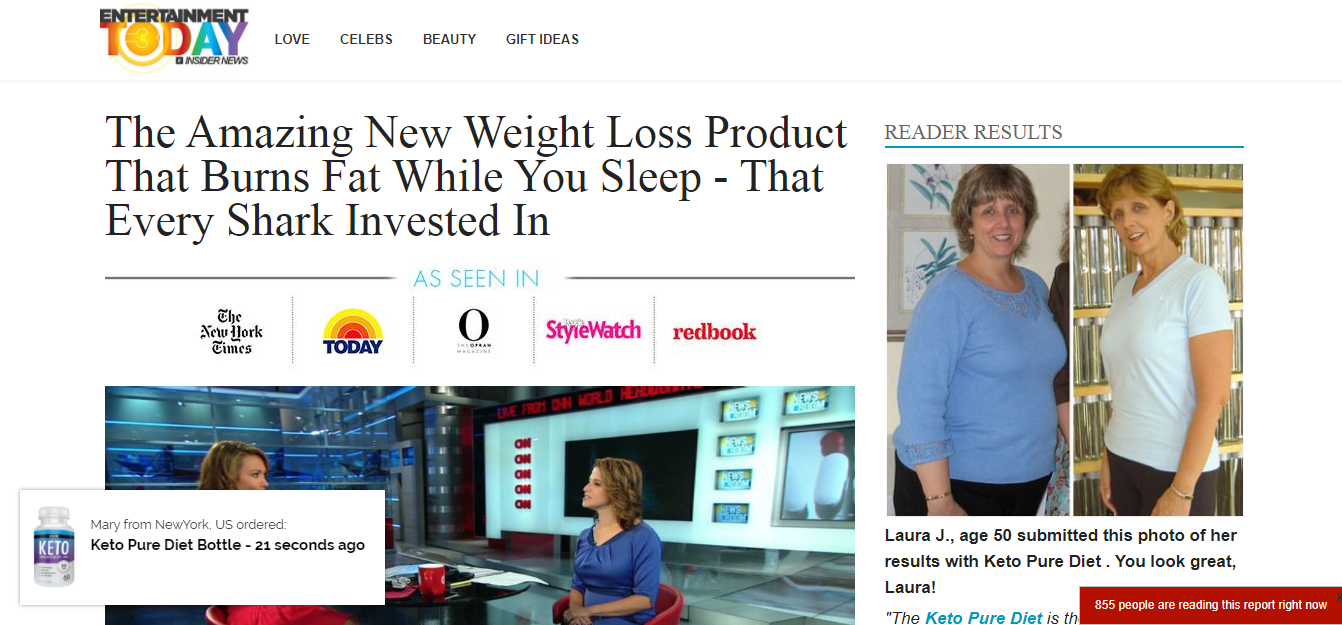
This landing page follows the news and lifestyle format. Instead of looking like a news report, this one mainly utilizes a health and lifestyle theme of popular online magazines today. Here's an analysis of the advertorial and some of the elements used that contributed to its success.
-
Angle and Headline
The advertising angle used in this headline states the problem of the target audience (fat) and offers a solution (burns while you sleep). This headline targets body enthusiasts or plus-sized populations who want to lose weight without doing much work or exercise.
The headline has just the right amount of information to make anyone click and read. Like the rest of the advertorials on this list, it has a long-form content structure that gives very detailed information without revealing too much at the beginning or straying away from the promised information. There is a flow in the story from the beginning towards the advertisements and promotions in the end.
If you would look at the featured image, you would notice that it includes the logos of famous news and entertainment brands, such as The New York Times, Today, The Oprah Network, StyleWatch, and RedBook.
-
Written Content and Images
According to the article, Jessie Hiltbrand and Deborah Maddix are geniuses behind the weight loss pill that works. There two cellular biology graduates studied Ketosis, which is the natural state of the body, and developed the Keto pure diet bottle. They were able to get thousands of people to buy their products in five minutes, and that's a lot of purchases. Even celebrities love Keto Pure Diet.
Aside from this information, they added before and after pictures of people who used the product, including celebrities. There are various testimonies and that proves the product works. Keep in mind that credibility is essential if you want to get more conversions. If a person doesn't trust your brand, that person will not make a purchase.
-
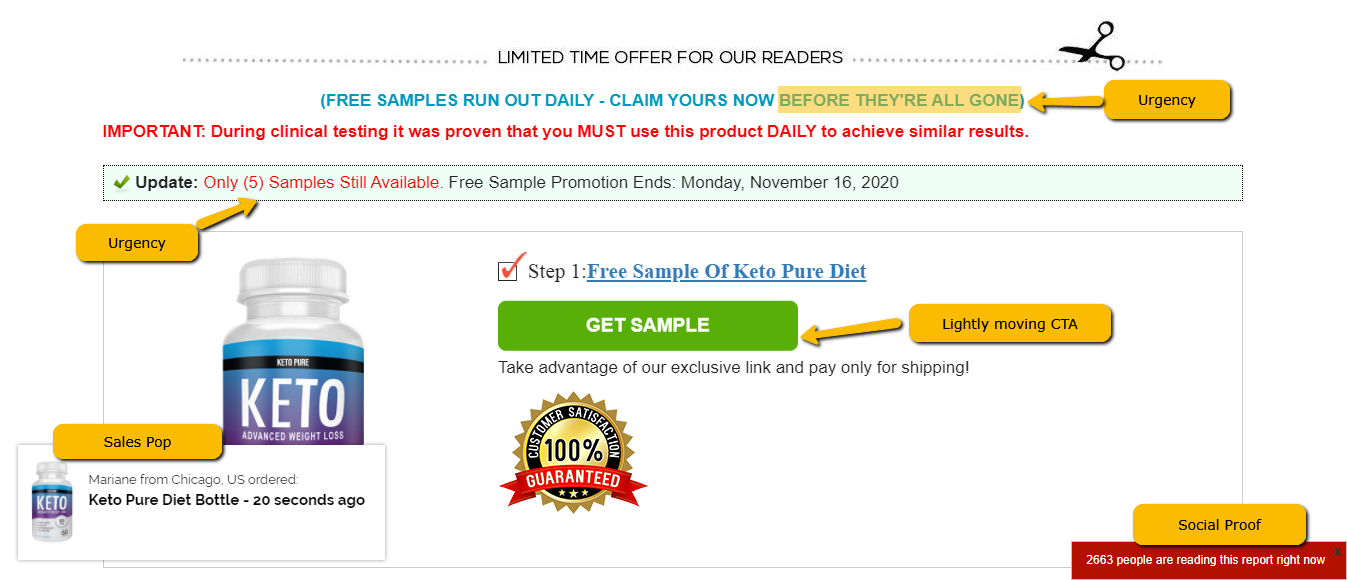
Limited Offer and Call to Action
The limited-time offer creates a sense of urgency in the readers who want to make a purchase. Making worthwhile limited time offers can you get you some conversions or increase your conversion rates. As expected, a distinguished CTA button at the end of the advertorial tells the readers to take advantage of the exclusive link for a free sample of the product.
-
Social Proofing
There are comments from their customers at the bottom of the page as is usual with these top landers. But the advertiser took it a step further.
Aside from the content on the main page, you may notice two other elements that contribute to the success of the lander, and these are displayed in the left and right bottom corners. The one on the right bottom corner displays the number of people currently viewing the page at the same time as the current user.
The one on the left bottom corner is a notification pop-up that displays people who have purchased the product, complete with first names and city, a few seconds ago. The pop-up appears and disappears every few seconds. The movement catches the attention of the viewer, without disrupting the user experience.
These two are used for conversion boosting and excellent social proofing.
5. RevivaBrain: Trump Battles the FDA Over Carson’s Breakthrough Discovery! Says “This WILL NOT Be Banned, The American People Have a Right To Have Access To This”

Similar to other LPs, this one follows the news theme, with a bit of variation.
-
Angle and Headline
The headline for this advertorial makes use of famous figures to increase its chances of attracting an audience. The famous figures in the headline are Ben Carson and U.S. President Trump. Using prominent individuals to promote your brand is a good advertising and marketing strategy.
The landing page is a news scoop of Business Insider. One attempt to look like a legitimate news page is the presence of ads at the header and another at the sidebar. The ad that shows IQ Plus is the product being promoted on the page.
-
Written Content and Images
This effective advertorial tells the story of the product before actually advertising it. The information is well-detailed and intriguing enough to hold the interests of the readers. The use of celebrities, popular figures, and images makes this advertorial quite lengthy but doesn't reduce its quality.
According to the article, RevivaBrain is a revolutionary brain booster that even the famous neuroscientist, Ben Carson, recommends this product as his brain is "sharper than ever" since he started using it. Revivabrain has surprised the world with its innovative and mind-blowing achievement.
As the advertorial progresses, you would notice references from famous movies that featured pills that can help improve brain function such as Lucy and Limitless.
Revivabrain is said to be recommended by a lot of prominent figures and celebrities, namely Denzel Washington and even Stephen Hawking. They give testimonies of the product and how it is the "real deal." It helps improve brand credibility and naturally leads to getting more sales and conversions.

-
Limited Offer and Call to Action
There is a limited-time promotion that offers a trial of Revivabrain as well as the benefits you gain from purchasing the product. They paired this with a limited number of items available. The CTA button which says “Send My Risk-Free Trial” can be found at the end of the advertorial for interested readers who want to make a purchase. There is a 100% Customer Satisfaction Guarantee ribbon that helps add legitimacy to the product, and finally, a Facebook comments section for social proof.
Final Thoughts
We’ve found that most successful landers incorporate the AIDA Principle. If you couldn’t find your niche here and would like to follow the same style, read our in-depth guide on the AIDA Principle to help you master this concept.
There are two things common among these great converting landing pages, and these are:
- the presence of social proof at the end. Whether it be with the use of the Facebook Comments plugin or the typical blog comments sections, it is a display of ordinary people’s results.
- the news format. This gives the impression that the product is news-worthy, and is therefore trustworthy.
In conclusion, these work because they made use of important components in their landing pages, namely, captivating headlines, well-structured content including an interesting story, detailed information about the product and testimonials, and social proof in the form of comments.
Although these landing pages make use of different advertising angles, you can tell that they are all quite effective for their niches. Stay tuned for our analysis of successful landing pages that focus on other verticals.

