We’ve already discussed Anstrex’s top landing pages on Bitcoin and Health verticals and AdPlexity’s top landing pages on eCommerce, Insurance, and Refinance. This time, we’ll talk about top-performing Dating and Casino landing pages coming from both Anstrex and AdPlexity.

Table of Contents
Dating Vertical
Mainstream Dating
Adult Dating
Casino Vertical
Before we dive into it, let it be known that we do not have any kind of relationship with any of the spy tools, nor with the products displayed in the landing pages discussed below.
AdPlexity randomly releases the top-performing landers for $1, while Anstrex has generously uploaded theirs in a mega thread in affLift. If you are not part of that affiliate forum, you can sign up for Anstrex’s weekly releases here.
Best Performing Landers and Pre-landers for the Dating Vertical
Now, Dating can be a tricky vertical to promote when using native advertising, mainly because there are lots of prohibitions when it comes to this category.
First off, there are two main subcategories for Dating, and that is Mainstream Dating and Adult Dating. The first one is of course accepted almost everywhere, provided that your ad text, images, and landers are wholesome. Some even have limits on suggestive poses, what body parts should not be shown (as conservative as a hint of cleavage may not be allowed), and so on. The latter subcategory is not always accepted.
While some native advertising traffic providers do allow adult offers, they can still be strict on the ad creatives and landing pages. The only sources that may allow exposures and full nudity are those that actually specialize in adult traffic.
In essence, before promoting adult dating offers, make sure you not just double-check but also triple-check what’s allowed in the platform you are using. You wouldn’t want to get kicked out of a network because you tried to run a prohibited offer, right?
We will be discussing pre-landers that perform well, even those that fall under the adult dating category. However, we will also be discreet by hiding images that may not seem appropriate.
Let’s start!
Mainstream Dating
We’ve found that most of the top-performing landing pages for mainstream dating are in the European continent. For this reason, many of the landing pages below are in foreign languages, specifically the local languages of the target market.
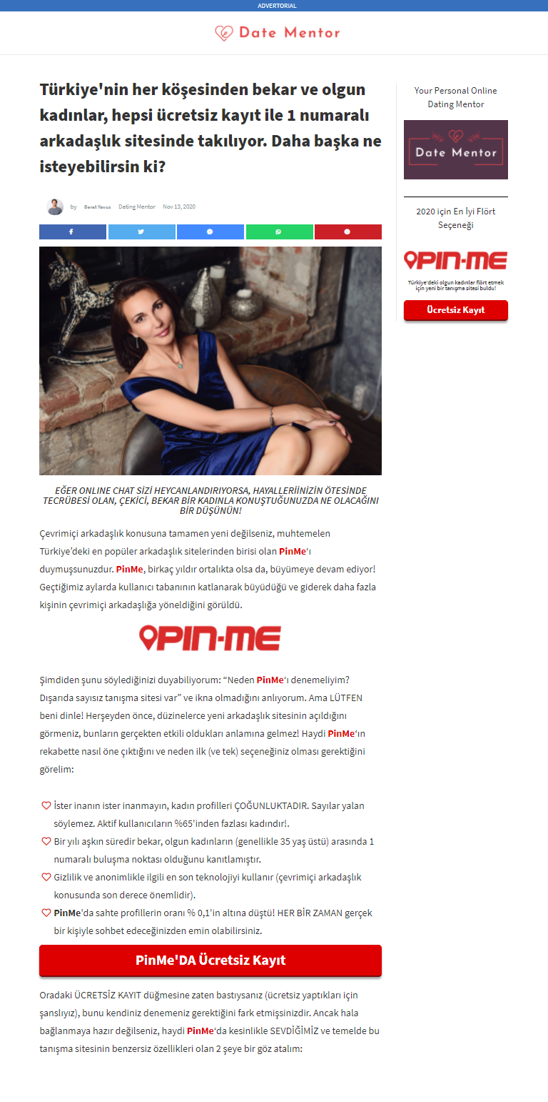
1. Advertorial Landing Page
This landing page is in Turkish, which gives us a hint on where it is being promoted. The dating offer is called Pin Me, and the advertorial proceeds to state the benefits of signing up for a free account on the dating site.
Advertorials work great for native ads traffic because the user would feel like he has just been redirected to another article and not an ad.
-
Target Market
The language itself is one way to narrow down to a specific demographic (eg. those who live in Turkey). Within the text, the “author” states that Pin Me is used by mature, single women who are 35 years old and above. This is likely the same age range as the target audience.
It is also mentioned that the majority of women registered on the site are from Istanbul, but there are also those from other parts of Turkey. This is effective in making the viewer feel that he might find someone in his locality.
-
Design Highlights
The page was made to look like a post on a website called Date Mentor. It was supposedly written by a man (who is actually the “Date Mentor”) and is completed by social media sharing buttons for that blog post feel.
To highlight the dating website, the word “PinMe” is always in bold characters, sporting a red color, and is also a clickable link.
There are only two photos on the page, both of rather mature women, and the post is actually very plain. This can help minimize distractions, making the red links and button gain more attention.
-
Call to Action
The CTA is in bright red color, much like all other PinMe links. The button emphasized that registration is free.
2. Questionnaire Landing Page
Let’s analyze three landing pages here that use the same tactic but look different from each other.
Dutch Mature Women

Bosnian Mainstream Dating
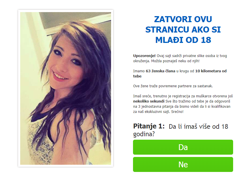
English Landing Page

A questionnaire pre-lander can accomplish two things:
1. The interaction helps warm up the audience to the offer.
The more questions you have, the more invested the audience will be. Conversely, if you have too many questions, it can discourage the viewer.
The ideal number of questions is three. Not too few, not too much; just perfect. Each question must require only a simple answer, and you should provide at least two options for the user to choose from.
This is what both the Bosnian and English landing pages aim to achieve. Let’s take a look at the questions they have:
Bosnian Pre-lander
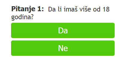
Question 1: Are you over 18? (Yes/No)
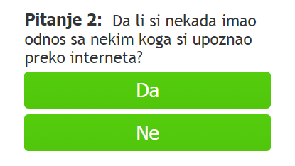
Question 2: Have you ever had a relationship with someone you met online? (Yes/No)
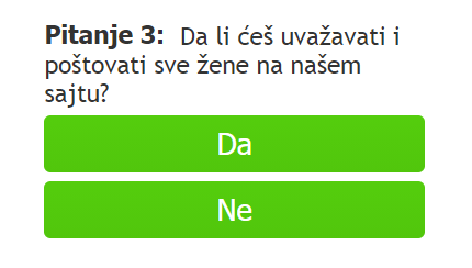
Question 3: Will you respect all women on our site? (Yes/No)
English Pre-lander


If you would notice, apart from the first question that helps you filter out viewers that are not of legal age, the other two questions make no sense and won’t give you information on your audience. These two only exist to warm your audience up.
Basically, whatever their answer to the last two questions won’t matter. Even if the user answers “No” to the question of will the user respects the women on the site, he will still be qualified!
2. The quiz format can help you filter out your audience.
Let’s say your offer accepts only males aged 40 and above, but you are receiving viewers whose age you cannot determine. Questionnaires can help filter out traffic that you don’t want in order to increase your chances of conversion. This can also help improve your traffic quality in the eyes of the affiliate network or advertisers you work with.
If you’re a smart marketer, you can even set up multiple flows to direct users to different offers that they can qualify for based on their answers to your questions. This means you can earn more!
The Dutch landing page used a questionnaire format for this purpose. They used the following questions:
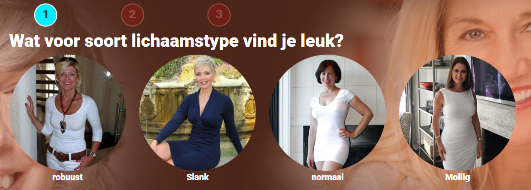
What kind of body type do you like?
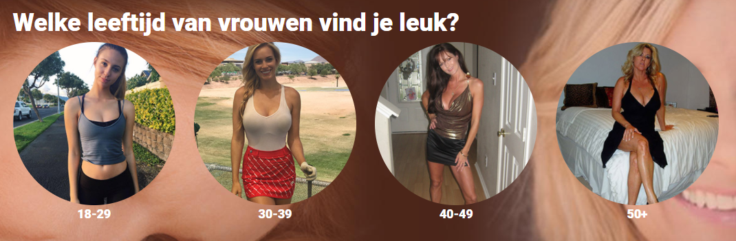
What age of women do you like?
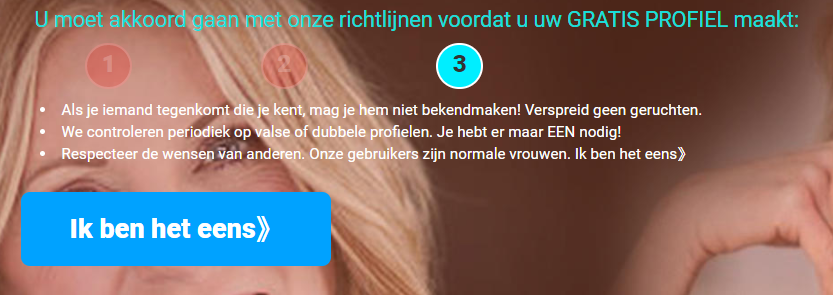
You must agree to our guidelines before creating your FREE PROFILE:
- If you run into someone you know, don't reveal them! Don't spread rumors.
- We periodically check for false or duplicate profiles. You only need ONE!
- Respect the wishes of others. Our users are normal women.
(button) I agree >>
Notice that there are only two questions, and the third one basically just asks the users to agree to the rules of the platform. The second one is the most important question; that is the question that helps your AI choose which offer to display to the user.
So for your offer that accepts males aged 40 and above, you can assume that those who chose women aged 40-49 and 50+ qualify.
-
Other Elements
Aside from the quiz format, there are a few other design aspects of the three pre-landers that made them attractive to the right audience.
Some elements of the Dutch landing page made it clear that the target market is an older demographic. For instance, the words “VOLWASSEN VROUWEN” (translation: Mature Women or Adult Women) on the first page are highlighted by using a different font color.
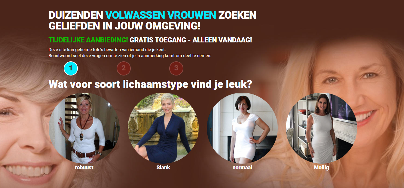
The images used in the background, as well as those of the question choices, are of mature women. These are not-so-subtle hints that the advertiser is looking for senior adult men.
As for the English and Bosnian landing page, it is evident that the target is a younger demographic, based on the slideshow images of younger women who look to be in their early twenties.
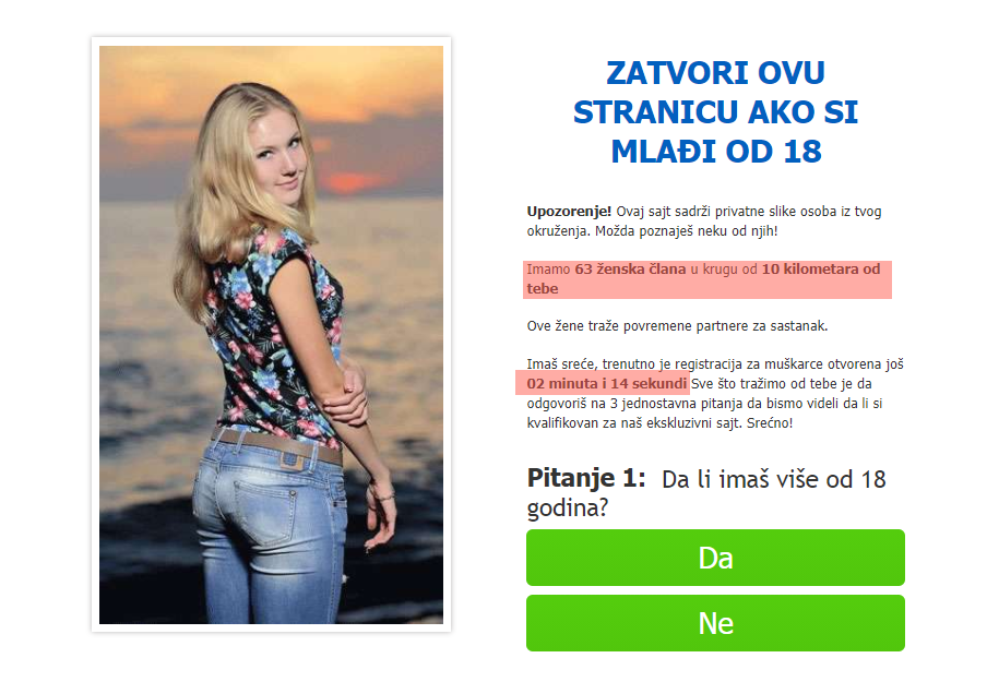
As we’ve highlighted in red in the image above, the text states that there are “63 female members within 10 kilometers” of the user. This gives the user an idea that he connect someone near him.
Furthermore, there is a working countdown timer set to 2 minutes and 30 seconds. This increases the sense of urgency to complete the quiz or the viewer will lose out on this “exclusive” opportunity.
-
Call to Action
After completing the quiz, the page shows a list of rules when joining the platform. It basically states that if you ever see someone you know, you should keep it to yourself, and you should respect the wishes of female members as they are real women. This part reinforces the belief that you are joining a platform where you can actually meet real people and you won’t be chatting with bots.
For all three landing pages, the CTA button only appears after the quiz has been finished. Not only does this reduce distractions, but also gives the user a unidirectional flow. No confusion; no other way to go.
3. Website Landing Page
Now don’t get confused -- this is not really the offer’s website. It is a pre-lander made to look like an actual website. This type of landing page works really well for audiences that have seen more than enough of their share of ads and would immediately recognize a promotional landing page.
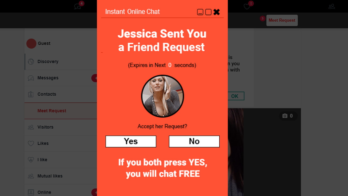
As you can see, there is a persistent brightly colored pop-up that says someone has sent you a friend request. The color captures your attention, drawing your eyes to the message.
Behind it is the dashboard of what looks like a typical social media platform. Somehow, this makes the “friend request” look legitimate.
The thing about this landing page is that while the CTA is on the pop-up banner, the user can click on any part of the page and he will be redirected to the offer page.
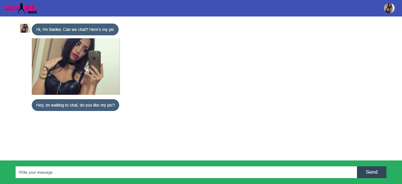
4. Chat Landing Page
This type of pre-lander is all the rave right now. As we previously mentioned, engagement increases the user’s interest. This interactive landing page makes the user believe that there is a real person chatting with him because of the series of prompts and responses.
This type of pre-lander works for mainstream, casual, and adult dating.
-
Page Elements
This is the desktop version, but it is a responsive landing page that also fits a mobile phone.
The page is pretty simple -- it was made to look like your usual messaging app. The pretty girl makes the first move and sends not just a message but a photo of herself.
Now that photo is very important. It should be captivating but must not look like it has been taken by a professional photographer. As you can see, the girl featured took a “selfie” of herself from a mirror reflection. Does it convince the user that there is a real girl chatting up with him? You bet it does.
Analyzing the content of the “girl’s” messages, you would notice that these are written in an informal manner. It is even sprinkled with emojis here and there, reinforcing the idea that this is an actual person.
-
Interactive
What makes this lander believable is that you can actually type and attempt to “chat” with the lady.
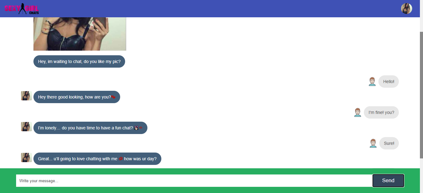
As you can see, there is a bot that responds to the user’s chats. Responses are timely and appropriate. Some variations of chat landers allow a limited number of replies, after which a notification shows up saying the user must sign up in order to continue chatting.
This doesn’t do that, but what made it perform well is that every time the user clicks on the “Send” button, the offer page opens up on top of the current window. We can assume that the offer page prompts the user to sign up to chat more. The user can always go back to this tab and he will see that the girl still replies to his messages.
Since our last top-performing pre-lander can transcend to adult dating offers, let us move on to this subcategory.
Adult Dating
This dating category usually shows women in various states of undress and posing suggestively. But it’s not just the images that pull users to sign up for the offer -- it’s also the enticing techniques that advertisers use.
Some of the popular lander types for Mainstream also work for Adults. Let’s have a look at some of them (in a discreet manner).
1. Quiz Landing Page
There is no question about the target audience of this landing page, and that is Italian men. The flag of Italy is shown on the lower left, plus the entire page is written in Italian.
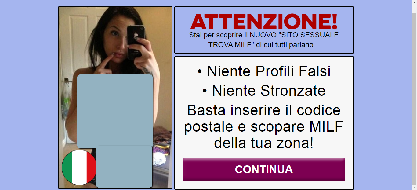
The text basically shows a warning that the user is about to discover a new adult dating site that has no fake profiles and no BS.
Clicking on the “Continua” (translation: Continue) button or just any part of the page leads you to the questionnaire. Unlike the Questionnaire LPs we have discussed in Mainstream Dating, this lander does not limit itself to three questions.
While it initially shows that there are only 4 questions, there’s a total of 8 questions in this questionnaire. This does not include the initial page and the final page that contains the Call to Action.
Curiously, once the quiz starts, there are no more images on the purple-colored page; only the question and the promise of seeing nude photos of women in the area.

There are four initial questions that are pretty intriguing. This could be the reason why audiences are captivated by it. Here are the questions followed by our analysis of each:
- Many of these milfs are desperate single moms and cheating wives who want to have some fun. This could be a neighbor of yours or someone you know. Do you agree to keep the identity of these milfs a secret? (Yes/No)
This question will surely trigger your curiosity. Will I find someone whom I know? Is it possible for my neighbor to be on this platform? This triggers your curiosity.
- These milfs have asked us not to let men who are looking for a "relationship" pass. They just want quick sex. No appointments. Do you accept this request? (Yes/No)
Who can say no to a “just hook up” request?
- Do you agree to use a condom when having sex with a woman you met on our site? (Yes/No)
While this is an unusual question on a landing page, it seems to be a serious question that gives the impression that the adult dating platform will follow through with its promise of finding a casual date.
- Every day you check your account you will probably have multiple requests for sex from the milfs on our site, are you comfortable with that fact? (Yes/No)
This question builds up the user’s excitement. There is a possibility of getting not just one, but several hook-up requests in a day!
After these first four questions are a series of follow-up questions that can be used by the advertiser to capture data about the user. This data can be evaluated to show the user the offer that he will most likely subscribe to based on his preferences.
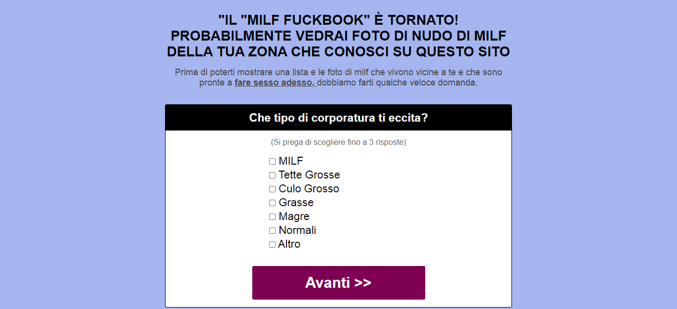
These questions are:
- What kind of build excites you?
- Which age group do you prefer?
- What kind of relationship are you looking for?
- Which distance do you prefer?
Each question comes with at least five choices, and the user can pick up to three. Once the last question is answered, the CTA button shows up, with accompanying text that reminds the user to keep the women’s identities a secret once he signs up.
At first look, you wouldn’t think this simple-looking landing page would be able to convert. Plus, it is very long!
Based on our assessment, this landing page follows the AIDA principle to the core.
- Attention: It uses a half-naked woman and large warning text.
- Interest: It asks the user if he can be discreet in case he sees someone he knows.
- Desire: It asks the user about his preferences when it comes to a female companion.
- Action: It thanks the user for his responses and asks him to sign up.
A user that reaches the last page will likely sign up, even if the subscription is a paid one. Why? Because he has already invested two things: his time and his feelings. He has already anticipated this. He will not quit now.
Hats off to the creator of this landing page as it is very well thought out.
2. Click2Call Landing Page
This is not a typical landing page. First, it only works for mobile. Second, it only works for Click2Call, Click to Dial, or Pay per call offers.
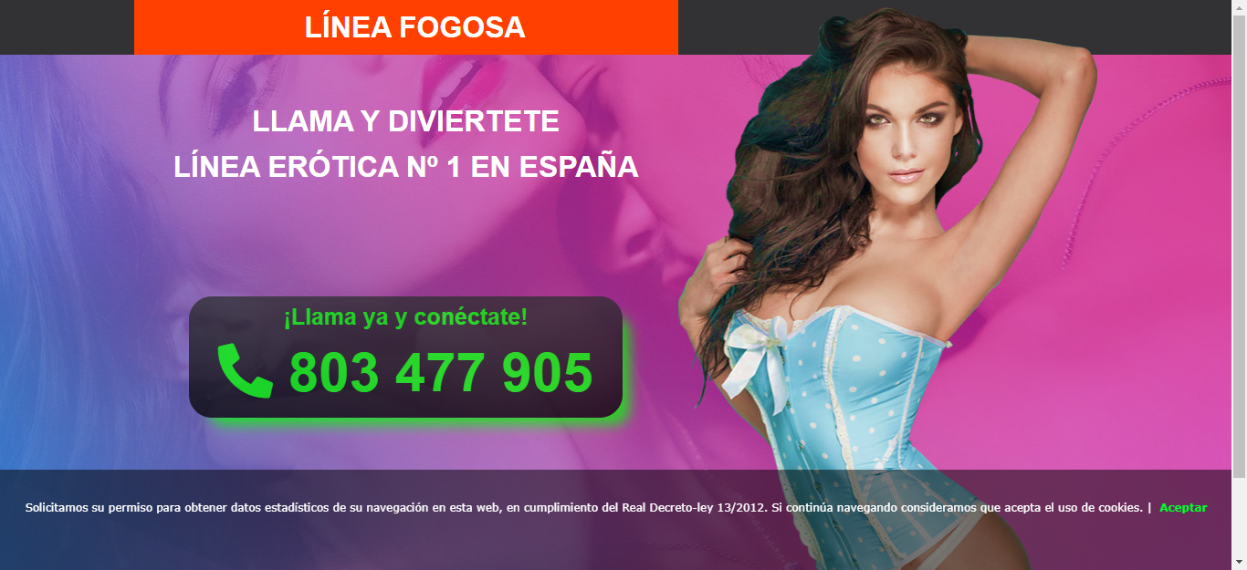
It is a very simple lander targeted towards Spanish-speaking audiences. The content (text and imagery) implies that the user will have erotic conversations over the phone.
Most click2call offers do not allow nude images on the landing page, which is probably why the photo of the woman in the foreground and the couple in the background are a bit tame, considering it is an adult offer.
The CTA button includes the text ¡Llama ya y conéctate! (translation: Call now and connect!) and the phone number. Clicking the button will prompt the user’s phone to dial the number, which leads to a conversion for the advertiser.
With the right targeting, this can certainly perform well as there is no additional offer page and there is no need for the user to input anything.
Best Performing Landers and Pre-landers for the Casino Vertical
With people stuck at home and bored out of their wits because of the pandemic, many have resorted to online forms of entertainment. While others turn to streaming sites, some look for more exciting stuff, like gambling in online casinos.
Online casino games are addictive forms of entertainment that can cost a lot. But if you’re lucky and persistent, it can also be very rewarding (not just for your feelings, but for your pocket, too!)
The goal of casino offers is to entice the user with freebies to get them to sign-up and make them so addicted to the games that they will open up their wallets and deposit a certain amount in order to keep playing. The promise of a big jackpot can sway a person to keep playing.
We’ve seen the upward trend in the Casino vertical the past year. However, just like the Dating vertical, native advertising traffic sources can be a bit strict because Casino or online gambling is not legal everywhere. So practice due diligence when promoting such offers.
Believe it or not, it takes more than offering free spins and the promise of a huge jackpot to get a player to sign up. Let’s take a look at how some advertisers do it.
1. Page Pop-Up Lander
This is actually one of the most common casino landing pages today. When the page loads, a pop-up notification appears, hiding a portion of the page to catch the user’s attention.

The text congratulates the user for being chosen to participate for free. To make the content personalized to the user, the text displays the user’s ISP (Frontier networks customer).
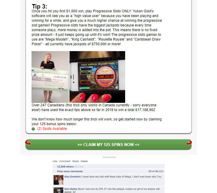
Once the Ok button is clicked, the user will see the complete landing page, which shows how many free spins the user gets, how much money has been paid out for the month, and a countdown timer that starts at a little over five minutes. The timer is useful in adding urgency.
The image of the slot machine is actually a GIF, which is probably one of the reasons why the page loads really fast (it doesn’t have load-intensive images). Page speed is a very important factor when it comes to landing pages, after all.

The first two spins are always a bust, but the third spin is the winner. The winnings are actually 125 free spins, which will encourage the user to continue playing, thinking that he might be on a “winning” streak.
The page quickly loads to a quiz format that contains three pre-qualifying questions:
- Are you over 18?
- Have you won anything online before?
- Do you have a valid email address?
After answering these questions, a loading bar is shown giving the impression that the page is actually checking whether the user qualifies, then opens up the CTA page. The “waiting” time helps build up anticipation.
The final page displays three tips that can help the user increase his chances of winning. At the bottom of the content lies the dark green CTA button telling the user to claim his free spins.
To finish it off, the advertiser added what looks to be a Facebook comments section for Social Proofing.
What initially looks like a very unassuming page turns out to be very user-engaging. All in all, it took us 10 easy clicks to end up on the final page.
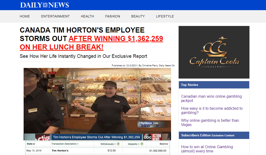
2. Advertorial Landing Page
If you’re reading a news article, then you click on a recommended post, and land on a page that looks like a typical news article, you would be encouraged to continue reading. What more if it sounds like really exciting news?
-
Landing Page Copy
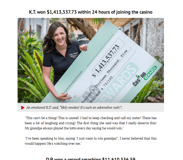
This advertorial for Yukon Gold Casino tells the story of a middle-aged woman who works at a popular food chain in Canada. Apparently, she storms out of her job after winning $1.3 million dollars. Sounds exciting!
The text continues to state that the woman is married, has two children, and is juggling multiple jobs. This triggers the reader’s Informational Social Influence, which makes her relate to the story because either she is in a similar situation or she fits the character’s demographic.
To effectively use this marketing strategy, the advertiser must have created a very accurate marketing persona. If you want to learn more about how to do this yourself, check our guide to creating The Perfect Target Persona.
To make the claim in the story more legitimate, there were several images of the woman. In one, she was holding a large check while still dressed in her Tim Horton’s uniform.
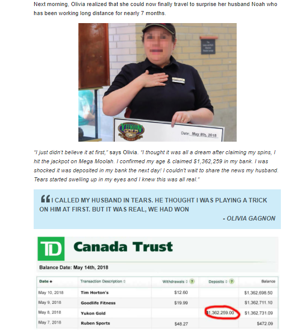
As can be seen above, a quote from her interview was made bigger and more prominent. A photo of her supposed Canada Trust account is shown, with emphasis on the one million dollar deposit. These all help build trust.
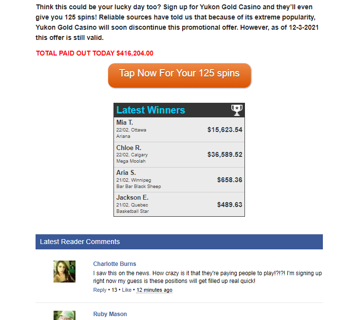
Towards the bottom of the page, the validity of the casino offer is reinforced by more pictures of people holding checks, a list of the latest winners, and a comments section where people are saying they saw this on the news and that they are interested to try (this uses the Crowd Wisdom Principle).
-
Design
There are many parts of the page that contributed to the success of this lander. First off, the page has the familiar look of typical news websites with the help of the following:
- name of the website at the top
- title format (with the words “Exclusive Report”)
- navigation menu
- the dynamically changing date right beneath the title
- the top stories list on the sidebar
- the ad for Casino Captain Cook on the sidebar.
Secondly, it uses a prominent call-to-action button whose color is way different than any other element on the page -- orange.
3. Long-Form Ad Copy
It’s very common to find casino landers with just an interactive spinning wheel, an offer for free spins, and a CTA button to push users to sign-up. While this may work for Cost Per Lead offers, it may not work for offers that require FTDs (first-time deposit) or those under revenue share.
The latter can rake in more money, but it requires players that actually pay to play. For such offers, a long-form ad copy can work wonders, like this one.

At one glance, you can see that the page looks somewhat of a business article. Instead of telling a story, this article provides tips on how to cash in big from online casinos.
It outright states that the viewer can get a matching bonus, which means the user must first make a deposit. This is a great way to filter out users that are only interested in freebies but have no interest in topping up their accounts once their freebies are used up.
To prove that the system the author is promoting works, several proofs of winnings are added with testimonials. This was strategically placed in the middle of the long ad copy to serve as a break and to reinforce emotion.
There are several CTA buttons throughout the entire article. Although they are noticeable, they are not intrusive and loud. They are even a bit toned-down.
To others, this may look like a boring long post, but to the target audience (possibly middle-income earners), this is perfect. It doesn’t mince words and actually provides actionable information to the reader, effectively gaining the user’s trust.
4. Video Landing Page
If your audience has short attention spans and doesn’t want to read through long posts like the one above, they might be enticed by a lander that contains a video explainer.
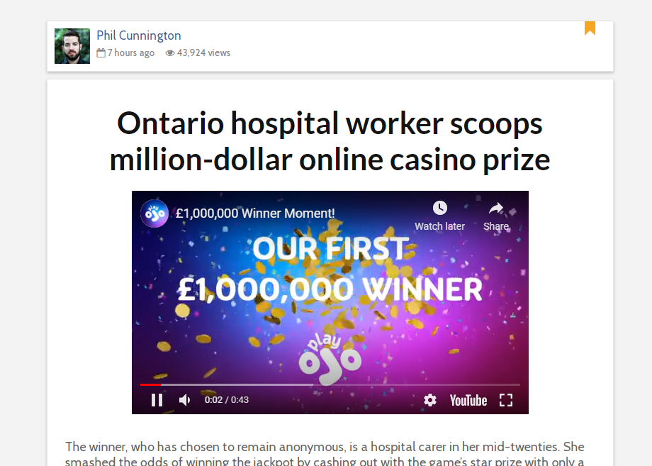
This LP features a Youtube video that shows how a user easily scooped a million-dollar cash prize in the Play OJO platform. Because everyone is familiar with Youtube, people intrinsically trust the video and think of it as legitimate even if we know that Youtube videos are community-based. It is the brand that we trust, and that trust trickles down to the video, and eventually, to the offer.
Below the video is a short but sweet text to encourage the viewer to register:
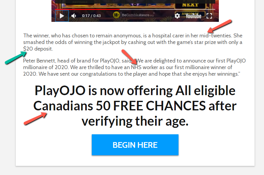
As we have pointed out in red in the image above, the text indicates the target demographic: a Canadian in their mid-twenties that has a job.
An NHS worker can either be white-collar or blue-collar workers, but with the amount of the deposit (pointed out in green) which is $20, we can assume that the advertiser is targeting blue-collar workers.
5. Localized Landing Page
This advertorial, which looks like a legit business and finance page, is not just written in Hindi, but also features elements unique to India.
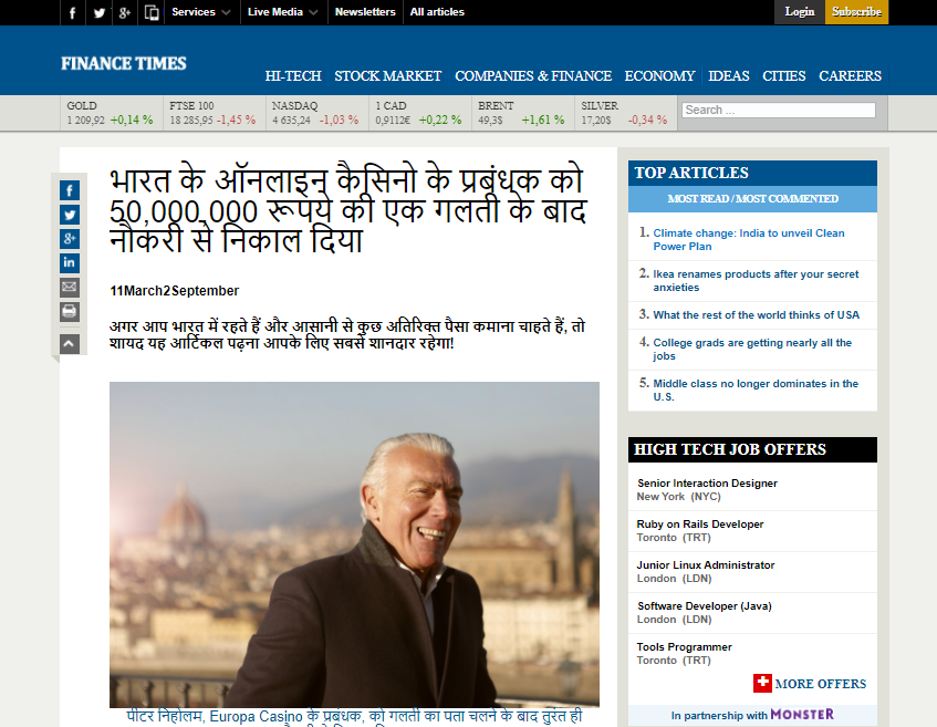
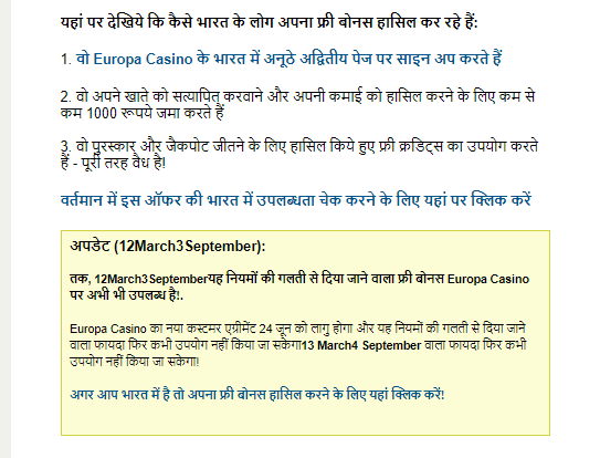
The news report talks about how the manager of Europa Casino was fired because he made a mistake and inadvertently caused new users to get higher bonus payouts than expected. As the story goes, while it is bad news for the company, it is great news for new users.
Towards the end of the article, the author states that there is still a chance to join and take part in this large bonus. For urgency purposes, two dynamic dates are added, with the first one showing today’s date and the second one showing tomorrow’s date as the last day that the bonus will still be available.
The bottom of the page further reinforces the business website feel by providing a professional-looking footer menu. This increases the trustworthiness of the page.
Final Thoughts
Dating and Casino are two verticals that cannot be further away from each other. But these are also what can be called eternal verticals: they will rake in profits no matter the season, the political landscape, or the economic state of the world.
Eager to start promoting dating or slots using native ads? Let’s talk and we’ll help you out! Hit us up at love@brax.io.

