Last time, we analyzed the best converting landing pages on Health and Bitcoin verticals based on Anstrex, a Native Ads Spy Tool. This time around, we’ll take a look at the top converting landing pages based on AdPlexity, another popular spy tool. Let’s focus on E-Commerce, Insurance, and Refinancing verticals this time.
Before we proceed, we just want to let our readers know that we take ZERO compensation for this, and we have no relationship with any of the companies mentioned here.
Table of Contents
Top E-Commerce Native Ads Landing Pages
Top Insurance Native Ads Landing Pages
Top Mortgage Refinance Native Ads Landing Pages
AdPlexity randomly releases top performing landing pages for a shocking price of just $1. However, they do it randomly and in just a short period of time that it’s very easy to miss. If you don’t follow the blogs of well-known marketers or if you’re not part of any affiliate marketing forum, then it’s likely you won’t get wind of it.
Not to worry! Even though we can’t give you the exact landing pages, we can at least give you insights on what made these landing pages for native ads perform well. Let’s get crackin’!
Top E-Commerce Native Ads Landing Pages
E-commerce offers are typically physical products that are available in retail. However, instead of being part of a selection of products that the advertiser has in their line up, each offer has a dedicated landing page that can be checked out on its own.
This helps in making it look as if the company is focused on manufacturing this product. Also, there are no distractions caused by additional products that can otherwise give the customer time to think his purchase decision through, which in the end can lead to cart abandonment.
E-Commerce products are mainly impulse buys -- the customer gets enticed and immediately proceeds with the purchase without seeking additional information elsewhere and without searching for alternatives. In short, the advertiser leverages on his target market’s emotions.
Let’s discuss how advertisers tease audiences into buying such products.
1. LISTICLE: 7 Awesome Gadgets Perfect For Xmas (Under $50)
As the title suggests, this landing page was created primarily as a Christmas promotion. This is perfect for those looking for a last-minute purchase for friends and family. As such, the urgency is already established; the advertiser just needs to give the reader the final nudge towards the right direction.
Upon reaching the landing page, you’ll immediately see that this looks like a typical blog or news post. It doesn’t look like an advertisement at all. This is called the Advertorial style of promotion.

Advertorial landing pages are perfect when using native ads because it gives the audience the impression that what they are reading is still regular content and not an advertisement.
To maximize the chances of conversion, the advertiser deliberately placed multiple products on one page. There are seven on this page alone!
The most probable reason for using a listicle or a list article is because the ads are being promoted in a general manner. The target demographic must be wide, accepting views from both men and women, as well as of different age groups.
TIP: If you want your targeting to be more precise, have a look at available targeting options here based on the native ad platform.
Since the title indicates that these products are $50 or less, the target market is probably in the low to middle-income bracket.
Marketing Principles Used:
It is evident that this lander promotes the benefits more than the features. This is because it is likely the viewer’s first time to hear of such products, so he or she would be more concerned about what the product does than what it is made of or what its technical specifications are.

The advertiser is hoping for an impulse buy, which is why the content is short and sweet (about 70 to 100 words), and the price is relatively low.
Finally, the advertiser adds a hint of urgency for some products. For instance, under Tigress Alert, it was mentioned that hundreds of thousands of units have been sold and that every woman in America should carry this.
This feeds on the viewer’s Fear of Missing Out. If a lot of people have purchased it, then it must be good.
Design Techniques:
The landing page design is important as well. If you would notice, there is nothing much around the page; just plain text, with a minimal header, product images, and of course, very noticeable Call to Action buttons after every product. The CTA is in hot red and contains clear text about what the button does.

Also, the product names are highlighted in blue, which are also clickable links. More ways to lead the consumer to the offer page!
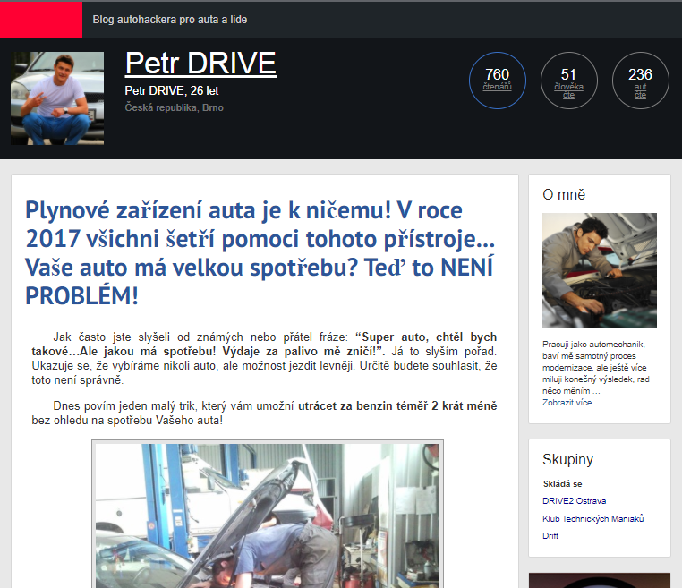
2. REVIEW BLOG POST in Localized Language: Petr DRIVE
If you want to appeal to the locals, your landing page needs to speak their language. That is the main marketing technique used in this lander, which is written in Czech.
For the sake of analysis, let’s allow Google to translate the page for us.
If you would notice, this is a review-type blog post that has been made to look as if the product was actually tried by the author.
The article includes a story; as if it happened in real life. It informs the reader of how the author was able to learn of the product, and what the results were based on his personal experience.
Marketing Principles used:
It is obvious that the landing page is targeting males. We can assume that the target persona is a young working male, interested in cars, and is a low to middle-income earner, as is obvious in the photos and choice of words.
This lander has been made to look like a blog post of a real person. This was further strengthened with the use of an “About Me” section, and images of a real person checking the car engine.
These things build up to the marketing concept of relatability. This means the reader will likely engage with the article because the “author” is of familiar stature, lifestyle, and interest.
Finally, the bottom of the article includes text that makes a lot of impact on the reader:

In this portion, it says that those who are selling this FuelSaver product for seven to eight thousand dollars are scamming people. The product can be purchased at a much lower price from the manufacturer (which the author conveniently adds a link to).
This gives the reader the sense that the product can be purchased for much less than 7-8 thousand dollars, and can only be purchased from the link that the author has provided. If the offer page displays the product as less than a thousand dollars, the reader will likely proceed with the purchase thinking that the price is a steal!
This part is playing on the reader’s emotions, pushing him to make an impulse purchase. Read this article about understanding your customer’s buying motivations in order to create better-performing ads.
Design Techniques:
The creator of this page used the social proofing concept in two ways:
1. Top of Page: Counters

This portion displays three counters, which tells the user how many people have read this page and how many people are currently reading the page at the same time as he is.
2. Bottom of the Page: Comments Section

At the bottom of this page is a Comments Section where other “people” indicate interest. Some even say they have ordered and are looking forward to the results, while others state that they’ve tried it and it works. There are also some that question whether or not the product works, which makes the comments look legitimate.
Furthermore, the whole page has been designed to look like an ordinary blog without much frills; typical of a man who is not very well-versed in designing a website and is not interested in “useless” stuff on his page.
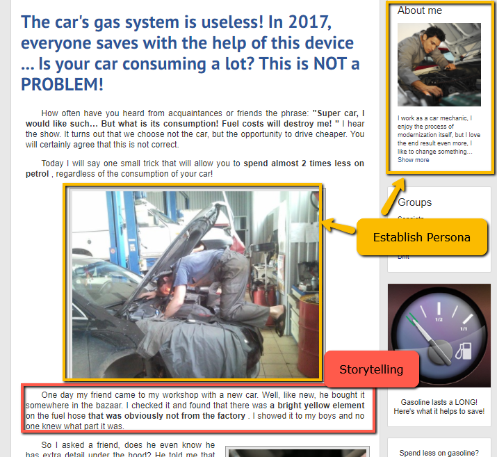
3. AS SEEN ON TV STYLE: EZBatteryReconditioning
One of the best ways to market a relatively unknown product is to say that this product has been featured in popular TV shows. This gives the product a certain level of authenticity.
EZ Battery Reconditioning states that it has found a way to bring dead batteries back to life.

The title, “Dead Simple Trick Brings Any Battery Back To Life (Never Buy Batteries Again)” achieves two things:
- Tells the audience that the process is simple enough, giving the reader the assumption that they can do this even if they don’t have any background on electronics;
- Tells the reader that he can save money since he will never buy batteries again.
Just beneath the title is the subheading that says this is a video. However, the media below it is not a video, but an image that has been made to look like one. If you click on what seems like a Play button, the whole page would reload and will open up the real offer page that features a video of the product.
If the reader doesn’t click on the image, though, then he can scroll down to a copy that isn’t really that long.
Marketing Principles Used:
There are a few elements that stand out on this landing page. When you scroll down to the text part, you will see these words in bold letters: over 19,000 people are using this.
This technique is called Crowd Marketing. If a lot of people are using this, then it must be worthwhile to try it yourself.

What’s also noticeable are the logos of well-known TV channels. We automatically feel that if a popular TV channel or show has mentioned this product, then it must be doing something right, else the company would be closed down by now.
The “As Seen on TV” marketing strategy gives the audience the idea that they can trust you (albeit temporarily, or right at the moment they are viewing your page), which is just enough time for you to win them over with the genius way that you can solve a recurring problem.
The lander also uses reviews on the sidebar as social proof.

Copy Technique:
We’ve included the “Copy” strategy here because we wanted to highlight parts of the content that the advertiser used to encourage readers to click on the CTA towards the offer page.
If you would notice in the screenshot above, the landing page mentioned over and over that the reader should watch the free presentation. It also mentioned “Learn” or “Learn More” a few times on the page, making it seem as if there is no payment involved in order to gain access to the simple trick.
These little words deliver big results.
4. SHORT COPY: Free Electricity
For this one, we’ll be analyzing two landing pages that are being used by the same advertiser. Or it’s also possible that these landing pages were created by two different affiliate marketers promoting the same product. The advertiser must have made a lot of money from these promotions seeing as two of their landing pages made it to the top of AdPlexity’s list.
These two landing pages used very similar tactics for promoting this Free Electricity offer. Let’s discuss and compare them to each other.
But before mentioning the same elements on these two landing pages, I just wanted to point out one design tactic employed on the first lander that was not used in the second one.

The first landing page was made to look as if it was written by a caucasian male named Mark Edwards, while the second landing page provides no hint of who the author was.
There is also a dynamically changing date element, which displays the date based on your computer. For more information on dynamic keyword insertion, read our guide here.
Lastly, this portion also includes a view count that is almost 15 thousand. For a post that has just been made on the same date that the user is viewing it, having that many views must mean the post is popular! (Or so the reader would think.)
Now let’s get back to the same tactics utilized in both LPs. To make it easier, here are the screenshots of the two landing pages, with numbers pertaining to parts that we’ll be discussing.
Landing Page 1

Landing Page 2

Point #1: Page Name
Landing Page 1 (LP1)’s name is PatriotWealthReport.com, while Landing Page 2 (LP2)’s name is PatriotAdvanceReport.com. Both page names mention the word “patriot”; we can therefore assume that the target persona is a military man. The advertiser wants to let the user know that the author himself is a former military man. This follows the marketing principle of relatability wherein the reader relates to the writer by dint of having the same background.
Points 2 and 4: Heading and Content
If you would notice, the titles and ad copy are completely the same. This means this copy has already been proven to work.
The headline mentions two important things: that you can generate free electricity, and that doing this is actually easier than you think. Audiences are easily persuaded by the mere mention of the words “free” and “easy”. Put them together in one section and you’re bound to yield amazing results.
Now looking at the content, you’ll notice that it follows the short-form content format. It briefly mentions a 52-year old man who created the technology. The target audience likely falls under this age group.
Based on the information we’ve gathered so far, the target persona is a retired military personnel who is currently in his early 50s. See how useful having a well-crafted target persona is? It allows you to build a story around a person that your target market will relate to.
Also, have a look at the key phrases used by the author to entice potential customers:
These words are those that resonate well with the audience, based on their demographics, interests, and financial situation.
Finally, the last paragraph of the text says “If you want to save money too”, which gives the impression that if you don’t want to watch the video, you are not concerned about saving money. And who doesn’t want to save money?
Point 3: Images
The photos between the two LPs are different from each other. LP1 features a rugged-looking man next to a weird-looking machine, while LP2 features two images of the supposed energy-saving set-up that looks simple and homemade. It is possible that these are being split-tested.
Point 5: CTA Button
The CTA button is large and is bright green, making it stand out from the rest of the page. The ad copy is short and there is only one CTA -- this type of landing page is targeted towards people who have short attention spans or have little time on their hands.
Seeing as the CTA encourages the user to watch the video on the next page, this means the reader prefers watching over reading.
5. NEWS STYLE POST: Trackr
The News Style post is one of the most popular types of landing pages, especially for traffic that comes from native ads and pops. Take a look:

Marketing Principles and Design Tactics:
The design of the landing page looks familiar, yes? This is exactly what the advertiser hopes to achieve, to utilize the familiarity principle to gain the trust of first-time viewers, even without saying anything yet.
Now as we mentioned above, this LP uses the News Style format. Here’s how they achieved this design:
-
Header Portion

The top part of the page is very noticeable, which makes the design of this area important. The dark blue color is typical of many news websites. The fonts used for the webpage name and the navigation menu are familiar fonts as well.
The website logo (Lifestyle & Tech) is not too extravagant so as to call attention to it, but still equally necessary to maintain consistency.
Across the logo on the right side is an ad-looking element. Adding something that looks like an ad makes it appear as if the website earns from ads on the page, and that the page is not really related to the advertiser.
-
Body
There are a lot of notable elements in this portion.
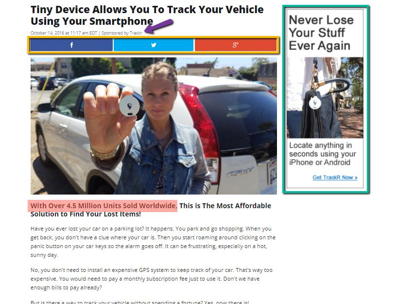
First off, look underneath the title (pointed by the purple arrow). It says “Sponsored by Trackr”. In reality, there is no need to add this since this is an advertorial, right? However, the creators of this page purposely placed that to reinforce the reader’s belief that this is a legitimate news site, and that Trackr is paying this website to feature their product. Smart, right?
On the sidebar is a banner ad for Trackr, which works in two ways: to give the user the option to visit the offer page, and to reinforce the belief that this is a legit news page. Adding social sharing options is a design choice since having one is typical for news sites.

The LP follows a long-form copy style.
The beginning of the article mentions that this product has sold over 4.5 million units worldwide (highlighted in yellow in the above image), which insinuates that this is already a popular product.
Then it proceeds to mention possible pain points: not being able to find your car in the parking lot. Emphasizing customer pain points is a great marketing technique.
Once the reader realizes that this is a problem he has encountered, he will proceed to read to find out how this problem can be solved. After introducing Trackr, the page proceeds with the features and benefits of the product.
-
Call To Action and Pre-CTA Text
Now let’s head over towards the bottom of the page, where most of the click-throughs happen.
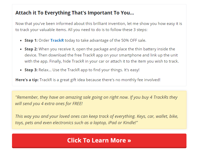
The large and red-hot CTA button “Click to Learn More >>” really stands out. The reader will definitely not be confused about where to find it and what it means.
Before the button, though, are very important pre-CTA text. This text builds up the reader’s confidence in the product as well as the sense of urgency to buy now.
Why, if I buy 4, they will send me 4 extra ones for FREE! This has got to be one of the greatest deals ever!
Based on our five examples above, you must have noticed that e-Commerce offers are impulse purchases. It is not really part of your shopping list, or you don’t really need it right at this very moment, but you are persuaded to get one for yourself.
Top Insurance Native Ads Landing Pages
The insurance industry has always been one of the best performing business industries, but the recent pandemic has affected it greatly, along with many other verticals.
However, according to Swiss Re Institute, the insurance industry is bound to recover much faster than other business types.
The time is ripe to start promoting insurance offers. But don’t do it without first reading through our analysis of the best performing insurance landing pages based on AdPlexity.
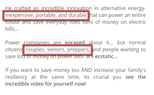
1. DEMOGRAPHIC FILTERING: National Family Insurance
While some native advertising networks provide the option to show your ad to a specific group of people based on their gender and age, others do not. However, when it comes to insurance offers, particularly life insurance, advertisers only accept specific markets.
Anything that does not qualify is rejected, will lead to lower traffic quality, and would even cause the advertiser or affiliate to be banned from promoting the said offer.
As such, advertisers must be creative in narrowing down the viewers and finding their target market through the haystack. One of the ways to do so is by filtering your audience based on the content.

As can be seen from the screenshot above, this landing page by Smart Lifestyle Trends used the phrases “American Seniors” and “Seniors all over the US” to imply that the offer they are talking about is targeted towards seniors. Anyone who is not a senior citizen will immediately close the page.
The Census Bureau of the USA considers senior citizens to be those 65 years of age and above. However, when it comes to promotions like this, anyone above 60 is included most of the time.
The bottom of the page shows this part:

As you can see, the advertisers further filter out people by instructing them to select their age (as shown in Step 1). To make the reader choose his age group easily, avatars accompany each age group.
The target here are seniors, so it’s likely that only the last option (60+) will be brought to the main offer. People who click on the first three options will be brought elsewhere. If you’re a smart advertiser, you’d look for life insurance offers that fit the first three demographic groups so that you can still earn from accidental conversions.
Nevertheless, the advertiser would surely have filtered the correct demographic using these techniques, ensuring that his traffic is compliant with the requirements of the offer.
Marketing Techniques:
So what makes this landing page powerful? First off, have a look at the first paragraph in red text:

The first paragraph gives the reader the idea that his neighbors have been saving big on something that the reader also has. This plays on the reader’s emotions and will make him feel envious (my neighbor knows something I don’t?)
On the other hand, the phrase “Thanks to this Secret” will tap on the reader’s curiosity. It is human nature to want to be in on a secret.
The middle paragraphs serve to reinforce the previous statement that you can get cheaper life insurance with this sentence (highlighted in yellow):

The highlighted text provided concrete information about what you can actually get ($250,000 worth of life insurance) and what you can expect (low monthly rate and no medical exam needed).
This can be considered as a short-form copy and is effective in both teasing the reader to view the offer page, as well as filtering out the demographic.
2. FOCUSED ON TARGET MARKET: YourLifeCovered.co.uk
Different types of layouts appeal to different demographics. For this instance, the target demographic is a married woman. As is evident in this top-performing LP, women trust lifestyle blogs.
Married women are usually the decision-makers when it comes to matters involving their household. So for family insurance like YourLifeCovered, a lifestyle website is recommending the insurance provider makes sense.
Marketing Tactics:
One of the biggest priorities of a homemaker is to find quality services for her family at an affordable price. So if she can get the same service at a whole lot less than what she regularly budgets for, then she will definitely grab the opportunity.
This is called Coupon Marketing. Even though there is no actual coupon provided on this landing page, the advertiser built the foundation of getting something for cheaper using several elements:
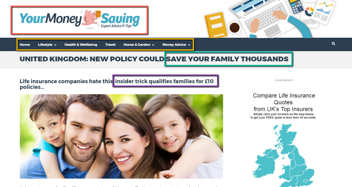
- The website name: YourMoneySaving
- The navigational menu: the menu mentions topics that many “mommy couponer” websites talk about, including Money Advice.
- The title of the post: mentions that this new insurance policy can help you save money.
- The subheading: still above the fold, the subheading states that this is an “insider trick” which can make the reader curious, and the £10 price, which is low under any circumstances.
The greater part of the article focuses on the benefits of the product, which is helping families compare life insurance plans and providers.
To dissuade a user from thinking this page was created by YourLifeCovered.co.uk itself, a section congratulating the company is added, as can be seen in the highlighted text below:

Also, a sidebar was added with banner ads, topped up with the word “Advertisement” above. This gives the impression that you are viewing a real lifestyle website (see, there’s even an advertisement for life insurance!), and not a page actually promoting an offer. This is a design choice.
To improve the offer match, a demographic filtering element has been added, as is discussed in our first life insurance LP example:

Top Performing Refinancing Landing Pages for Native Ads
Now let’s talk about some finance verticals. Offers that fall under these are personal loans, credit card offers, or mortgage and refinancing deals.
If you would read through our post on rational versus emotional purchases, you would find that offers related to mortgage and refinancing are the trickiest to master. However, once you get the hang of it, everything would easily fall into place and advertising such offers would be a breeze.
1. IMPULSE CONVERSION: The Better Finance
The truth is, no matter what your offer may be, if you create landing pages that imitate news sites, you are bound to catch your reader’s attention. This is especially true if you use pops or natives ads as traffic types and your native ad is displayed by news sites.
This is why it’s no surprise to find top-performing mortgage refinance offers looking like a news update. The key, however, is in crafting the copy to make it believable.
Marketing Principles Used:
Take a look at how this landing page looks above the fold:

The copy starts with “Congress extends the greatest mortgage reduction program in US History one last time”. Since it mentions “congress” and “US history”, the reader will automatically feel like this is a news post.
This is followed by a pretty long page title that immediately captivates the audience’s attention with the help of two important numbers:
- $4,264 worth of mortgage reduction
- 60-seconds to qualify.
To a person suffering from mortgage debt, these numbers mean a lot. The reader will immediately feel excited about how much he can possibly save. This is what leads to impulse conversions.
Now the advertiser will build on this momentum by using reinforcing statements such as this:

- Set to expire on (date, possibly the date of pageview) - this uses the principle of urgency;
- Banks have been keeping this a secret - this uses the curiosity marketing principle;
- 1 Minute Quiz - this also uses the curiosity principle (it’s just one minute, what is there to lose?)
Finally, to warm up the audience and at the same time filter out unwanted traffic, the landing page includes a short quiz that contains three questions.

However, since we see several other parts of the page where the user can click on to proceed to Easy Loan Site, it is highly likely that the reader will be brought to the offer page no matter what his answers may be.
We can therefore assume that this quiz element is used to imply exclusivity and to strengthen Easy Loan Site as a legitimate calculating tool approved by the national government.
Design Tactics:
The LP uses images that build up the credibility of the offer. An image of a cheque and an obvious screenshot of a Facebook conversation is used to make it seem legitimate.


The advertiser also maximized several elements of the lander to bring the reader to the offer page, including the “ads” on the sidebar and the “recommended pages” at the bottom.
2. TONED DOWN BUSINESS WEBSITE: Bills.com
This is actually the more toned-down version of the same offer as above. While The Better Finance aims for impulse conversions with big letters and photos of cheques, Bills.com’s landing page uses calmer messaging and offers no promises to its readers.
As we’ve mentioned before, refinancing offers are tricky to master because the people within the target market have different temperaments. If a prospective customer that falls into the target market backs out of the first landing page for this category, then they will likely respond better to this one.
If it looks like a finance website, that’s because this landing page is actually an advertorial by a real financial advice website! If you are already familiar with the website and its design, then you would automatically feel at ease.

Bills.com’s page looks like your typical business website which contains information about mortgages, understanding debt, and credit. While this navigational menu doesn’t really point elsewhere, it makes that reader feel that this website’s main function is to provide credible information. The sidebar even includes Recent Posts, which are all clickable links and lead to the offer page.
Marketing Strategies:
The title of the post, “The Home Refinance Plan Banks Don’t Want You Knowing” taps into the reader’s curiosity. What is it that they don’t want you to know?
The LP also uses the urgency principle to encourage the user to act now:
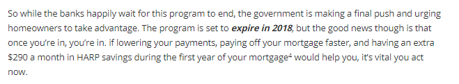
As you can see, the words “expire in 2018” are written in bold letters. The last sentence also mentions that the reader should act now. It’s pretty noticeable though that the text is not too pushy, which gives the impression that this LP is meant for individuals who actually read the text and not just skim over them.
Since we’ve established that the target audience of this page are people who are critical of what they read and engage with, it is only fitting that this lander contains these elements:

The As Featured In section displays logos of popular and credible business and finance websites.
Furthermore, these trust logos are displayed at the bottom of the page:

Both these sections are used to give the landing page and subsequent pages credibility as well. These are called Trust Signals.
Design Techniques:
The widget-looking elements on the sidebar are actually just images and also point to the offer page when clicked.

The call to action is two-fold.
First, it asks the reader to identify his location. This not only warms the customer up but also helps the advertiser’s algorithm to identify the best-matching loan refinance offer. Although the latter is possible, many landing pages just do this step for the former reason. Almost always, the results generated are the same.

Second, a bright red-orange CTA button is shown. As this is the most colorful part of the webpage, it is very noticeable.

Though these two landing page examples for refinancing are worlds apart, we can still find some similarities, like for instance the prequalifying questions. One may outperform the other depending on the traffic sources and/or website referrers. It would be best to try both styles when running similar offers.
Don’t Reinvent the Wheel
The essence of spying on your competition is to find out what works best for them. There’s a great chance that their techniques will work on your offers, too! As they always say, don’t try to reinvent the wheel, instead, copy what’s already proven to work.
If you apply what you’ve learned when building a landing page either for your e-Commerce products, insurance, or finance offers, you can be sure to expect a positive change in your ROI.
Make Christmas several months early and start hustlin’ today! If you’re using native ads to promote your offers, you can use our platform to make native ad management easier. Sign up for a 15-day free trial today. For inquiries, shoot us a message at love@brax.io and we’ll be happy to help.

