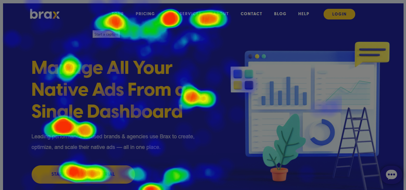
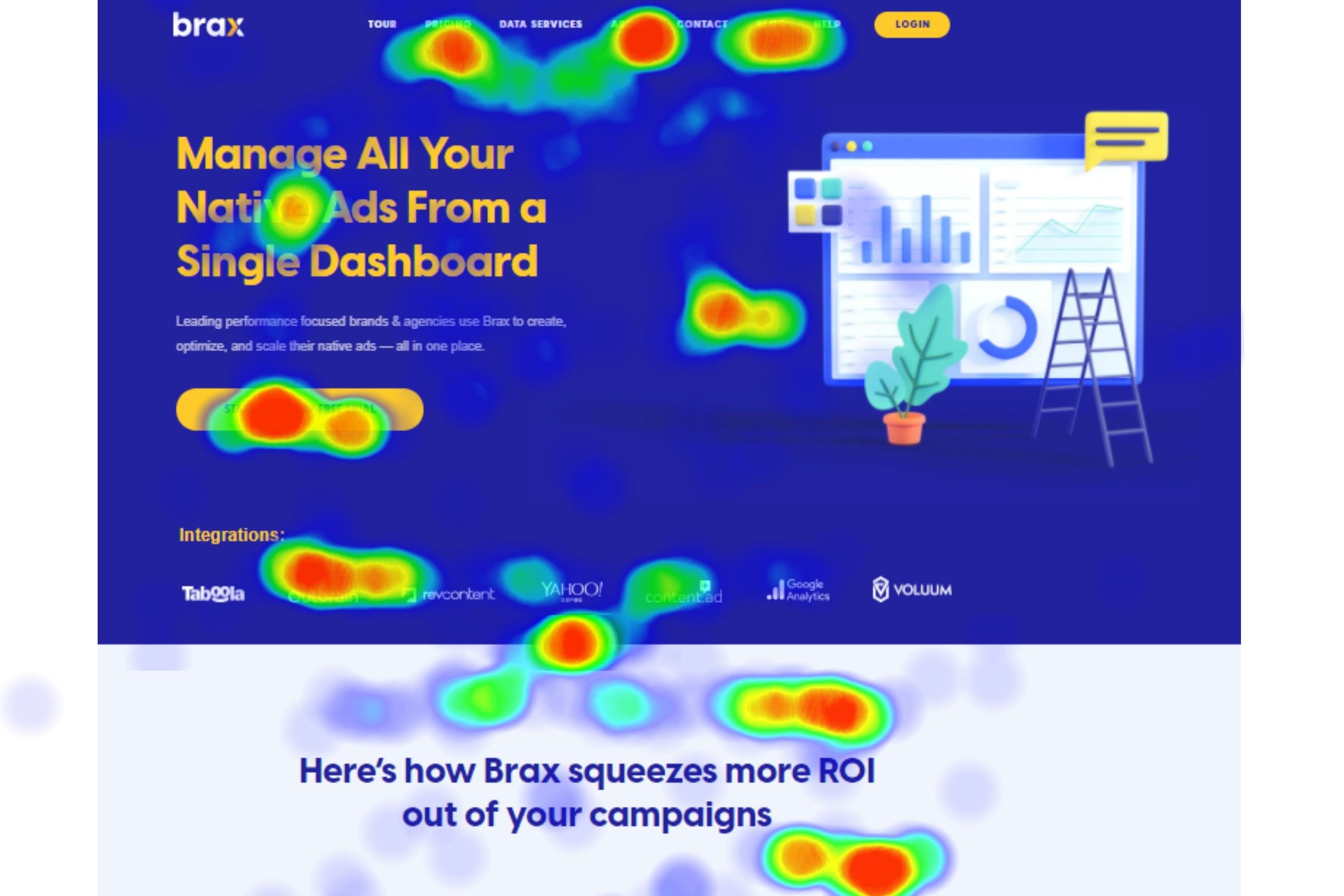
Have you ever wondered how you'll be able to determine which part of your webpage the viewer actually looks at? Aside from buttons and links, have you ever thought about where the user clicks on the page?
There is a wealth of information out there that can potentially help you improve how your landing page functions. If only there is a way to get this information.
Fret not! You are not the only one who wondered about this. And those who thought of this first were able to figure out a way to gather such data -- and that is through heatmaps.
Heatmaps generally function as a means to visualize complex statistical data. Different professions make use of heatmaps including doctors, engineers, sociologists, researchers, marketers, and so on. For website owners, heatmaps are a very useful tool for increasing conversion rates. With heatmaps, you can easily visualize complex statistical data and determine how well users are engaging with your website. You can tell what they click on, what they scroll past, or what they ignore completely. Using the data collected from heatmaps, website owners can then create a better user experience for their users. Nevertheless, not knowing what to look for in heatmaps or how it works could make the whole process fruitless.
Table of Contents
What is a Heat Map and How Does It Work?
The Different Types of Heat Maps
Scroll Maps
Click Maps
Move Maps
Eye-tracking Heat Maps
Attention Maps
Benefits of Using Heat Maps
How To Create And Analyze Heat Maps
10 Heat Map Tracking Services
What Is A Heatmap And How Does It Work?
A heatmap is a software that analyzes data to give a visual representation of behavioral data by using colors. It was developed in the mid-1900s by Cormac Kinney in an attempt to enable traders to beat financial markets. He did so by making it easier to view and comprehend large amounts of data without having to decipher the raw numbers manually. Just one look and you’ll have a quick overview of the data.
Today, the aim of using heat maps is to visualize the way people interact with your website, including what they click on, what action they take, and how further down your page they scroll.
With the data collected from heatmaps, website owners can reveal usability issues, user interface (UX) problems, areas that get the most attention on the webpage, and even pain points that make it difficult for users to perform certain actions on the page.
Heat maps work by gathering behavioral data from web pages while using a dark-to-light color scale to reveal certain information on users’ behavior. The areas that get more clicks from users appear in a dark color, while the areas with less attention get a lighter color.
This concept is based on the fact that we usually associate heat with dark red colors and coolness with light colors like blue, hence the name heatmaps.
This type of user remote testing serves as an indispensable source of information to measure users’ attention, interactions, and engagement as follows:
-
Attention
Heatmaps use the warm-cool color scheme to help you detect where the attention of users go when they visit your site based on where they click on, hover across, gaze at, or scroll through. With this, you could find out which of your website elements or parts of your landing page that users find the most interesting, along with areas they find confusing such as navigation menus or forms.
-
Engagement
Just as heatmaps help you detect areas on your website that get the most attention, it could also tell you which elements on your website users engage with the most. When using content, for instance, heatmaps easily show you what points users begin to disengage or get confused while reading.
-
Interactions
Based on what users click on, how far they get down a page, and how they navigate through your site, you can get insight into how well your visitors interact with your website. Are they clicking on your call-to-action button? Or do they even go far down to see it?
The Different Types Of Heatmaps
There are various types of heatmaps you can use for website analysis, and each of them depends on the different aspects of user behavior. The major types of website heatmaps are described below:
1. Scroll Maps
Scroll maps, just as the name implies, is a kind of heatmap that lets you see the percentage of visitors that scrolled to certain parts of your page before bouncing. This data is important because it helps you determine important factors like the length of your content and the location of your call-to-action button.
If visitors aren’t reading your long-form content, you may be better off focusing on creating other kinds of content (such as short-form content or even video content) that will interest your audience. With a scroll map, you can determine the spot on your site that users easily see and strategically place your call-to-action there.
Scroll maps also help you gauge your users’ attention span. As you may know, the attention span of humans is steadily decreasing. In just fifteen years, the average attention span of a person decreased by a quarter. That being said, if you want your most important information to get to your audience, you have to know how long they pay attention to your content and how much they are willing to scroll down your web pages.
Ways To Use Scroll Maps
There are various ways you could make use of scroll maps to spot data patterns and optimize user experience, nevertheless, here are a few of the most common ways to use this tool:
-
Detect the areas where you lose visitors’ attention
Since scroll maps show you how further down the page your users go, you can make use of the data revealed to figure out ways to tweak the design or copy of your web page to make them more likely to scroll further down. If you have a long landing page, scroll maps can be of great help in directing visitors towards converting.
-
Discover false bottoms
Often times, your users may not realize that there is more content beyond where they seized to scroll, probably due to a considerable amount of white space, line breaks, or confusing blocks. This is what we call a false bottom.
With the aid of scroll maps, you can carry out a depth test on your web pages to detect false bottom areas. For instance, if your carry out a scroll map test and observe a sharp change in color from green to blue towards the end of the page, it means that most of your visitors did not make it to the end.
In cases like that, you may want either remove the obstruction or move the content to higher the page where users can easily see it.
-
Learn what your visitors see above the fold
On a web page, the fold is where the page ends on a user’s screen before they need to scroll. This varies greatly across different devices. Above the fold simply describes the largest majority of the page users see immediately they land on a web page.
Scroll maps automatically determine the average fold of your web page across different devices, that is, the average portion of your page users see upon landing. When you study the fold data, you could rearrange your page content if necessary, and place the more important elements higher the page in such a way that it makes the fold across all devices.
-
Find out if users can easily find they came for
It is not uncommon for website owners to believe that the main aim of using a scroll map is to find ways to make users scroll all the way to the bottom. Sometimes, less is better.
When users have to scroll too far to get what they need, they may quickly lose interest in your website altogether. If you figure out your visitors have to scroll too much to get what they came for, you could shorten the content, use filters, or bring the information most users need to see higher the page.
-
Know if your page offers a comfortable cross-device experience
Users may behave differently across various devices. A user scrolling through your web page with a phone may not be willing to scroll as further as they would with a desktop device.
If your website is the kind that responds to device type and resizes accordingly (responsive website design), a scroll map would be helpful in finding out where users stop scrolling on different devices.
With the data gotten, you could then design a cross-device experience that suits all your users. You could determine the best position for your call-to-action to get users’ attention across all devices.
Don’t blindly follow the general rule that mobile-optimized pages are usually shorter. Always take out time to learn how your own visitors or target market behaves.
Example Of A Scroll Map
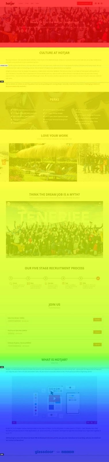
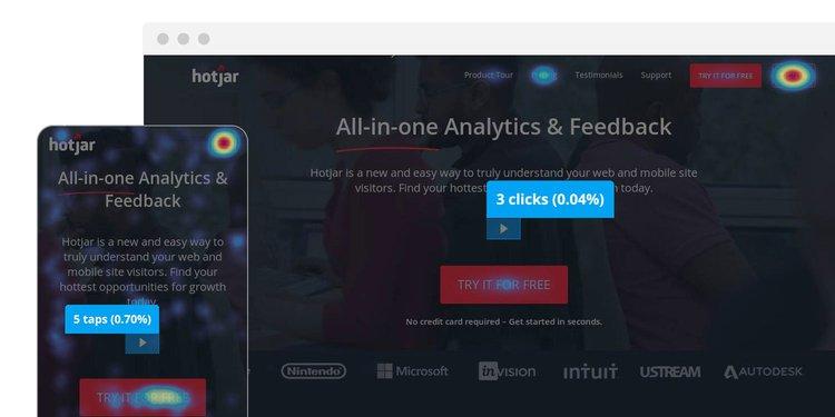
Scroll Map Sample from Hotjar
The above scroll map was derived from Hotjar’s career page. From this scroll map result, it is easy to tell how users interact with the content on the page. The image shows two sudden color changes – first at the beginning of the page from red to yellow, and the other at the bottom of the page from green to blue.
On a scroll map, you should observe a gradual change from hot to lighter colors, and so any sudden changes indicate that a significant percentage of users stopped scroll after they got to that particular point.
From the example above, different inferences could be made as to why most users stopped scrolling at those points. It could be that users assumed the page ended after those particular sections probably due to the amount of whitespace present and left as a result, or the elements in the section picked their interest and they clicked on a link that redirected them elsewhere.
2. Click Maps
Click maps, as the name implies, is a kind of heatmap that illustrates the areas of your website where users click on the most. It uses the same warm-cool color scheme to show the hot areas of a web page – that is, the most clicked on will be displayed in red, while the least-clicked on will be shown in blue. Click maps are known as tap maps in mobile devices because on such devices users tap instead of clicking.
With these tools, website owners can determine which areas and elements on their webpage are being clicked the most, which ultimately reveals the intent of their audience. Click maps also reveal specifically how clickable elements convert, especially calls to action.
Ways To Use Click Maps
With click tracking, businesses can better empathize with their users and collect data needed to create a better experience for them, which in turn helps the business grow. Below are the ways you can use click maps on your website or app to make improvements:
-
Learn the content that users feel is most important to them
Where users click on a page can tell what they feel is important to them. Most times, users click on the most prominent elements on a page like a big call-to-action button, which is expected. But you can also learn the areas of your website that are important to your users, such as part of a piece of content, and then react accordingly.
-
Find out which areas should be clickable, but are not
The areas on a page that aren’t clickable are often of less significance to website owners. However, if click maps reveal that users are crazily clicking on a non-clickable area like a particular image, its fair to assume that they believe something specific should be behind it.
In most cases, it is important to consider what that might be and make adjustments to the page element accordingly. If they keep on clicking on an object or a non-link text, why not add links or appropriate buttons to those? This might increase your click-through rate.
Click maps may also reveal where users do not click. This matters because as the website or business owner, you often have a clear picture of what you feel the clients’ perceptions of importance and value should be, based on your target persona. Sometimes, this may be totally out of context as regards what the clients really feel.
To the organization, every element on the web page is important and every story should be told. If care isn’t taken, the belief of the organization towards what’s important to users can result in over-crowded navigations that can easily throw the users off balance.
Click maps can solve the issue by providing objective data that bridges the perception gap. If a click map shows users aren’t clicking on an element you feel is important, then it should not be there. This insight could make a huge difference in how effective a business’s online presence is.
-
Track what works and what doesn’t
Most times, users click on elements that move them to, which may be clickable or not. Click maps reveal if users are clicking and tapping on buttons, site links, and calls-to-action. Key elements that aren’t getting clicked enough can be adjusted and areas that users engage with the most can be leveraged to get the most out of the users’ attention.
If for instance, a click map shows that users are clicking on the ‘Table of Contents’ section at the beginning of a lengthy content post, while you don’t necessarily have to make the elements clickable, it tells that users are engaging with the element. This shows that users are making use of the table of content to navigate the long post.
Without the data gotten from click maps, you may not know whether specific elements add value to users or not, and may end up removing the wrong element you feel only takes up space.
Link tracking easily tells you which links get clicked the most, however, click maps show you which words motivate users to click simply because users often click on elements they are moved by. In general, click maps help you realize which areas of your website work and which areas don’t.
-
Detect bugs and errors
In addition to revealing clicked areas, click maps also tell you when clicks don’t work. Sometimes, users may click on an image they expect to be a link or on a broken link that doesn’t redirect properly, and then get stuck. Click maps track all clicks that failed and obstructed users from progressing down the conversion funnel.
When you collect such data gotten from click maps – confusion, frustration, and rage clicking areas, you can then create an effective optimization plan for improvement.
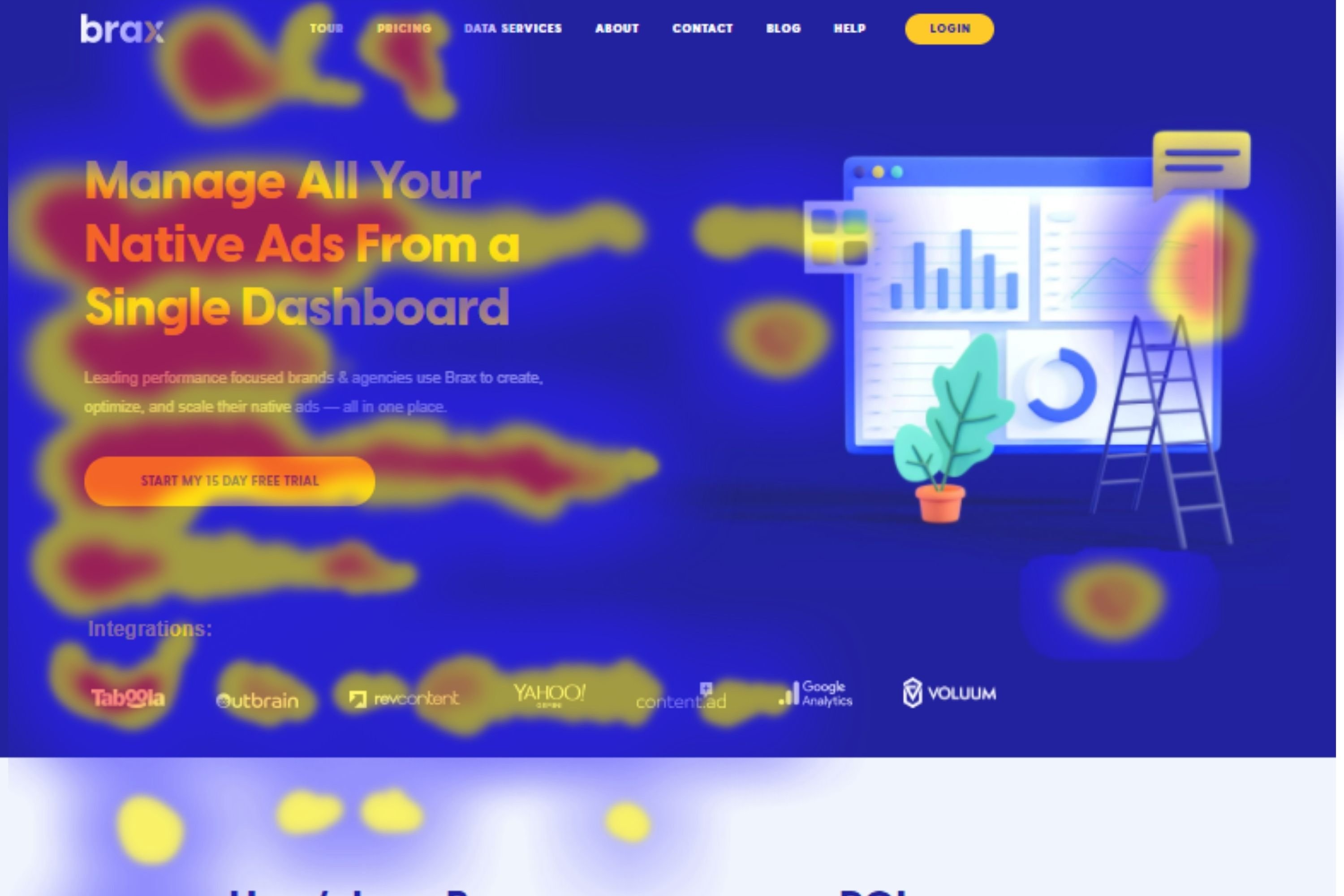
Example of a Click Map
Click Map Sample from Hotjar
The click map above clearly shows where users click and tap their fingers on desktop and mobile versions of a website. The results reveal the elements on the webpage that attracted more clicks along with the elements that were almost completely ignored.
The play button in the center of the page may have been assumed to be an important element by the website owners, but the click maps revealed something else. Both the desktop and mobile versions didn’t attract up to ten clicks out of thousands.
This simply shows that the element is of no use to the audience. If the video does contains valuable information, then changes will have to be made to present the video in a more appealing way or the information contained in the video in a different way. If the video element does not contain an important message, it may be removed altogether.
3. Move Maps
Move maps also known as hover or mouse maps are, in a way, related to eye tracking which can tell you how users read your page content. They function to enable you to identify how users hover across your website with their mouse, along with areas users mistake for areas they can interact with.
The idea is that people move their mouse across areas they are reading or viewing on a webpage. The longer users hover their mouse over a particular area, the hotter it becomes. Move maps serve as an easy and reliable way to tell if your website visitors are paying attention to specific areas of the page you need them to focus on.
This kind of heatmaps makes use of mouse tracking to monitor the mouse movement of users while browsing, which helps to get into the mind of visitors. Although this may seem like an unreliable method to track what’s on the mind of website users, think about how you behave when browsing the web. You would mostly use your mouse to browse the web on your desktop and hover across areas you’re fixating on. Therefore, move maps can tell areas where users focus on the most, along with areas they focus on the least.
The accuracy of move maps is however questionable because it is possible people look at elements that they don’t hover over. Users can also move their mouse over areas that get very little attention, therefore resulting in the inaccuracy of move map results. At the same time, the hover results gotten may also be accurate. In short, there is no way to really determine the accuracy of the move map results.
In 2010, a Senior Experience Researcher at Google named Dr. Anne Aula carried out a study on mouse tracking and arrived at some rather disappointing results:
-
Only 6% of web users showed some relationship between eye-tracking and the movement of their mouse.
-
Only 10% moved their cursor over a link and then went on to read other things on the page.
Nevertheless, this doesn’t rule out the fact that there is some correlation between mouse track and eye movement. You could make use of it to verify your suspicions or predictions on user behavior. In addition, mouse tracking is relatively less expensive than eye-tracking, making it a common option among website owners.
Ways To Use Move Maps
Despite the backlashes on move maps, they can still be used in a variety of ways:
-
Predict and measure user experience
Move maps can be used to track and visualize the trend in users’ mouse movement, and hence serves as a useful means to gain insight into how good your website’s user experience is. It can also be used to deduce the pattern of users’ attention in complex web pages, along with the difference in the focus of users on a varying page layout. What this means is that move maps can be used in testing which website layout works better while optimizing conversion rate.
With move maps, it is easy to identify parts of a page that grab the most attention or distract users. If a move map analysis shows that users paused the most over image content, this would mean that the images capture most of the users’ attention and would help to speed up the decision-making process and apply more of such elements. The information gathered from move maps analysis could also be referenced at different points in time to find solutions to experience breakage.
-
Use it as an indication to influence decision making
Move maps function better in observing the reason behind actions on a webpage, rather than just the behavior of the users. While other kinds of heatmaps track the choices and actions that users take on a web page, move maps go beyond that into considering the process leading to the actions or choices. This means that every move users make towards or away from actions matter, in the sense that although the user may have moved away from an action, it implies that the action was considered during the decision-making process.
When you’re able to track the entire decision-making process on your page through move maps, you can then make effective changes to your interface or product that will have a more significant impact on the attention of visitors.
This kind of heatmap can also be used by eCommerce analysts to gain insight into the decision-making process of buyers. Mouse movements can reveal patterns of visitors before they leave the checkout page. These patterns can be used to identify the elements that nearly caught the attention of users but didn’t as a result of not being captivating enough.
This can then be used to optimize those elements to make it more likely that the next user finds it more interesting and converts. For instance, you could analyze the mouse movement at the checkout page to reveal how users hover around the main call-to-action button and determine if it draws users’ attention or not. If it isn’t drawing the attention of users, move maps can also help you detect the reason behind it – if other elements are distracting them, if the user even moved towards the call-to-action at all before leaving, and so on.
-
Use move maps to make the most of existing website traffic
Most website owners spend a lot of money, sometimes thousands of dollars, in obtaining new website traffic. Move maps serve as a less expensive option to capitalize on your existing website traffic to gain knowledge of what would make them convert more.
For example, with the help of the insight gained on user behavior from move maps, a SaaS marketer could run highly targeted marketing campaigns for specific audience segments. UX designers can also create website designs that appeal to their target audience. When aiming at optimizing web conversions and retaining existing traffic simultaneously, move maps could come in pretty handy.
Example Of Move Map
The above move map shows the areas that most users hovered across in red. Since the image attracts so much attention and engagement, it is easy to conclude that users are very much interested in that section of the page. The content in that section could be expanded to give users more of what they want. But at the same time, more research should be carried out to reveal more information on the intent of users before making any decisions.
4. Eye-tracking Heatmaps
Eye-tracking technology helps to observe and measure factors such as eye movement, point of gaze, dilatation, and blinking. The data acquired from eye-tracking can be used to learn where subjects focus their attention visually, the elements they interact with, along with what they ignore.
The difference between Move Maps and Eye-tracking Heatmaps is that the former uses mouse track movements in the assumption that mouse movements equal eye movements. Eye-tracking, on the other hand, uses technology to see the user’s eye movements.
This technology can be applied in different kinds of research such as marketing research and usability testing studies, to enable researchers to learn which website elements draw the attention of users easily. Using the information gotten from eye-tracking, website owners can then create more effective web pages and advertisements.
There a variety of ways eye-tracking studies can be conducted. They include:
-
The use of screen-based eye-tracking devices attached to a monitor
-
The use of eye-tracking glasses
-
The use of eye-tracker webcams
As the subjects stare at a webpage, the eye-tracking device narrows in on their pupils and determines the direction of their gaze. The pupils dilate when a person sees something intriguing or when they are having an emotional response to something they see. The subjects are informed of the study, by the way, and are given the devices and software needed for the study to be performed.
The data generated about the gaze of users through the eye-tracking software is then presented in form of heatmaps – that is, using the dark-light color scheme. The area users stare at the most is represented in red, while the opposite is represented in lighter colors like blue. The most common type of eye-tracking used by website owners is the webcam method because it is relatively cheaper than the other methods.
The kind of eye-tracking method employed in a particular study greatly relies on the nature of the research in question. For instance, a business based on a physical store may conduct eye-tracking market research using the glasses technology or headsets so they could understand what their subjects gaze at in the real world. An eCommerce store on the other hand will most likely make use of a screen-based tracker or webcam to learn what the eCommerce store users are looking at when shopping through their site.
Just like with any other type of behavioral study, you must establish the questions you wish to have answered by eye-tracking market research before you begin. If you’re carrying out an eye-tracking study on your eCommerce website, for example, the questions you may want to answer are:
-
Can users spot the page elements they need to carry out specific tasks?
-
How easily can users locate the call-to-action?
-
How long do users remain on each web page?
-
How easily can users read and comprehend the website?
Once you have gotten the information you need from the data gathered through the eye-tracking research, you can then use what you’ve learned to improve the experience of users on your website. Eye-tracking can help you gain a good understanding of what your customers and visitors prefer, beyond most other kinds of research methods.
For instance, if website surveys are effective in pointing out what visitors consciously focus on, eye-tracking heatmaps can go beyond that and highlight what occurs below the conscious awareness. Since our eyes follow what interests us, researchers can observe patterns across test subjects and make more accurate forecasts on how the audience would react to certain changes as a whole.
When applied to usability and UX (user interface), this understanding enables businesses to build websites that are more usable, along with content that have a higher chance of attracting the attention of users and making them convert.
Example Of An Eye-tracking Heatmap
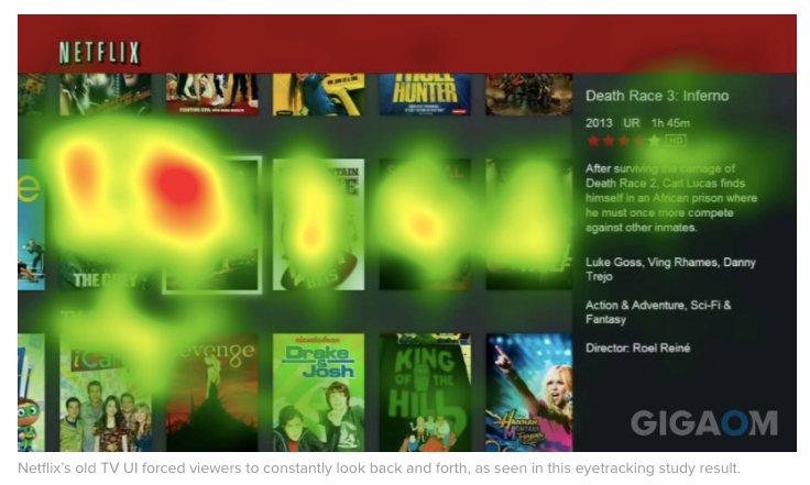
Netflix eye-tracking study, source: Gigaom
The above example shows where audiences are gazing at this Netflix page. You would observe that certain movies were gazed upon the most by users, while some movies were completely ignored. This simply shows the movies that are of interest to users. Using this eye-tracking information, Netflix can then present personalized movie recommendations to users based on what they like to see.
5. Attention Maps
Attention maps are another kind of heatmaps used to determine where users pay the most attention to your webpage, based on how long they spend on different areas of your website. These tools come in quite handy in discovering which information or elements on your website that users find attractive, and you can then use the information acquired to your advantage.
This kind of heatmap is used mostly on web pages that have a lot of content because it helps to decipher which part of the copy users read the most and which parts they just skip over. The results you get on what users like to read or view can be used to create page content that appeals to your audience.
In addition to determining which of your page content appeals to your users, attention maps also enable you to easily view their navigation activity with full horizontal and vertical scrolling. Most attention map tools take different screen sizes and resolutions into consideration while showing the portion of the page that has been viewed the most by users.
With all the interesting functions of attention maps, they play a vital role in measuring the effectiveness of a web page design. Your web page design could either ignite users’ interest or cause them to leave the page, and for this reason, attention maps are also very helpful to eCommerce website owners.
This heatmap type can help you identify reasons for shopping cart abandonment which could be the length of time users spend browsing products or searching for the ‘buy’ button. When the issues have been identified with the aid of attention maps, data-informed changes can then be made to reduce cart abandonment and improve conversions.
Example Of An Attention Map
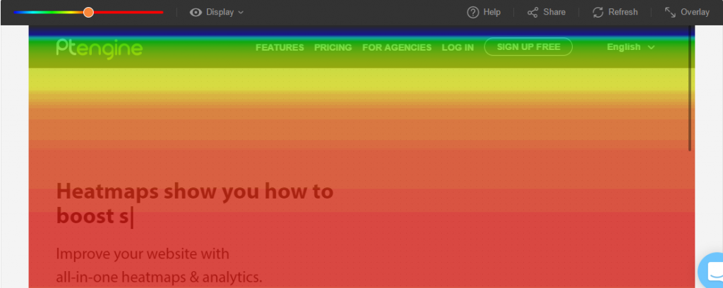
The attention map from Ptengine above shows the area page viewers spend the most time on. The red area clearly indicates that a significant percentage of page visitors spent more time reading the short copy in the center of the page. And based on the scrolling activity, you can tell that the other parts of the page were not only viewed by a fewer number of people, but also for a shorter period.
Benefits Of Using Heatmaps
Using heatmaps in general comes with a lot of benefits. Some of them are as follows:
-
Heatmaps give a quick overview of important web performance parameters
One of the biggest advantages of using heatmaps is that they instantly draw attention to significant issues on your website. Click maps reveal problems through the clicking patterns of users, Scroll maps help detect issues with the visibility of your page, and Move maps and Eye-tracking heatmaps tell you about issues with user engagement.
When these analyses are taken together, heatmaps can add significant speed in solving the problems of the website, such as cold spots and folds that don’t get enough attention. In a nutshell, heatmaps reveal to you at a glance what works and what needs to be adjusted.

-
Heatmaps offer a visual approach to analyzing numeric values
Most other kinds of analytic methods require the use of spreadsheets. And while spreadsheets are also quite accurate and based on hard data, the graphics that heatmaps present offer an undeniable advantage over data presented in rows and columns. Most people prefer pictures to spreadsheets because they are easier to assimilate.
A spreadsheet may reveal that particular links are lacking clicks or that certain pages have a significantly higher bounce rate than other pages on your website, but the numbers cannot tell you the reason this happens. When the same data is viewed through a heatmap, it will quickly highlight the problematic click rate along with possible reasons, which may be as a result of the link being surrounded by other distracting elements. The reason for a high bounce rate on certain pages may also be revealed by a heatmap as the page being less visible.
Due to how easy it is to read and understand heatmaps, they serve as very important communication tools. Designers and researchers can easily communicate with clients on the patterns and data obtained from research while showing them clear and understandable results. It also assists the website designers themselves in experiencing through the eyes of users what navigating through their web pages feel like.
-
Heatmaps make it easier to learn what users want and create smarter web designs
Website designers don’t create smart and effective web designs out of the blue. Most often, it requires time and lots of learning. Learning may not be easy as it involves questioning your own choices and acknowledging areas that need to be improved upon. When designing a website, learning from your audience is specifically essential, and heatmaps help you do just that.
Heatmaps highlight what users do and what they don’t while interacting with your website. Although surveys and forms may be useful in learning what users think, we humans are prone to some form of bias, meaning that a lot of times, what we say is not what we do. Heatmaps, alternatively, provide undeviating and raw feedback on the navigational patterns of users. When you combine heatmaps with A/B testing, you learn enough about your audience to create smarter and more acceptable web designs.
-
Heatmaps supplement your other analytical tools
Although heatmaps are different from other analytical tools and provide answers to questions others can’t, it doesn’t necessarily mean they offer answers to all questions and problems. Heatmaps should not be used alone, but as one of the tools in your analytical tool kits to achieve the best results.
When you combine knowledge gained from the crowd with the knowledge gained from longitudinal data, you will be able to see your website users’ activities in precise details. Filters may allow you to narrow down on particular segments of your audience like returning visitors who surf the net on their mobile phones, while feedback from users will let you know what users think about your website and the challenges they faced through their experience.
Information gathered from these other analytical methods are undeniably more useful when combined with information gotten from heatmaps.
-
Even when heatmaps results appear confusing, they still point out interesting issues
Sometimes when you make use of heatmaps, it may feel like you aren’t getting the answers you need or the results you get are complicating the matter more. This is often to the multiple colored splotches, dispersed clicks, or cold spots that may appear in one result. Although most people find this confusing, it can be a good thing.
Due to how complex people are, it’s no surprise that user interface designs may also appear complicated. When heatmaps present you with complicated results, it can be an opportunity to look into the site’s content or other tricky design problems. This is also one of the reasons why you must use these heatmaps with other analytical tools such as Google Analytics – to get clearer overall results.
-
Heatmaps enable you to know your visitors better and in turn, give them a finer experience
Websites are designed to communicate a string of messages to users which may be to sell an offer or an idea. In communication, the two sides matter, and for this reason, website designers have to pay attention to what the users are saying. This includes how users react to your message and knowing when you have a take a different communication approach, which is why heatmaps are so important.
Heatmaps instinctively trace data points to give you insight into where and when users get confused, frustrated, interested, and uninterested. Sometimes a particular message may be acceptable to a specific group of people, but may not to others. With the aid of heatmaps, you can learn how different audiences react to the same message and how to offer a better experience to all your users.
-
Heatmaps help organizations make intelligent choices that enhance the business in general
As a result of helping managers learn about the interests of their consumers, companies can make better web design choices that boost engagement and conversion rates. Heatmaps enable businesses to make intelligent choices that drive positive business results and ultimately improve the bottom line.
How To Create And Analyze Heatmaps
By now you should understand the uses and benefits of heatmaps, but how do you go about creating one? Most of the processes involved in heatmaps creation are automatic depending on the tool you use.
Due to how incredibly helpful heatmaps are, you may want to use them over other user testing methods. Nevertheless, it’s important that you first decide if it is the right approach for what you want to achieve.
If you want to make advancements to your existing landing page and its elements, then heatmaps are ideal. But if you are just in the process of designing a new website, there won’t be any need for heatmaps as you won’t have enough data to work with. Heatmaps are used on already existing websites to make data-informed redesigns, duplications, and improvements.
Once you are certain heatmaps are right for you, then you can take the following simple steps in creating a one:
1. Decide on what you wish to achieve and choose the pages to test
Heatmaps are great in finding out how well your website is doing when it comes to usability. Also, if you have high traffic but low conversion rates, heatmaps can help you discover why. You and important persons involved in your business must first decide on which areas of your website need improvement. This could be your landing page, checking-out page, homepage, or maybe a multiple numbers of pages.
Once you decide on the pages that need testing, you also have to determine what you need to test precisely and why. On a landing page, you may want to test how functional your call-to-action is. You may also want to find out what people aren’t clicking on certain links on your homepage. It’s always best to have a solid goal in mind to avoid wasting your time and other resources.
Most times, website heatmaps tools are created for certain web pages, so you must ascertain the pages of your website you want to test. You may want to test only your homepage and other specific pages because not all web pages are important for conversion. Also, sometimes when pages are similar, it may not be necessary to repeat the same analysis for all pages.
For example, on a typical eCommerce website, thousands of pages may have the same UI layout with only the content such as product listings being different. In cases like it, it would be best to choose a tool that can enable you to create a template of the page be the tested, and then apply the insights gained to other similar pages. Areas you may be concerned about on an eCommerce website include what parts of the description customers are viewing, whether or not they are clicking on clickable elements, and how effective the call-to-action buttons are.
Pages You Should Use Heatmaps On
You don’t have to put a heatmap on all pages of your website. To maximize the benefits from your heatmap analysis, you should add them to your pages with a lot of impacts. Here are four high-impact pages on your website that you should have heatmaps on.
a. Homepage
The homepage of your website is considered as the main page where the arrangement of all the products and services you have to offer is displayed. A user will always land on the homepage first before navigating to other sections of the site, therefore, putting a heatmap on the homepage, will allow you to understand what your users want.
b. Product Pages
You can add heatmaps on the pages of your website with high performance and the pages with a low performance for different reasons. For the pages with high performance, you can add heatmaps to know what makes users convert, and for the pages with low performance, adding heatmaps would allow you to see what prevents them from converting. The results of these analyses can help you make adjustments that would optimize your conversion rates.
c. Cart and Checkout Pages
If you are dealing with an E-commerce website, you should probably add a heatmap to the cash and checkout pages. This will show what stops your users from making a purchase and what causes the drop-offs. With this analysis, you make the necessary adjustments like the removal of unnecessary clutters from the page to reduce the drop-off rate.
d. Landing Pages
Adding a heatmap to your landing pages would help improve your ad campaign performance significantly. The heatmaps would show how the users from a certain medium interact with your site. With the heatmap analysis, you can think of ways to optimize your users’ experience on your site.
2. Pick the appropriate heatmap tool and install a tracking code
After deciding on the pages to test and what needs testing, you can then choose the right heatmap tool for your purpose. While choosing a heatmap tool, you must ensure the tool is dynamic, in the sense that it is able to test dynamic web pages.
Dynamic pages are those pages that contain elements that move such as a sliding or dropdown menu that draws over part of the screen when clicked on and becomes hidden again when deselected. The heatmap tool you choose must be able to measure dynamic elements that can be found in most websites, or the results you get may not be very helpful.
The next factor you should consider when choosing a heatmap tool is if it can create responsive heatmaps. If the heatmap you create is not responsive, you may not get enough data on different versions of your website – mobile and desktop. An ideal heatmap tool should be able to provide information on all device versions of your website while segmenting the users viewing your site across devices and compiling the data gotten in separate results.
After selecting your heatmap tool, the next thing to do is to incorporate the tracking code for the selected tool on your website and then set the heatmap live. If your website uses WordPress, be sure to select a tool that provides plugins you could easily install for the analysis process.
3. Analyze Your Heatmap Results
Once you’ve set up your heatmap, all you need to do is wait for the tool to accumulate data from your website. The amount of time you have to wait may vary from a day to weeks, depending on the size of your current traffic. After a sufficient amount of data has been collected, the logical thing to do next is to analyze the results. Heatmap analysis describes the process of reviewing data collected from heatmaps to gain helpful insight into users’ interaction with your website.

One of the advantages of using heatmaps is that it makes it quite easy to read results and identify patterns due to the way the results are visually presented. Most heatmap tools have a feature to allow you to make adjustments to the color contrast to let the overlay stand out even more. Afterward, you need to check for significantly warm areas. Those areas with a lot of warmth (that is, red), are the hotspots.
Hotspots represent those areas on a web page that get the most interaction, attention, and engagement. If you find out that there are hotspots in areas that you thought as less important, you should consider making adjustments to your page layout to leverage those areas and increase your conversion rates.
If you find out areas that a significant amount of users have clicked on whereas the elements are not clickable, you could either make them less clickable or leverage the position to insert useful links. The analyses from heatmaps can be used to improve website design while reducing bounce rates and drop-offs. If you want to really make the best of your heatmaps results to increase conversion rates, you could go further to carry out usability testing.
When analyzing heatmaps you can make use of the following 5-question checklist:
-
Are users seeing the important content?
You can make use of scroll maps to determine if users are actually seeing the important content elements or sections on your web page. To analyze scroll maps, start by evaluating where the average fold on your page lies, that is, the area of your page that most users see first when they land on your website. When you know where the average fold lies, you can ascertain whether people are seeing the most important content on your website.
In some tools such as Hotjar, the average fold is calculated immediately for both mobile and desktop versions of webpages. If for instance, you happen to have very important information right below the fold, it means that users will only view the important content if what they see is captivating enough to make them want to scroll down your page. When this happens, it’s best to make adjustments so that the important element falls within the average fold.
After analyzing what users see within your average fold, continue by reviewing the entire scroll map result, including the percentage of users who make it to particular points on your page or do not. This analysis is important for long pages that contain a lot of important information users need to see.
Observe for sudden changes in color as they show that a good number of people stopped scrolling after a particular point, probably as a result of assuming they reached the end of the page. With the amount of data gathered from scroll maps, you can determine whether key messages are being ignored by users and need to be relocated.
-
Are users clicking on important page elements like links and calls to action?
While a scroll map enables you to easily understand if users are seeing specific content elements, a click map will help you confirm if they are clicking on them or not. The aim of creating websites is either to help users find information, make them sign up for a service, or make them buy a product.
Therefore, when analyzing click maps data, observe user behavior on the calls to action, buttons, and links that allow users to take these actions. Determine if these elements are getting clicked on or tapped on in the case of mobile heatmaps, and how much interaction they are receiving.
You can then use the insight gained to make changes to your page design or carry out more in-depth research on user behavior. If you make adjustments to your page design, then ensure that you refer back to the click map results to compare behaviors and know how successful your new design is.
-
Do non-clickable elements confuse users?
Sometimes users may get confused and frustrated when they continuously click on non-clickable elements to no avail. For example, you may find that a good number of users keep clicking or tapping on a testimonial logo on your page expecting to be redirected.
Keep scenarios like this in mind when analyzing click heatmaps results, and observe for user behavior on non-clickable elements like images, titles, or graphical shapes. If you see that users click or tap on such elements, then you might need to make them appear less clickable and clearly differentiate them from clickable elements, or add useful links to them.
-
Are your users getting distracted by other elements on the page?
Users get distracted when multiple web page elements compete for their attention. When this happens, website users may get distracted from the main tasks they need to carry out. The heatmaps that easily reveal users’ focus on a webpage are move maps and eye-tracking heatmaps. Observe whether the mouse or eye activity is spread across the whole page instead of focusing on the key elements such as the copy, call-to-action, and links.
Also, observe for areas of the page that don’t receive any interaction. Depending on the result, you may need to redistribute your page content to remove or replace elements that take up valuable space on the page.
-
Are users experiencing issues across devices?
It’s possible that your website looks different for mobile and desktop users. Important content could be immediately visible on a desktop but end up well below the fold on mobile devices where it’s not visible to many users. Also, your page could look more structured and compact on mobile devices but scanty and disarranged on desktops.
This is why it is important to make use of heatmap tools that can analyze user behavior on both mobile and desktop. Observe for the challenges users face across different devices and determine changes that need to be made to your website build-up.
Make comparisons between mobile and desktop scroll maps of the same page to see if people are going through more or less content depending on the device they are using. Combine the results gotten from scroll maps with those gotten from click maps to observe for any changes in clicking or tapping behaviors across devices, that is, if users interact more or less with the same elements on mobile and desktop.
If there are clear differences between the behavior of users on different devices, then you may either need to apply quick changes or completely restructure the entire webpage.
10 Heatmap Tracking Services
Below are some of the most popular tools you can employ in creating effective heat maps of different kinds.
1. Browsee
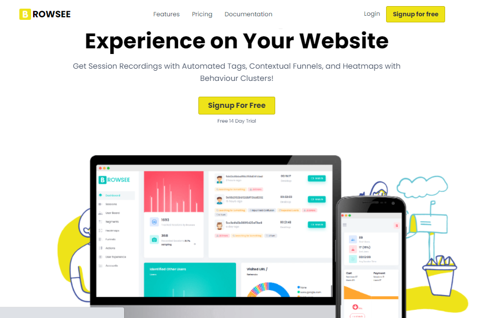
Browsee is a tool that helps you understand your entire page through its click pattern, scroll depth, user attention analysis, and heat map features. With Browsee, you get a complete picture of the activities performed on your sites or pages, along with an insight into how users engage with site elements.
It divides different user behaviors into various groups. This allows you to find out what users who convert tend to do and what users who drop off do. The heat maps provided by Browsee are informative and intuitive. With the three heat maps provided -- the click heat map, attention maps, and scroll heat maps -- you could identify what parts of your page or site had the most engagements or the least engagements. You can find out how changes in the content have affected your user interactions by placing your heat maps side by side for comparison on a set date range.
Limitations:
- No insights on why users don’t convert.
- You can’t export the information from the dashboard.
- The user interface of the software is not optimized
Browsee has a free plan that accepts a total of 200,000 pageviews, and can record up to 2,000 sessions. The paid plans include the Starter pack for $12, Plus for $32, Pro for $64, and Executive for $130, all charged on a monthly basis.
2. Plerdy
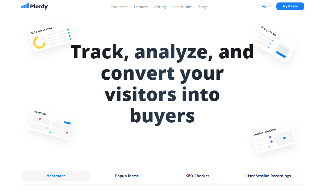
Plerdy is a multifunctional tool that tracks, analyzes, and converts your visitors into paying customers. Plerdy’s heatmaps records and displays all clicks on the website in real-time using more than 40 features and reports to analyze your user’s website behavior and clicks on website dynamic elements, sliders, menus, etc.
Once the script of the tool is installed, it starts collecting data on your website. To access the results, press (Ctrl+Alt+H) to view the tool's sidebar on your site. All gathered information is shown on the pages of your online website.
A good feature of Plerdy’s heatmaps is that the script of the tool records the clicks on the interactive elements of a page. Another excellent feature of the Plerdy heatmap tool is that it displays statistics on live websites in real-time. This allows you to see the interactions on your website and view the gathered information on separate pages.
Limitation
- The settings and features are quite difficult to understand, so the learning curve is quite high.
Plerdy’s plans include the Basic plan for $29 a month, the Business plan for $59 monthly, and the Premium plan for $99 monthly. They also have a free plan that accepts up to 2,000 page views a day and allows you to track up to three pages.
3. Hotjar
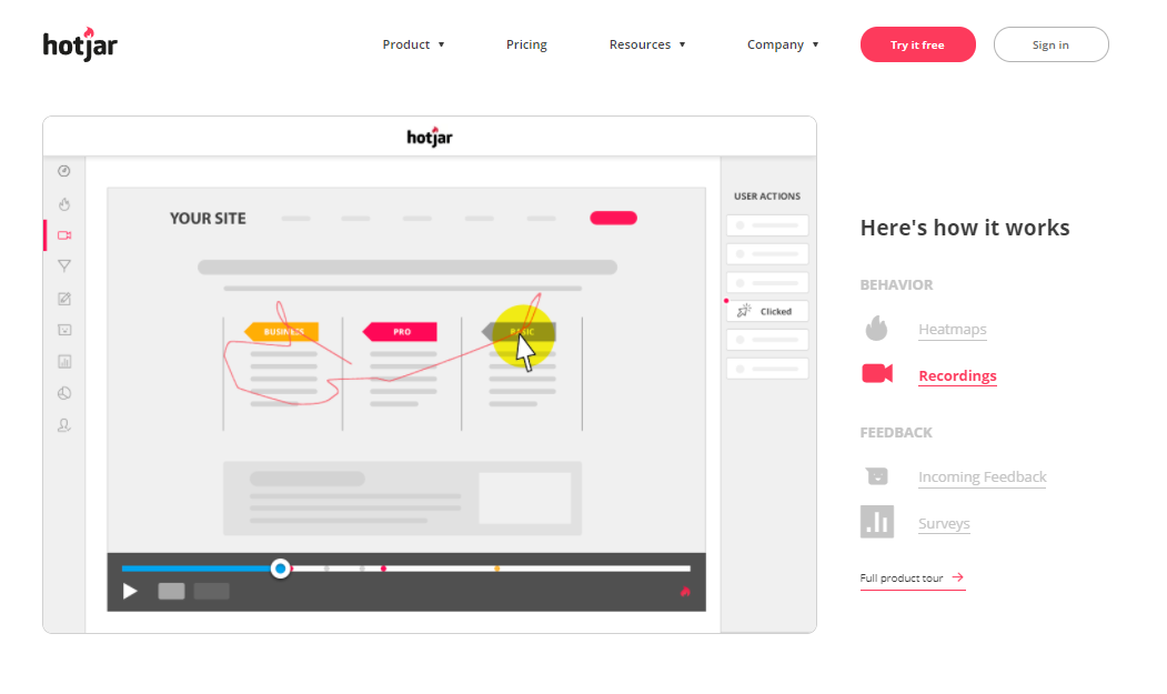
Hotjar is a well-known heatmap software that allows you to see and understand how users are experiencing your site without being confused by large numbers. It gives you insights on what catches the interest of your users by showing an analysis of their scroll and clicks behaviors. Hotjar makes use of three heatmap types: mouse movement heatmaps, click, and scroll heatmaps.
Hotjar’s various feedback collection methods can show you where your users might be experiencing difficulties and also what they want. With this, you can make necessary adjustments that would help you enhance your conversation rates. Hotjar has a simple interface that makes it easy to use. It completely visualizes the user’s journey on your website. It also has other behavior analytic tools like conversion funnels analytics, session replays, surveys, and polls and forms analytics.
Limitations:
- Has limited integrations with other tools.
- Cannot implement heatmap tracking on an exceeding number of website pages. Once the limit is crossed, it becomes difficult to activate heatmaps on all pages.
Hotjar is a little bit expensive for small businesses. It has a free basic plan to get you started, which accepts up to 2,000 pageviews a day but with limited reports and recordings. It’s cheapest plan is the Plus plan that charges $38 a month. These plans are under the personal category.
There are other plans under the business and agency categories, which start at $99 per month and gets pricier depending on pageviews.
4. CrazyEgg
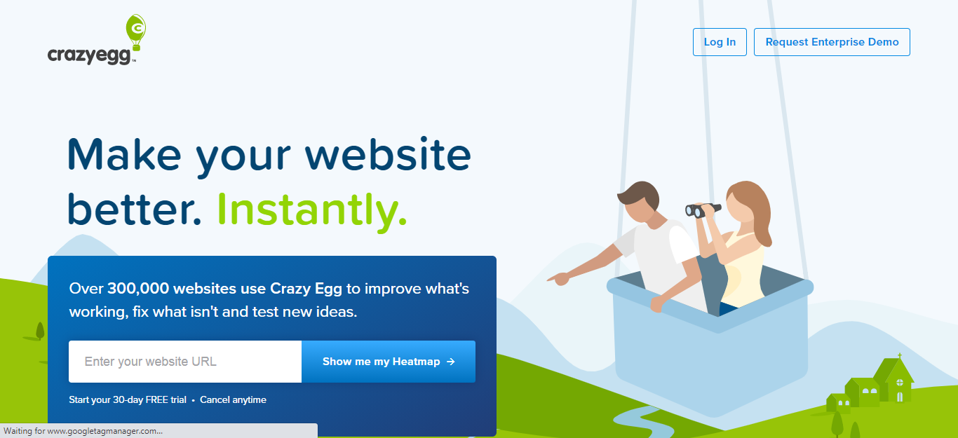
CrazyEgg is another popular service, crated by SEO and digital marketing expert Neil Patel. It is a traditional heatmap tool that comes with the special Confetti filter feature that divides heatmaps by color to show the channels your visitors come from.
It provides multiple types of heatmaps and gives insights on where your visitors' click, scroll, and what they look at on any page. CrazyEgg is generally known as an easy to implement heatmap tool. The features are simple and helpful.
CrazyEgg has other analytic features like Session recordings and A/B testing. You can get a better understanding of what needs to be optimized by combing the results of the A/B testing and heatmap insights.
Limitations:
- Inability to work with live sites as all statistics gathered are presented as screenshots.
- There are no features to record clicks on dynamic.
- Complicated registration process.
You can try any of CrazyEgg’s priced plans for free for 30 days. The cheapest plan is the Basic one, worth $24 a month. It accepts only 30,000 pageviews and 100 recordings a month, which is less than some of the free plans available elsewhere. It does allow split-testing and an unlimited number of websites, though.
The more pageviews your site gets, the more expensive the plan. You can also create a custom plan if none of the plans available suits you.
5. LuckyOrange
LuckyOrange is a multifunctional tool with a heatmap that makes collecting clicks on interactive dynamic content like menus, folders, and other drop-downs easy. Not only does this tool offer heatmaps, screen recording, and other analytic features, it also provides a chat feature that helps you connect with your customers and a survey form.
LuckyOrange’s dynamic heatmap lets you see everything your users did before they left your site. This tool adds an interactive layer for viewing data on the snapshot of your webpage. In addition to all these, LuckyOrange’s heatmaps also have a location-based tracking system that segments traffic by country.
Limitations:
- This tool doesn’t track links and buttons in old browser versions.
- The heat mapping tool comes with partial localization.
- It is not mobile-friendly which makes it impossible to view heatmap statistics on a smartphone.
- Interactions on mobile devices a long time for the heatmap to process.
LuckyOrange's pricing is straightforward and has no free plans available, but there is a seven-day free trial available for testing. It has four main packages with different page view limits.
The starter plan priced at $10 a month has a limit of analyzing 25,000 page views with unlimited heatmap data and recordings. The other monthly plans include the small business plan for $20, the Medium plan for $50, and the large plan for $100.
6. Inspectlet

Inspectlet helps you stop guessing what your visitors want with its impressing eye-tracking heatmaps, visitors recording, and scroll heatmap. The feature that makes the dynamic heatmaps of Inspectlet stand out is its eye-tracking heatmap that tells what part of your website your users are paying attention to or reading by visualizing their mouse movements.
Inspectlet also provides an advanced filtering feature that gives insight on a particular segment of your traffic i.e. knowing what visitors from a specific native ad traffic source or Adwords campaign do on your site. The filters also sort the users' behavior by device type.
Limitations:
- Occasional glitches on-screen recordings.
- The report display on smartphones makes it difficult to understand the elements interacted with.
- The information collected on dynamic objects is shown with discrepancies.
- No phone support, until you make an upgrade to a higher plan.
Inspectlet has a free plan that offers up to 10,000 page views and a thousand recorded sessions per month. If you want other features or an increase in the number of page views and recorded sessions you have to upgrade to a higher plan.
The other plans charged on a monthly basis include Micro for $39, Startup for $7, Growth for $149, Accelerate for $299, and Enterprise for $499.
7. Mouseflow
Mouseflow is a multi-functional tool that has a good variety of heatmaps. It provides click heatmap, scroll heatmaps, attention heatmaps, movement heatmaps, geo heatmaps as well as good segmentation and filtering features. It also has a chat integration feature that connects you to your visitors. Mouseflow’s segmentation and filtering features are capable of classifying visitors by language, screen size, location, and operating system.
Mouseflow's heatmaps give a good summary of where your visitors click on, pay attention to through their mouse movements, and scroll to. The location of your visitors is also shown. Its presentation of user behavior is easy to read, allowing you to discover what works in converting your visitors and what doesn’t.
Limitations:
- Mouseflow doesn’t record clicks on dynamic elements
- All clicks are shown on a screenshot
- Not mobile-friendly
Mouseflow has a free plan that offers unlimited page views and 500 recordings per month. There are four other plans available with more recordings unlocked. All plans have unlimited pageviews.
The first plan is the Starter plan for $24/month and offers 5,000 recordings/month, the Growth plan for $79/month offers 15,000 recordings/month, the Business plan for $159/month offers 50,000 recordings/month and the Pro plan for $299 offers 150,000 recordings/month. The basic features are available on all plans while the advanced features are only available on some plans.
8. SessionCam
This tool has a power-packed heatmap and some other handy tools like funnel and forms analytics, struggle and anomaly detection, journey mapping, and session replays.
SessionCam’s heatmap tool offers four types of heatmap: the click heatmap, scroll reach heatmap, mouse movement heatmap, and an attention heat map. It also has a screen recording feature that shows you the behavior of your users. It uses the aggregated data to show you the hot and cold engagement areas of your page and gives insights that help you improve the experience of your users.
SessionCam has other interesting features like side by side heatmap comparison. This gives insight into the behavior and performance of different customer segments that helps optimize your website pages. You can compare customers that convert and visitors that don’t, or customers operating on a mobile phone and computer. It also has a struggle detection feature that uses machine learning algorithms to show the frustration points of your users.
Limitation:
- Data is stored for only 30 days on basic plans.
SessionCam’s plans have their prices hidden. There is no plan available for free, but there is a trial available on all plans. You can get the pricing options only if you request for a quote or once you get a free trial.
9. SmartLook
Smartlook compiles the aggregated data of your users and gives insight into what works and what doesn’t work. It can be used on your website and on your mobile phone to carry out analytics. There are three types of heatmaps available in Smartlook: Click heatmap, Mouse movement heatmap, and scroll heatmap.
Smartlook’s heatmap has some interesting features like making heatmaps from the data you already have, download and shares your heatmaps to your teammates or clients, and segmentation of heatmaps by the device used (see how your page works on a computer, mobile phone, or tablet and know where to optimize your website).
Limitations:
- There is no scroll map on Smartlook
- It does not record data on dynamic elements
Smartlook has a free plan with limited features and accepts only 1,500 sessions per month. If you want access to more features you would need to make an upgrade.
The Starter plan begins at $31 a month for 7,500 sessions the whole month for one funnel an up to four events. The price goes up the more sessions you have.
If you want to use this service for an unlimited number of funnels and events, you can choose the Power Plan. It starts at $79 a month for up to 25 thousand sessions. Again, the price increases the more traffic you want to record.
10. Heatmap.com
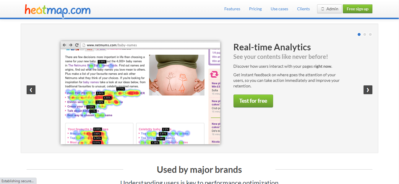
Heatmap.com is not multifunctional and only has a heatmap feature. But if you want a dedicated heatmap service, this is it. This tool uses an augmented reality approach that brings the most important data right on your pages and shows you what is happening on your site and shows you exactly where your users made their clicks. The heatmaps are created and shown on your screen in seconds and it updates constantly without needing to reload your page.
It allows you to change the contents on your site or page and see the impact immediately. It also tracks clicks on dynamic elements and allows you to export your information in a spreadsheet file. Heatmap's heatmap has a 100% interactive interface that allows you to navigate through your pages when the heatmap overlay is shown.
Limitations:
- Statistics collected are deleted after you stop recording interactions.
- Lacks other features like scroll maps and screen recording.
Heatmap has a free plan available for trials. It tracks up to a whopping one million pageviews a month for up to five pages. There is no limit to how long you can use the free plan. The downside though is that the features are very limited.
The Zen Plan allows you to monitor up to 10 million pageviews a month, and is free for the first five pages. Subsequent pages are priced at $5 a month.
If have high traffic volume and would like to track them all, then you can get the Premium plan for $100 a month. This unlocks all features, tracks up to 100 million pageviews per month, and allows an unlimited number of pages to be monitored.
Start Improving Your Landing Pages Now
Heatmaps are a great tool for learning about the behavior and intent of web users. They provide easily comprehendible data on what users click on, how they navigate through web pages, how long they spend on different parts of a webpage, what they gaze at the most, and what interests them.
The method of data display used by heatmaps, which is the color visual scheme based on heat areas, makes data analysis quite straightforward, and, let’s face it, easier to understand!
The different kinds of heatmaps – click, scroll, hover, attention, and eye-tracking, all have loads of benefits over other analytical methods. Nevertheless, that’s enough to say that these tools can be used alone to get enough information on user experience and interests. When combined with other important analytical tools, you can unlock invaluable information about your audience.
With the pricing level of the tools mentioned above, the value is well worth it when the data you get is quickly incorporated into your webpages. If budget is an issue, then try the free versions. There is a lot to be gained in using an analytics tool that gives you all the information you need at a single glance.
Implement what you’ve learned from your heatmaps and start tracking your landing pages today. If you need help with launching your native ads campaigns, hit us up at love@brax.io today.

